Hands On with the Motorola edge (2022)
Aug 18, 2022, 8:00 AM by Rich Brome @rbrome.bsky.social

Motorola has a new $500 phone and it's kind of a big deal. While Motorola has been successful with more affordable phones lately, not since 2017 have all of the big three US carriers offered a Motorola phone over $400. But in the 2022 edge, Motorola may have come up with the perfect balance of specs and features at the $500 price point. It's certainly competitive, and possibly a really great value in this oft-neglected price class. But what compromises did Motorola make? How does it feel in person? We check it out and give you our first impressions in this hands-on.
It's really interesting to compare this phone to this year's edge+, Motorola's flagship phone. That phone is double the price, and yet this model keeps all of the most useful and important features. All of the following features are rare at this price, found usually only on higher-end phones: 144 Hz display refresh, fast wireless charging, 4K HDR video recording, 960 fps super-slow-motion, reverse wireless charging, and Wi-Fi 6E. It's normal these days for a phone at this price to have one of these features to help it stand out. But to have all of them? That's wild. Honestly, I'm hard-pressed to think of a major feature I care about that's missing here.
Hardware
Motorola probably saved some money by moving from Qualcomm's flagship Snapdragon chip to a MediaTek chip. But the Dimensity 1050 in this phone is no slouch. It's not a "flagship" category chip, but it's not an "entry" or "mid-range" 5G chip, either. MediaTek considers its 1000-series chips the "premium" category, which sits between "mid-range" and "flagship". Further, Motorola seems to be taking advantage of the 1050's full capabilities, which isn't the case in every phone.
Also, the Dimensity 1050 chip is tailored for the US with support for certain advanced 5G technologies, so you should definitely see better data rates than you would with an entry-level 5G phone.
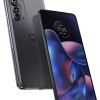
I'm glad to see an OLED display, and it looks nice in person. It supports HDR10+, that 144 Hz refresh I mentioned, DC dimming, and a 1300-nit bright mode for outdoors. It hides an optical fingerprint reader, (which is situated unusually close to the bottom of the phone.) I'm also glad to see a bezel that's almost uniform (no "forehead" or "chin") and reasonably thin.
Motorola brags about how thin and light this phone is, as they should. Picking it up, I was indeed quite impressed with how thin and light it felt. But the look and feel are both still quite premium. Part of the reason it's so light is that the frame and back are both plastic. But honestly they could have told me the frame was metal and the back, frosted glass, and I might have believed it. It feels that nice, and that well-made.
The side buttons are fine, although I remain annoyed that phone makers keep putting the volume control so high up on the side.
The camera hump is significant, and the same basic design as the one on this year's edge+.
While 99% of the phone looks quite premium, one odd detail stands out to me. It's truly the tiniest thing, but the SIM tray simply does not match the rest of the frame. On most phones, it blends in and is barely visible. Not here. But hey, at least it's on the bottom of the phone. I'm very much nit-picking, here.
Just to cover some of the other keys specs: it has a 5,000 mAh battery, 30-watt fast charging, 15-watt wireless charging, 50-megapixel main camera, 32-megapixel front camera, 5G, and NFC. It does not have a 3.5mm headset jack. Nor does it have a microSD slot for expandable storage, but Motorola is throwing in 100 GB of Google cloud storage to make up for that.
I want to give Motorola a little credit for including a 13-megapixel wide-angle camera. Too many phones — even in the mid-range — include wide-angle cameras that have lesser resolution, making them toys at best. Motorola has certainly been guilty of this. Now would I prefer the 50-megapixel wide camera in the edge+? Sure. But 13 megapixel is still roughly on par with the wide cameras of many flagship phones.
While the Dimensity 1050 processor isn't a gaming powerhouse, there are some features gamers might appreciate, like 360 Hz touch sampling, stereo speakers, and of course the 144 Hz display refresh. There's also Ready For, which I talk about a bit below.
Each carrier (T-Mobile, AT&T, and Verizon) will be offering a slightly different configuration. AT&T's will have 6 GB RAM, while the others will have 8. Verizon's will have 256 GB storage, while the others will have 128. And, as is common, only Verizon's will have mmWave 5G.
Software
Motorola offers a good flavor of Android that sticks to Google's excellent designs where it counts. It's an awkward time of year to release a new phone with Android 12 when Android 13 was just released. And it's even more awkward that one of Motorola's biggest tweaks is color-themed icons, which are now obsolete as Google has essentially baked that feature into Android 13.
But there is reason to rejoice about Android on this phone: Motorola is committing to three major OS upgrades and four years of bi-monthly security updates. This is an excellent policy and much better than Motorola has been offering on most of its recent phones. This should make corporate buyers happy, and Motorola has extra software (ThinkShield for Mobile) onboard that makes the phone even more enterprise-friendly.
Ready For is onboard, which is Motorola's answer to Samsung's DeX. But it's also more, and different. It can make your phone work a bit like a desktop PC when plugged into a large monitor. But it also has modes for streaming TV and gaming. You can even connect a Bluetooth gaming controller and go wild with Fornite on your big-screen TV. It's a smart feature.
I like Motorola's Android software as of late, so I'm glad to see no major changes compared to other recent Moto phones.
Camera app
With a standard flavor of Android like this, the camera app is the one place a manufacturer can go nuts with their own software ideas and unique features to help a phone stand out. Motorola has an excellent camera app that they keep refining year after year, and that continues here.
You'll find all the usual Motorola tricks, like Dual Capture (for photos and video), which combines images from both front and back cameras simultaneously. The Pro mode lets you do long exposures up to 32 seconds. The night mode can be automatic, and the Portrait mode is assisted by a dedicated depth camera on the back. There are all the usual other features you'd expect, like smile and gesture triggers, AI scene recognition, etc.
The video features match that of a flagship phone, with 4K HDR capture, Audio Zoom, and 960 fps super-slow motion. Impressive.
I like that you can customize which modes are in the main carousel and which are behind "More". That's handy.
The camera app is well-rounded and packed with features that are both useful and fun. It's also not too tricky to use.
Summary
So many phones these days are boring and exactly what I expect them to be; no more, no less. I can't tell you how many times I write a summary like this and just want to say "Eh, it's fine." (And that's certainly been the case with many recent Motorolas.)
But not this phone. I'm quite impressed by this one. It doesn't have a wild design or any one crazy feature. It doesn't fold or change colors. But it looks nice and feels nice. Crucially, it manages to nail the most important specs and cram in a really impressive feature list for the price. You used to have to spend at least $800 to get all of these features in one phone. At $500, this is a great value.
For too long, the US market has been dominated by just two types of phones: "affordable" and flagships. But the 2022 Motorola edge has the potential to revive the mid-range phone market in the US. I hope it succeeds.
Comments
No messages


 Motorola's new Edge Offers a Lot for $500
 iPhone 15 Series Goes All-In on USB-C and Dynamic Island
 Samsung S24 Series Adds More AI, Updates the Hardware
 Motorola Refreshes razr Lineup with Better Batteries & More
 Motorola edge (2022)


