Review: LG Lotus
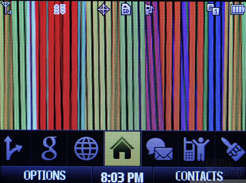
The Lotus is part of a trio of new phones that are among the first to use Sprint's new OneClick user interface. The base home screen has a carousel running along the bottom of the screen. Using the D-pad you move sideways through this carousel to access different menu items. As you pass over each item, a list of options appears above it that you can choose from. For example, if you scroll over the messaging icon, you'll get a list of different things to choose from, such as going to your inbox, initiating a new message, etc.
The carousel itself is fully customizable. You can add or delete icons at will, and move them around to an order that suits your usage needs or style. A few months ago at CTIA we noticed a bit of a lag on all the One Click phones we tested when scrolling from icon to icon. This final build of the software proves to be faster. There is still a delay, but it is shorter than before.
The carousel items are meant to serve as shortcuts to sections of the phone. The Browser icon, for example, lets you choose to open the browser, see your recent history or go to your bookmarks. This lets you jump straight to the web page you really want to go to rather than launching the browser first and then scrolling to your bookmarks or history.
One carousel item is Google. When you scroll to it, it opens a Google search bar, and below that are links to Google Maps, Gmail, and several other Google services. This is a nice touch to have built in mobile search capabilities.
As is common to Sprint phones, there is a carousel item for your favorites. This lets you populate a bunch of shortcuts to action items or applications.
There is also a full regular menu that houses all of the phone's applications and services. This larger menu appears in a standard list or grid view.
OneClick eliminates a lot of the digging around in menus that is necessary in Sprint's current feature phone user interface. By standardizing across the same platform, Sprint is sure to annoy some users who want more ways to personalize their phones, but OneClick does actually make finding the phone's features faster, even if not in "one click."


 CTIA Fall 2008
 Hands On with the moto g stylus 5G (2023)
 How To Turn Off an iPhone
 How To Turn Off an Android Phone
 Google Pixel 9 Series Revealed: at Least Four Models This Year
 LG Lotus


