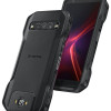
Review: Motorola VA76r Tundra
The Tundra's menu system doesn't differ all that much from that of other AT&T feature phones. From the home screen, the left soft key takes you to what AT&T calls a list of "options" that are really shortcuts to applications such as the camera, Bluetooth, the alarm clock and more. Calling it "options" - rather than "shortcuts", "favorites" or "apps" - is a misnomer.
The main menu can be configured into a grid, list or spinner view. I found the grid to be the easiest to use. You can also re-order the layout of the grid, which is always nice. Beyond this main menu, most other menus are simple numbered lists.
For the home screen, the four directions of the D-pad can be set as shortcuts to specific applications.
Overall, the UI is pretty basic and the menus don't drill down too deep.


 CES 2009
 iPhone 15 Series Goes All-In on USB-C and Dynamic Island
 Samsung S24 Series Adds More AI, Updates the Hardware
 Motorola Gets Serious About Foldables with New RAZR Lineup
 Kyocera Brings DuraForce Pro up to Date
 Motorola VA76r Tundra


