Review: Palm Pre
Browser
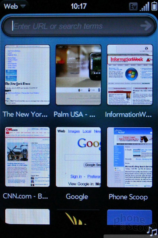
The Pre's HTML web browser is fun to use. When you first open it, you get a grid-like panel of your bookmarks. About nine fit on the screen at any one time. Basically, each bookmark is a snapshot of each web site that you've marked. Press to open that page. Neat. There's also a URL address bar at the top.
The Pre uses Sprint's EVDO Rev. A network, which, for the most part, makes for fast browsing. Web sites such as Google and Facebook's log-in page loaded in 3 seconds. CNN took a disappointing 12 seconds, and NYTimes an even more disappointing 18 seconds. That's for the full desktop HTML versions of those sites, mind you, not mobile-optimized HTML. Web sites simply look fantastic on the Pre's beautiful display. Tapping will zoom in/out to different sections of any site you visit, as will pinching.
The browser's preferences allow you to customize some settings and see things such as your browsing history. You can also add web sites to the home screen as cards, making them instant bookmarks from the Pre's desktop. You can also share web site links via email.
Browser
Customize
The Pre lets you change up most of the normal things you expect to be able to customize on any handset. I've already detailed many of them, but wallpapers, ringtones, caller IDs, alert tones, the menus, etc., can all be customized as you wish. The Pre has a lot of keyboard-based shortcuts, and some of them can be user defined to quickly initiate certain actions. You can choose any song from your music library as a ringtone.




 Video Tour: WebOS 1.4
 Video Demo: Palm Pre Plus Mobile Hotspot
 CTIA 2009
 CES 2009
 Nothing Phone (2) Sports Upgraded Specs, More Useful Glyphs
 Palm Pre (CDMA)

