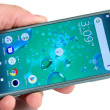
Review: Motorola Devour
Mar 2, 2010, 1:54 PM by Philip Berne
Is the Motorola Devour the Droid's little sister, or is it a social butterfly all its own? Phone Scoop takes a longer look at this intriguing aluminum Android device, running Motorola's Motoblur interface.
Form
Is It Your Type?

Motorola's second Android phone on Verizon Wireless opts for social networking features and Motorola's Motoblur interface over the raw power of the Motorola Droid. If keeping in touch with your Facebook and Twitter friends is more important than a high-res screen and a stealth fighter look, the Motorola Devour is worth a look.
Body
The Motorola Devour picks up on the current unibody construction trend, as most of the phone seems like it was carved from large blocks of aluminum. It doesn't go as far as, say, a Macbook Air or an HTC Desire, but there are plenty of smooth, unbroken surfaces and sharply carved edges to give the phone a modern look. The phone feels quite sturdy. The battery is hidden under a long panel on the side; it's more a slot than a traditional covered battery door, and it wasn't easy to remove at first, but it does score points for being unique. The slide opens with a reassuring click, and it's much less stiff than the slide on the Motorola Droid.
The Devour doesn't use the high resolution screen or fast processor of its Verizon Wireless cousin, the Droid, but if this is the Droid's baby brother, it's a big baby indeed. The phone feels wide and chunky in the hand. The aluminum body adds more heft than I like, and those sharp edges will make quite an impression, literally, if you keep this phone in the same jeans pocket all the time. As my colleague Eric Zeman exclaimed, this feels like a groin injury waiting to happen.
There are a mix of buttons and keys on the Devour, to the point that they seem intended more for novelty than usability. There are three touch sensitive keys below the screen: a menu key, home key and a back key, but no search key, like you'll find on other Google Android handsets. These keys didn't work very well, and often I had to find just the right angle to tap my finger on them to get a hit. Still, they look pretty all lit up with a bright, white backlight.
Instead of a trackball or D-pad, the Motorola Devour uses an optical pad on top of a button. You can change your menu selection and move the cursor by rubbing your finger over the tiny black square, and then make your selection by pressing down on the button. In practice, this didn't work well, either. The Devour was unresponsive to my finger motions, and tapping the touchscreen itself was always a better choice.
The keyboard on the Motorola Devour isn't bad, and I certainly like it more than the keyboard on the Droid. Keys are well spaced and discrete. The individual keys are a bit stiff, so I could never get my typing times up to par, but typos weren't so much a problem. I wish there were more specialized keys. I like keyboards that have dedicated keys for common symbols, like the @ symbol or even a “.com” key, but the Devour keyboard offers only letter and numbers as primary keys, and the usual assortment of symbols with the function key pressed.
Up top, there's a standard 3.5mm headphone jack, always welcome on a multimedia phone, and a power / screen lock button. This button was even harder to press than the volume keys, because the black bit of plastic that comes up from the back sits a bit higher than the power key. I had to aim carefully to hit it.
On the left side, there's a microUSB port and the large, sliding door that hides the battery port and microSD card. The memory card isn't hidden by the battery, so you can easily change cards on the fly. Removing the battery requires flicking a lock switch and pulling a thin plastic tab, and this seems precarious. In a hurry, I could easily imagine ripping off that tab, and then my battery is stuck inside for good.
The Three S's
Screen
The screen on the Motorola Devour seems much smaller than it actually is, thanks to the large black border all around it, and even more aluminum casing surrounding that border. Still, it is the smallest screen I've seen on an Android device, coming in a hair smaller than the screen on the T-Mobile myTouch 3G or T-Mobile G1. The resolution is also a disappointing HVGA, 320 by 480 pixels. For comparison, the Motorola Droid packs 2.5 times the pixels into a display that's just over a half-inch larger, so the Motorola Devour's screen doesn't look nearly as crisp and sharp as its Verizon cousin. Text looked a little jagged at times, and some images suffered from a screen door effect. Icons and menus looked bright and colorful. I also had no trouble using the screen outside on a bright, sunny day, even with brightness dialed down to about 50%.
Signal
Wireless signal strength on the Motorola Devour was unimpressive, and lousy in some cases. Where other Verizon Wireless phones saw 2-3 bars of service, the Motorola Devour would only report a single bar. The phone would also lose contact with the 3G, EV-DO network on occasion and revert to slower 1xRTT, where other phones kept hold of the faster signal. At its lowest points, my calls would still dial out, but incoming calls from my other test phones would not come through on the Devour. Also, downloads from the Verizon Wireless V Cast store and pages loaded on the Android Web browser took a speed hit when signal was poor, and some pages stopped loading entirely.
The Devour also has Wi-Fi, but I had serious trouble making a connection. Though the phone connected properly in my first day of testing, on my second day of trials the Wi-Fi seemed to stop working altogether. It couldn't properly connect to any Wi-Fi network, and I never got a Wi-Fi status indicator in the notification bar, even though the battery usage meter told me that the Wi-Fi radio was a significant drain on the phone's power resources.
Sound
Sound quality on the Motorola Devour was okay, but I've come to expect more from Motorola's devices, which often sound much better than this. My voice sounded a bit muffled on my caller's end, and had a digitally compressed quality to it. On my end, the Devour's earpiece sounded pretty good, with no static problems or drop-outs, but callers still sounded somewhat distant. The speakerphone is clear, but not as abusively loud as I like. I could barely hear the speakerphone in my car over the engine and outside noise while I was driving fast. This wasn't a problem with the ringtones. The phone produced some loud rings, and I could hear it even when it was tossed in a backpack or buried in a coat pocket.
Battery
It seems that Motorola's Motoblur interface is something of a battery hog. While the Droid had exceptional battery life, the Motorola Devour, like the Motorola Cliq, couldn't last as long. In a simple calling test, the Devour fared well. I managed a test call that was 15 minutes shy of seven hours talk time. But in standby mode, the battery drained much faster. I charged the phone fully on Tuesday morning, and before lunch on Wednesday the phone died. Testing GPS navigation and Bluetooth drained the battery even faster, so with heavy use, the Motorola Devour might not make it through a full day's work without a charge.
The phone does have some interesting battery options to help conserve power. You can adjust the performance mode of the phone to save juice. The phone will turn down the display brightness and even disconnect from the 3G data network to prolong the battery life. There's even a battery usage meter to let you know which features and tasks were draining the battery fastest. Not surprisingly, the display and the Wi-Fi radios were the big culprits in my tests, but the phone's standby mode was also a power hog, which is why I blame Motoblur, with its constantly updating social networking features.
Touch
The 3.1-inch touchscreen on the Devour is not as responsive as I like. Occasionally, button taps wouldn't register properly, and I'd have to angle my finger properly to get a hit, just as I did with the touch buttons beneath the screen. This was especially annoying when the phone had trouble dialing for a call. A few times during my tests, the Devour also registered a key press when I was really swiping my finger, which caused an app or widget to open unexpectedly. It's a slightly annoying problem, though it wasn't a dealbreaker.
Those touch buttons are far worse, especially the back button, which is closest to the edge of the phone. A few times I would mash the button repeatedly and get no response, even while the Home and Menu buttons seemed to work properly.
The phone interface responded well to touch, but it wasn't perfect, especially when I was navigating the 5-pane home screen. There was a slight lag between swiping my finger left or right and seeing the screen move. This wasn't as much a problem on long lists, like my music playlists or my contacts list, though some Web pages would also lag when I was panning and scrolling.
Basics
Menus
Android's basic interface and menus are quite dynamic, and Motorola's Motoblur interface adds plenty of useful features. There are plenty of ways to customize the Motorola Devour's 5-pane home screen. You can add shortcuts to open applications, Web pages, music playlists and more. You can dial a contact quickly by tapping a shortcut on the home screen. You can even add a shortcut that will open Google Maps and start navigating from your current location to a preset destination, a shortcut I use quite frequently.
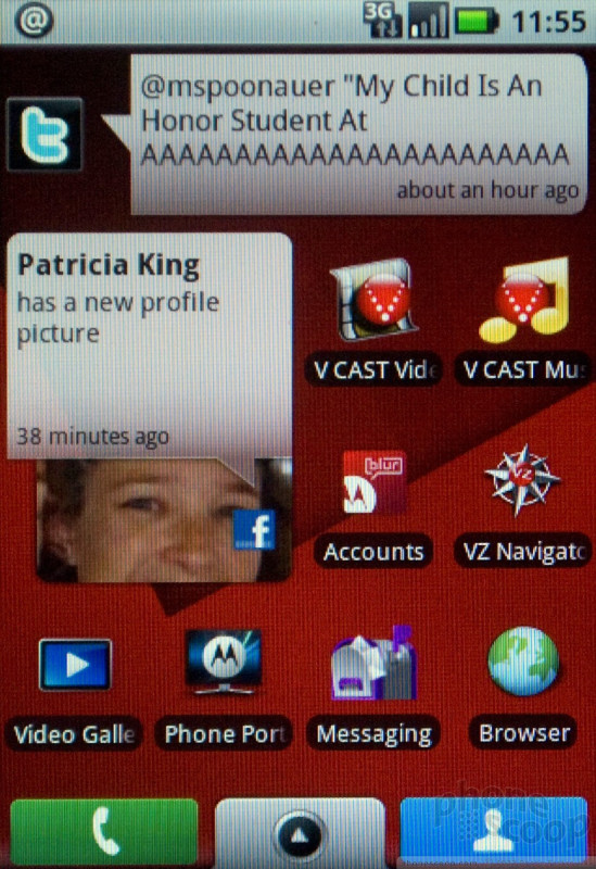
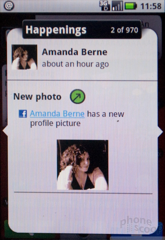
Beyond shortcuts, there are plenty of active widgets available that will continually update with new information. One widget, the so-called Happenings widget, collects all your friends' updates from Facebook, Twitter and MySpace. Another widget, Motoblur's Social Status widget, lets you update these services all at once with the same message, or individually. A News widget gathers articles from RSS feeds. Best of all, these widgets look great and are easy to use. You get one update at a time directly on your home screen, but if you tap the widget you get a simple slideshow view that lets you flick left and right to read more. No need to open a separate app or your Web browser, all that information is collected on the front page.
Most of the phone's settings are all buried in the Settings menu, but these can be difficult to navigate, as well. For instance, you can adjust power usage in the “Battery Manager” menu, but if you want to see which apps and features are draining your battery quickest, you have to find the “Battery Use” option under the “About Phone” menu. I also wish that these settings menus were consistent between Android devices, but they're different, in somewhat subtle ways, on every Android device I've used (which is almost all of them). Of course, this won't be a problem until you buy your second Android phone.
Calls / Contacts
Calls
At some point, manufacturers stopped including Send and End keys on touchscreen phones, and I miss them terribly. It's easy to make a call from the home screen, as the little phone tab persists through all five panes. But if you have any other apps open, you have to jump back out to the main screen to access the telephone features. Strange that you can press a button and start the camera from within any app, but you can't make a call as easily? Of course, the voice dialing button will interrupt any other task, so you can always dial quickly by speaking to the phone, which is a great feature to have while driving.
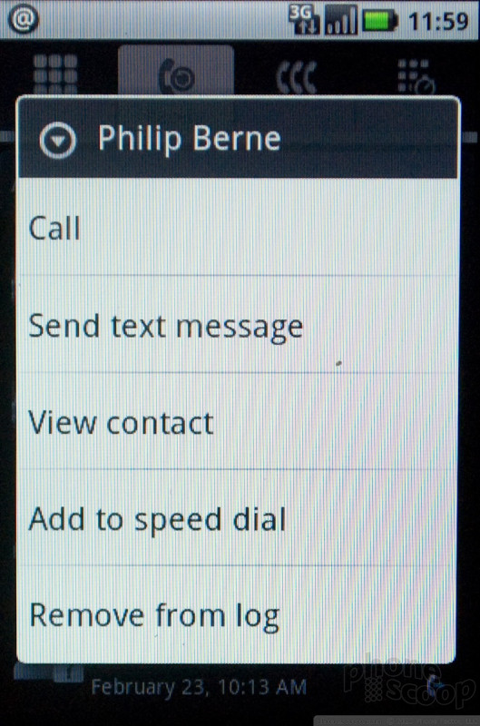
In the calling menu, you get a dialpad and a few other helpful lists. One tab shows your recent calls. Another tab gives you a look at your most frequently dialed contacts, while a third tab lets you assign contacts as speed dial numbers. Strangely, you can't access your entire contact list from within the dialer, but the contact tab, like the dialer tab, persists throughout the main menu panes, so it was easily available.
Call management could be easier once you've connected with your caller. It's cool that the Devour automatically imports recent Facebook or Twitter avatars, and these show up on the calling screen once you're connected. You also get to read your caller's most recent status update. But I like to make 3-way calls, and these were not easy to place or manage on the Motorola Devour. You can't simply dial a new number and press Send, you have to find the New Call option in the pop-up menu. Then, once you have a third party on the line, it should be easier to join, swap or drop an individual caller from the conversation, but the Devour doesn't break up the two calls on screen so you can control each line individually.
Contacts
For contacts, the Motorola Devour has a robust range of sync options. The Motoblur interface is happy to gather your address book from Gmail, Facebook and Microsoft Exchange servers, among other options. Unlike Android phones with a stock, vanilla Google interface, the Motorola Devour also comes with built-in PC sync software, so you can even synchronize with the address book on your desktop. Unfortunately, I'm using a Macbook at the moment while I'm in between Windows machines, so I couldn't test this Windows-only sync feature, but the option pops up automatically when you plug your phone into a USB port.
The contact list aggregates all of your contacts together, including your Facebook and Twitter friends, and this might be a bit excessive. After all, Alyssa Milano is probably not going to call me personally, though I have a ringtone set for her just in case. When you tap on an individual contact, you get a screen that offers all of their personal information. You can also view a history of your communication with that contact, whether that includes phone calls or messages sent by email, SMS, Facebook or Twitter. Similarly, there's also a History tab on the main contacts screen that shows all of your recent communications with every contact. There's also a more general Happenings tab that shows all of that contact's recent status updates.
Messaging
Though the Motorola Devour clearly prefers Google's own services to the alternatives, the phone has a wide range of messaging options. For email, you get an inbox for Gmail, which has more advanced features for Gmail's labeling and threaded conversations. You also get an inbox that brings together every other email account, like your POP or IMAP mail account or your corporate Exchange account. The Devour had no trouble displaying HTML emails or email attachments, especially office documents using the included QuickOffice suite.
The Motorola Devour also has a unified inbox for all your social networking sites. You can read and send Facebook messages and Twitter DMs without opening their respective apps. All of these different email options may seem confusing, but the Motoblur interface on the Devour does a nice job walking you through which service you're sending from, and to which contact you're sending a message.
Text messaging was also easy on the Motorola Devour. The text messaging inbox gets a slick, threaded look so all your messages with a contact appear as one long chat conversation. It's easy to insert pictures, sounds and even videos directly into your text messaging chat. You can insert multimedia from the text messaging inbox, or you can tap on a picture in the photo gallery to send it using any of the messaging features the Devour has on board.
Extras
Music
Music is not a strong suit for Android devices, and even though Verizon Wireless gives the Motorola Devour an extra push, it turns out to be a push in the wrong direction. While just about every other Android phone has shipped with the Amazon music store on board, including Verizon Wireless' other Android phone, the Droid, the Devour comes with Verizon's stodgy old V Cast Music store. The selection on the V Cast store is great; that's not the problem. But it's a horrible piece of software. It's sluggish and crashed a few times in my tests. You can only download one song at a time, and you can't do anything else while a song is downloading. Navigating the song lists is a complete nightmare. Worst of all, the songs you get are locked down with DRM and twice the price of singles downloaded on the Amazon store ($2 in most cases). The only good thing I can say is that the stock Android music player can handle the V Cast songs, so you don't have to use a proprietary player, too, but that isn't really a compliment.
The music app for Android is the same as you'll find on every other Android device, except that it can play the DRM tracks from Verizon Wireless' V Cast Music Store. The Motorola Devour doesn't have any hardware playback controls, but it is well equipped for multimedia. There's a 3.5mm headphone jack up top so you can use your own earbuds (the phone comes with no such accessory). There's also an 8GB microSD card pre-installed, which is a good start and might be enough storage for working out or short commutes.
Camera
Camera
The camera interface on the Motorola Devour is barren and buggy. Though the camera app opened in a hurry whenever I pressed the camera button (even by accident), the camera took too long between shots and often froze at the image preview screen. Sometimes pressing the shutter button would return to the live camera view, sometimes I had to press the back button because the shutter button wouldn't help. Sometimes I even had to quit the app entirely and relaunch the camera to snap another shot.
There are no image settings for the camera, either. You can change the megapixel size of your images, but you can't adjust white balance, focal points or image quality in any way. There are no scene modes, though you can shoot in black and white or sepia, among other simple color filters.
Gallery
As bad as the camera is, the Motorola Devour actually has a good image gallery. Images are presented with a cool, 3D effect and subtle reflections, and its easy to scroll through images and present a slide show with simple flicks and taps. You can even edit images in the gallery, and here's where you'll find tools to tweak white balance, crop and rotate an image, or adjust the hue. There's even an auto fix tool, and it did help somewhat, though not enough to salvage a bad snapshot. You can add frames or caption balloons to your pics, too, and then send them off however you like.
The Devour excels at giving you options to share your pics. You can send images as MMS messages or in an email, and its easy to upload to Google's Picasa site or your own online album of choice. You can also upload pics to Facebook, Twitter or your favorite social network. Motorola even has its own online album service for Motoblur devices, in case you need to sign up for something new.
Pictures / Video
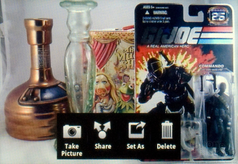
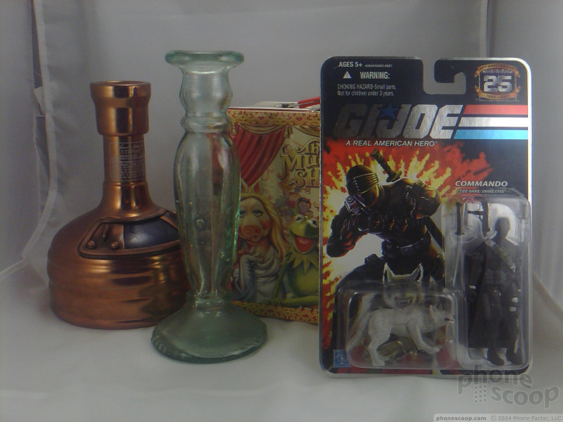
The 3 megapixel camera on the Motorola Devour is quite poor, and its images are nearly unusable. Colors look drab and grey, though the camera did keep from blowing out red hues, a common problem on small image sensors. Details were almost completely lost, however. The camera has no auto focus, so I couldn't get close enough for fine details. At full crop, the camera produced a jarring, jagged effect on almost every edge I searched, almost as if this were really a 1 megapixel sensor blowing the photos up too large. Photos might work in a pinch, if you're desperate and you happen to come across a sasquatch crossing the road, but this will not be definitive proof you saw Bigfoot.
Video quality from the Motorola Devour's camcorder was as bad as the still image quality. The camcorder can record videos at VGA resolution, but the frame rate was very low, sometimes dipping lower than 10 fps. Outdoor videos looks pretty good, but indoor videos were grainy and pixilated and the camcorder seemed to render a bit green, with no way to adjust the white balance. While the camera was moving, videos looked a blur. As light levels changed, the Devour's camcorder couldn't keep up, and even dimly lit spots would get blown out as the camcorder failed to properly shift from dark to light areas.
Check out my sample video from the Motorola Devour's camcorder:

3GPP / MPEG-4 format (viewable with QuickTime)
Browse / Customize
Browser
The Web browser on the Motorola Devour is quite good, as I'd expect from a Google Android device. Though the Web browser comes with Flash Lite support, I've never been a fan of Flash Lite, and it didn't help the browsing experience on this phone. Videos would never load properly, and the browser came to a screeching halt when I tried to load more complicated Flash Web sites. It's no wonder that Adobe won't be bringing its more powerful Flash 10 to this phone; it doesn't seem to have the power to handle the task. Zooming in and out of pages was a bit jerky, and the phone doesn't support multi-touch pinch and zoom gestures, but the zoom controls are always front and center on the browser display.
Adding bookmarks is easy, and your favorites appear in a list format. It's too bad the browser doesn't get the thumbnail view that you'll find on more advanced Android OS phones, but it was still easy to maintain bookmarks, and besides your chosen favorites the Devour also lists your most frequently visited pages as well as your complete browsing history. It was also easy to add these bookmarks to the homescreen, which lets you jump directly to your favorite site with a single tap.
The Motorola Devour surfs the Web on Verizon Wireless' EV-DO Rev. A network, its fastest 3G service. In practice, the Web browser seemed snappy enough, though it was never in a hurry. Mobile sites loaded very quickly, but large sites, like CNN's homepage, took much longer, even compared to similar phones on the same network. I might have had an even faster Web experience if Wi-Fi worked properly, but as I mentioned, I wasn't able to connect to any Wi-Fi network consistently.
Customize
Android phones like the Motorola Devour offer significant customization options out of the box, and even more customization through apps available from the App Market. There are loads of setting options available to tweak everything from power management to touch sensitivity on the optical joystick. Besides the Motoblur interface, you can't do much to change the basic theme of the device, at least not out of the box. There are a few theme apps that can change your menus and icons, but these tend to be very resource intensive and buggy, so I'd hesitate to recommend them for Devour users.
Extras
Clock
The Motorola Devour presents a large clock on the locked display, so you can check the time without unlocking the touchscreen. Once you've started using the phone, the clock is a tiny set of numbers up in the notification bar, and you can also tap the bar quickly to see today's date. You can add an analog clock widget to any (or all) of your home screen panes, but you don't get the huge selection of cool clock designs that you'll find on an HTC Hero or other HTC Sense phone. There's an easy alarm clock app on the phone, too, so you can set multiple alarms and leave the phone by your bedside as an alarm clock radio. You can even wake up to one of your MP3 tracks or a video when the alarm goes off.
Bluetooth
The Motorola Devour supports Bluetooth 2.0+EDR with protocols for handsfree devices and stereo music playback. I paired the Devour with my various Bluetooth devices with no trouble. I tried a few Bluetooth headphones from Plantronics and BlueAnt and the Devour found them quickly and paired easily. Sound quality on the Devour was pretty good, on par with other phones we've paired with these headsets. Reception could cut out occasionally as we moved the phone to and from our pocket, but that's not unusual for Bluetooth. You can even use voice dialing with your Bluetooth earpiece. I also paired the Devour with a set of stereo Bluetooth speakers from Parrot and music came through loud and clear.
GPS
With more Verizon Wireless services on board than the Motorola Droid, the Motorola Devour offers a strange, equivocal mix of GPS navigation options. You can pay a monthly fee to use the newest version of Verizon Wireless' VZ Navigator. Verizon's navigation app has seen significant improvements recently, with a much better interface and some very convenient location-based features to help you find local movies, gas prices, concert events and more. Or, you can go with the free navigation now offered in Google Maps on the Devour. Google's free navigation is surprisingly good, and I could hardly tell the difference in quality between the two. VZ Navigator does have more features built in, but not enough for me to justify paying $10 per month. Plus, VZ Navigator had trouble using the GPS signal on occasion. While Google Maps found my location quickly, VZ Navigator would sometimes stall, requiring a full restart of the phone to work properly. This only happened a couple times during my testing, but for a paid app it should work better than the free option.
Market
The Motorola Devour gets access to the Android App Market. Apps on the Market tend toward the productive or system hack side of the developer world, with fewer games and entertainment apps than you'll find in the Apple App Store, unless you think it's entertaining to hit a button and hear Stewie Griffin speak, in which case you're in luck. Not every application will show up, even in a targeted search. For instance, I wanted to test the graphically intensive Sherpa app, but it wasn't available for the Devour so it didn't appear. Only apps that work with Android OS 1.6 (and not the other 3 versions currently on the market), will appear. Even so, there are plenty of apps for Twitter, Facebook and other social networking functions, including loads of options to update your status or upload pics.
Video
A video tour of the Motorola Devour on Verizon Wireless. You can watch it here:
Or visit YouTube for more viewing and sharing options.
Wrap-Up
While the Motorola Droid served as a flagship phone, with its high-res screen, excellent battery life and superior hardware specs all around, the Motorola Devour is all about social networking. The Motoblur interface offers deeper integration with your favorite social sites, especially Facebook, Twitter and MySpace. If you want a constant stream of information from all your friends and followers, the Motorola Devour is the better choice on Verizon Wireless.
The Devour is held back a bit by some strange design choices. The phone feels chunky and cumbersome. The screen seems too small against all the plastic and metal that surrounds it. Touch sensitive buttons under the display gave me plenty of trouble, and the optical joystick was so bad that I stopped using it after a few tries, even when I hiked the sensitivity up to its maximum. The keyboard isn't bad; it's even better than the keyboard on the Droid, but it isn't great, either, and the phone would be easier to use with more shortcut keys and buttons under the slide.
Verizon Wireless also hasn't added any useful software to this phone, and every attempt seems worse than the alternative free option. The V Cast Music Store is horrible, a sluggish and buggy mess of a music store that had me longing for the Amazon MP3 store on other Android phones. VZ Navigator worked fine, except when it didn't work at all, but the extra location-based features aren't enough to justify the extra monthly expense, especially when Google's own navigation option comes free on this phone. Motorola has added their own extras in a PC sync tool and wireless media sharing, but none of these services were compatible with my computer so I had to skip them for now. That kind of defeats the purpose of Google's platform-agnostic Android intentions.
The best competition for the Motorola Devour is probably the Palm Pre Plus. Both phones have deep contact integration with your favorite social networks and innovative search options that let you dig into the Web, the mapping software or the phone itself. While Palm's WebOS might be easier to use out of the gate, Google's Android platform allows for deeper customization options and has a more robust App Market. I won't foment this argument any further, because both of these phones are a fine choice for the right user.
Comments
Don't you think it's time to move the browser out of the "Extras" section?
I was playing with a Backflip yesterday, and everything looks similar to this one. One thing that was annoying was navigating to a different page required you to bring up a separate menu, choose "Go," and then type in the URL. This just seems like a pain, when the title bar already shows the URL, you just can't select it to change or type in another one.
But overall, very good review, I just think the review layout needs some retooling for 2010.
Signal
I had even done the *228, then 1 and also 2. Doesn't seem like it helped much at all. Hope they can release a software fix for this and do it soon.












 Motorola Gets Serious About Foldables with New RAZR Lineup
 Nothing Phone (2) Sports Upgraded Specs, More Useful Glyphs
 Motorola Shows Off New Concepts in AI, Foldables
 Boost Updates its Celero Phones for 2024
 Arm Announces Most Efficient Processors Cores for Phones to Date
 Motorola Devour

