Review: Nokia E73 Mode
Jun 14, 2010, 8:00 AM by Eric M. Zeman
Nokia churns out another E series QWERTY phone. This follow up to the E71 and E72 makes some notable improvements in the hardware, but the S60 software inside doesn't quite hold up its end of the bargain.
Form
Is It Your Type?
For die-hard S60 fans, there are few choices from U.S. carriers. The Nokia E73 Mode offers S60 in an appealing refresh of the E71/72 hardware. It's an elegant messaging device with hardware that works as well as it looks and feels. It's a pity, however, that S60's age is showing. While the software is powerful and lets users do pretty much anything, its bogged down user interface is beyond old and frustrating to use. Still, the E73 has plenty of merits worth discussing.
Body
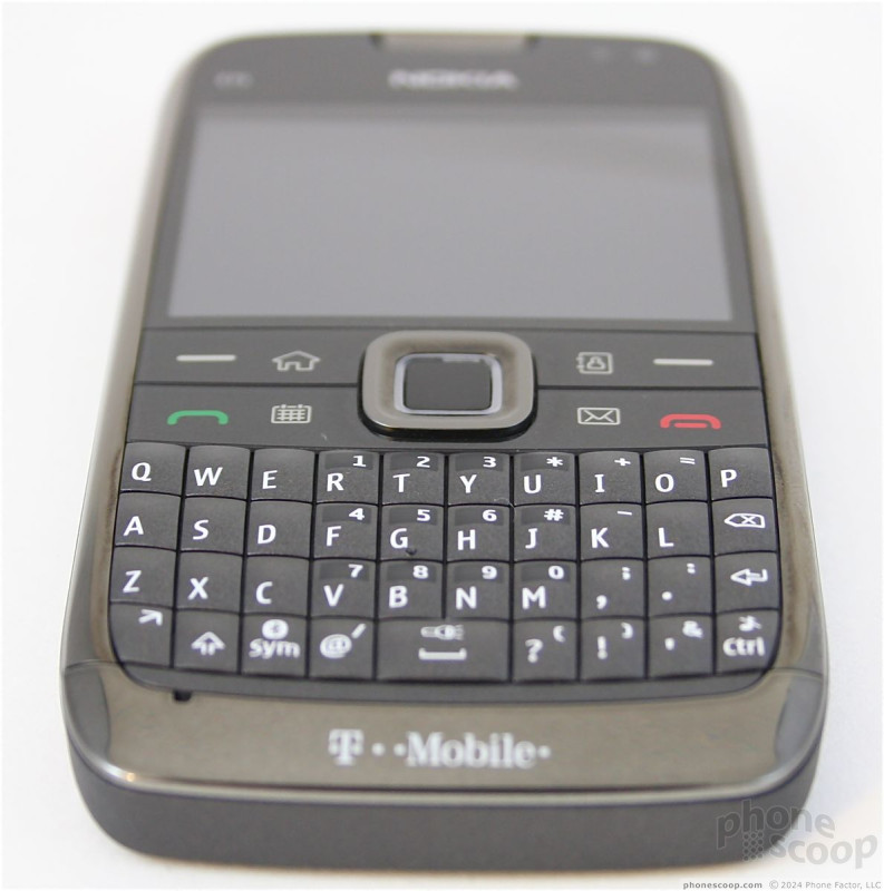
The Eseries is Nokia's line of devices aimed at business users over general consumers, but don't let that stop you from considering the E73 Mode. The Mode follows in the design footsteps of the E71 and E72. It is slim, stylish, and made from the finest materials. Although I liked the metal-rimmed appearance of the E71/72 slightly better, the Mode is still class all the way. You can tell it uses solid materials by the heft. It is no lightweight. It may be thin enough to slip into any pocket, but you'll know it is there.
The biggest difference between the E71/72 and the E73 Mode are the control keys on the front. Where the E71/72 have six distinct (but small) buttons, the E73 has four larger buttons, each with two functions. Starting in the upper-left side of the control cluster, there is a soft key / home key. Press one side of the button to activate the soft key, press the other side to take you to the home screen. The other three buttons pair the following: send / calendar, end / email, and soft key / contacts. The Eseries devices have always provided quick access to vital functions such as email, contacts and calendar, and the E73 is no different. Travel and feedback of all the buttons are good, but you do have to be careful with thumb placement. It is all too easy to accidentally press the end key rather than the email key, or the home key rather than the soft key.
Nokia has placed a nice D-pad in the middle of all these buttons. It's the perfect-sized squircle, with just the right amount of edge so that it is easy to find and use. Travel and feedback were spot on. The center of the D-Pad is an optical trackpad. It is very sensitive, and combining the center button with a redundant trackpad underneath makes for navigation overkill from time to time (e.g., you often overshoot stuff).
The E71 and E72 share identical keyboards. The E73's has been altered slightly for the better. Rather than having rows of keys that go straight across, there is a very slight smile-shaped curve to the E73's keyboard. The keys have just a hair's-breadth more shape to them, and travel and feedback has been improved. The size of the keys is still diminutive, though. The improvements do have the desired effect: the E73 is easier to type on than its forebears, even if by only the smallest margin.
The rest of the E73's hardware is identical to the E72.
The microUSB and microSD ports are both tucked into the left side of the E73. It is easy to get at both. The volume controls are on the right, though the E73 is the third device to make the same mistake as far as I am concerned. The volume keys are separate, not a toggle. Nokia has placed a voice control key between the volume keys. Even though the volume keys have just a bit more shape and texture to them when compared to this voice command key, it is still easy to press the voice key when you intend to raise or lower the volume. Annoying.
The majority of the E73's back side is the metallic battery cover. I like this cover, but it has two problems. Number 1: it gets darned hot when using the phone. Number 2: for some reason, it is prone to gathering finger oil, which shows up as ugly stains and smears on the metal surface. No oleophobic protection here.
The power/lock key is on top. It's recessed and flush with the surface of the phone. It's hard to find, and hard to use. Next to it is a 3.5mm headset jack, which means you can use regular stereo headphones with the E73.
The Three S's
Screen
One feature that sadly has not been improved on the E73 is the display. It carries forward the same 2.4-inch, 320 x 240 display. Not only is it smaller than many competing smart phones, the resolution just doesn't cut it. Pixelation is visible everywhere. Text, icons, graphics, images and Web sites all have rough edges. With so many high-quality displays on the market, it is a disappointment that Nokia thinks it can get away with such an inferior screen on what's supposed to be its flagship business device. As far as view-ability is concerned, indoors is no problem. It actually holds up pretty well outdoors, too, though that depends in part on the settings, backgrounds and themes you choose.
Signal
The E73 excelled at collecting T-Mobile's signal. Nokia devices typically have 7 bars for signal strength (as opposed to 5). Most of the time, the E73 had 5 or 6 bars. I only saw it dip down to T-Mobile''s EDGE network once, and it was in an area that I know to have spotty coverage. How did the signal performance affect calling? I didn't miss a single call while testing the E73. Nor did the E73 drop any calls. Data sessions were mostly speedy, though I noticed a couple of minor slow downs. It's a Nokia, and it behaves like a Nokia.
Sound
Call clarity with the E73 was outstanding. Nokia knows how to make phones that are superior as phones, and the E73 is no different. I heard zero noise or fuzziness while making calls with the E73, and those I spoke with said I sounded crystal clear. As far as volume is concerned, the earpiece is easily loud enough to overcome most environments, including a noisy coffee shop and a busy city street. The speakerphone was board room quality. You could conduct a business meeting in the executive suite with no problem. Clarity and volume were perfect. The ringers and alerts can also be ratcheted up to near rock concert levels. I easily heard a call with loud music and a lawnmower providing background noise.
Battery
The E73 is also a solid performer when it comes to battery life. One benefit of having a smaller display is that it takes less processing power to handle it, which in turn leads to better battery life. I was able to manage 2.5 days with the E73, and that included a lot of voice calls, email, texting and Web browsing. Even turning on the Bluetooth and Wi-Fi radios didn't appear to have too much of an impact on the E73's battery life. If you're headed out for the weekend, you can probably leave the charger behind. Going on a 3-day business trip? Better bring it just in case.
Basics
Menus
The E73 Mode runs Nokia's S60 Third Edition Feature Pack 2 system software. Back when it first hit the market, it was a solid operating system. It still is when it comes to power and capabilities, but the user interface is practically unchanged since S60 first hit the scene nearly 10 years ago.
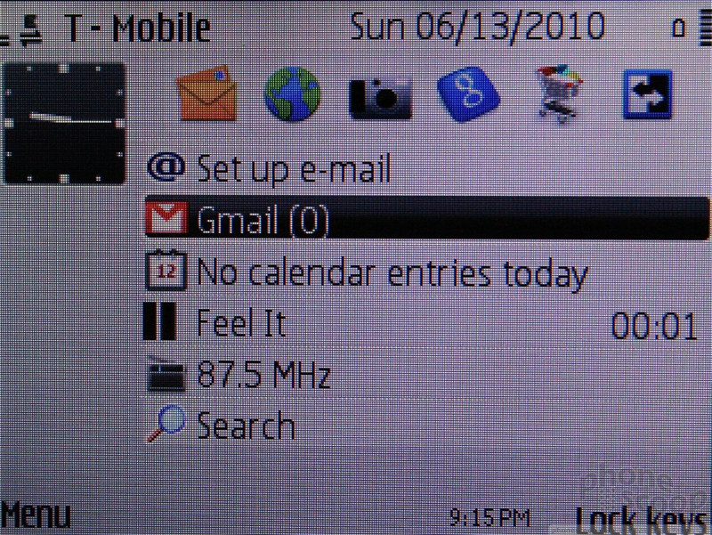
The home screen has a lot of flexibility. There is a dock of sorts (when "Active Standby" mode is activated) that runs across the screen just under the notifications bar. It holds quick links to apps or actions and is completely user customizable. Below the dock, S60 offers a "Today"-type screen that shows you recent emails, calendar appointments and information such as that. The E73 also can switch "modes." Say from 8am to 6pm, you want the device to provide short cuts to your work email, calendar, etc. Great. But from 6pm to 8am, you'd rather have fast access to the media player, camera and web browser. No problem-o. Just customize each mode in the way you want, and use the mode switcher key to easily jump between the two. Of course, you can just ignore it if you want to.
The main menu is accessible via the left soft key. Nokia has done a little bit of work to flatten this menu structure and make it easier to interact with. The basic layout is a grid, but can be changed to a list view if you so prefer. The main folders have been slightly renamed, making it a bit quicker to figure out where stuff is. The menu is responsive to the D-pad and most actions are performed instantly. Applications open in a blink. S60 lets users move applications and folders wherever they wish, so the menus can be completely customized.
One thing I noticed. The operating system asks for "permission" a lot less. One of my biggest and longest-running complaints with S60 is that it asks you permission to do stuff every single time you press a button. Now, it feels like it is remembering settings/behaviors better and asking (interrupting, really) less than it used to.
Though S60 feels more utilitarian these days and less polished, it still offers plenty of oomph. There are literally dozens and dozens of applications preinstalled on the E73. S60 is so evolved that nearly every tiny detail or facet of the phone's behavior can be modified or controlled. Most users won't bother with this stuff, but it is there for those who like to tweak.
Calls/Contacts
Calls
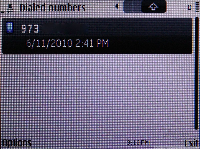
The calling software of S60 hasn't changed much over the years. Pressing the send key will bring up a list of recent calls. Tabs run across the top of the call log to let you know if you're looking at a list of all calls, missed calls, received calls, etc. Pressing sideways on the D-pad will move through each different tab, letting you see the different call lists. Highlight a number in the call log and select it to call.
During a call, the menu key offers a wide array of options, such as sending an MMS, turning on the speakerphone, etc. Nokia phones are so good at getting this basic function of telephony right, it is hard to find anything wrong with it.
Contacts
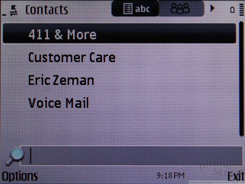
The E73 holds 1000 contacts, and can be stuffed with all the information you might need to store. Out of the box, it has but two phone number fields and one email field per entry, but there's an "add detail" function that lets you add as many additional phone numbers, email addresses, etc., as you wish.
Adding contacts can bit a bit frustrating. Most U.S. consumers probably haven't heard of Nokia's Ovi Mail or Ovi Contacts services. In fact, neither is preinstalled or even referred to on the E73 itself. Instead, the only way I was able to sync my Gmail contacts was to set up Gmail as an Exchange account. This is a pain in the butt, and requires following instructions on Google's help pages to figure out. It's just not easy enough.
Alternately, Windows users can take advantage of Nokia's desktop syncing software to load up their device.
The one goofy thing with S60 is there are a million clicks required to do anything. It feels like every other action has a drop-down menu associated with it, asking you to make addition choices. It gets old after a while. The contacts app is one place where this just has to become a matter of muscle memory. There are so many options, buttons, tabs, drop-downs and selections that it can be overwhelming. The learning curve may be steeper than on other platforms, but S60 has plenty of flexibility.
Messaging
The messaging story has improved dramatically of late for S60. On the E71, for example, no matter how I tried, I couldn't properly configure the device to receive Gmail. On the E73, all I needed was my username and password. Thank goodness for this improvement. The S60 supports POP3/IMAP4 and Exchange. The email client is better than it used to be, though it is still leagues behind what RIM, Apple and Google offer. It supports basic plain text email messages. If an HTML email happens to land in your inbox, you can choose to view it. I'd advise against it. It just takes forever and isn't worth the wait for what ends up being just a prettier version of the email. The email program in general I found to be a bit sluggish — much more so, in fact, than any other program on the phone. For a device that is aimed at business users, this is a curious foible.
On the SMS side of the equation, Nokia has done little to match the competition. The SMS/MMS interface is uninspiring and drab. You don't get true threaded messaging, either. You can choose to view SMS messages "By Sender" but this is not real threaded messaging in the conversational style that we've become accustomed to. Instead, it lumps all the messages from one sender all together in a row. SMS/MMS is one area where Nokia needs to make some major revisions quick.
Notifications for all messages are delivered to the bottom of the home screen. You can easily see a list of missed calls, unread emails and unread SMS/MMS messages.
Social Networking
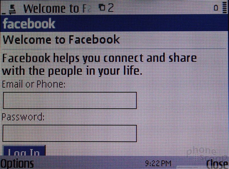
The E73 attempts to fool you into thinking that there are Twitter, Facebook, and MySpace apps on board. Instead, the E73 offers only links to the mobile web versions of each of these three services. That's not cool. The mobile web version of Facebook that is rendered on the E73's browser is actually fairly decent, but it doesn't compare to stand-alone apps such as those created for the iPhone or Android.
There are alternatives, but you have to know about them. Some of the native Twitter apps worth looking at include Gravity, Twittix, TweetS60, and Fring. These get the job done, each with its own sense of style.
Social networking is another area where S60 falls flat compared to many alternate platforms.
Extras
Music
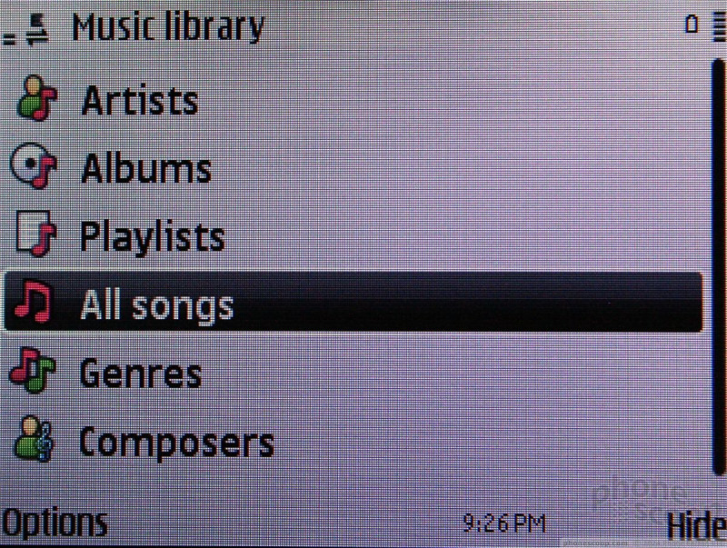
The E73 is not a multimedia phone, but that doesn't stop it from being a pretty good music player. You can add a shortcut for the music player to the dock on the home page. Opening it up brings you to the music player's main menu. This menu lists the artists, playlists, songs, albums, etc. Using the options menu (left soft key), you can access some options from here, which include some organizational tasks such as creating playlists or moving music around.
When music is playing, the options menu lets you access the shuffle or repeat functions, as well as the EQ. There are five pre-set EQs, but the E73 also allows you to add what appears to be an unlimited number of your own presets with an eight-band EQ (8!!!). This is more functionality than many dedicated music phones have. I was able to dial in the exact type of sound I wanted, and let the new Soulfly CD crush my ears for a while as I wrote this review.
The rest of the controls work as expected, and the D-pad is your main controller for playing, pausing, rewinding or advancing your music. Be careful, though. The optical trackpad inside the D-pad duplicates the action of the D-pad itself. This can cause some minor annoyances, such as skipping past the actual button you want to use and hitting something else. If you exit out of the music player, the E73 adds a shortcut to the phone's home screen so you can quickly pause a track if need be. You can also set tracks stored on the phone as your ringtones if so desired.
Incoming calls pause music, which resumes after the call is complete.
The E73 also has an FM radio. This worked flawlessly. I was able to find my favorite local radio stations with ease, and sound quality was decent.
Thank goodness Nokia is using 3.5mm headset jacks on more of its phones now.
Camera
Camera
The E73 has a 5 megapixel camera with flash and autofocus. The net result? Better than average photos.
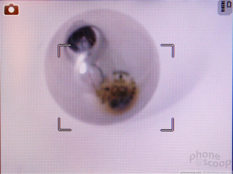
The camera software itself is not changed from other Nokia phones. The menus and usability factor are about the same. The camera comes to life in about one second. Pressing the D-pad up or down will zoom in or out, even if you have the camera set to its highest resolution. Rather than using the optics to zoom in, however, the E73 uses digital zoom, which will result in fuzzier images the more you zoom in.
Pressing the D-pad to the left (or either soft key) will bring up the dock that houses all the camera's functions. There are tons of features in the dock. You can set the flash, the resolution, scene modes, a timer, white balance and exposure. The left soft key opens up another menu for more fully adjusting the camera's settings.
Pressing the center of the D-pad lightly will focus the picture. Focusing takes about 1 second. Press the D-pad all the way in to snap the picture. Pictures are taken in just a fraction of a second after pressing the shutter button, even if the camera needs to fire the flash. Once a picture is taken, you get to review it before going back to the viewfinder. It takes about 2 seconds for the E73 to process and present the image for review. Only then can you return to the camera to capture another image. It's a bit slow. I would prefer it if the camera behaved faster.
The E73's camera software is above par, but that doesn't mean we wouldn't like to see it refreshed and easier to use. Just sayin'.
Gallery
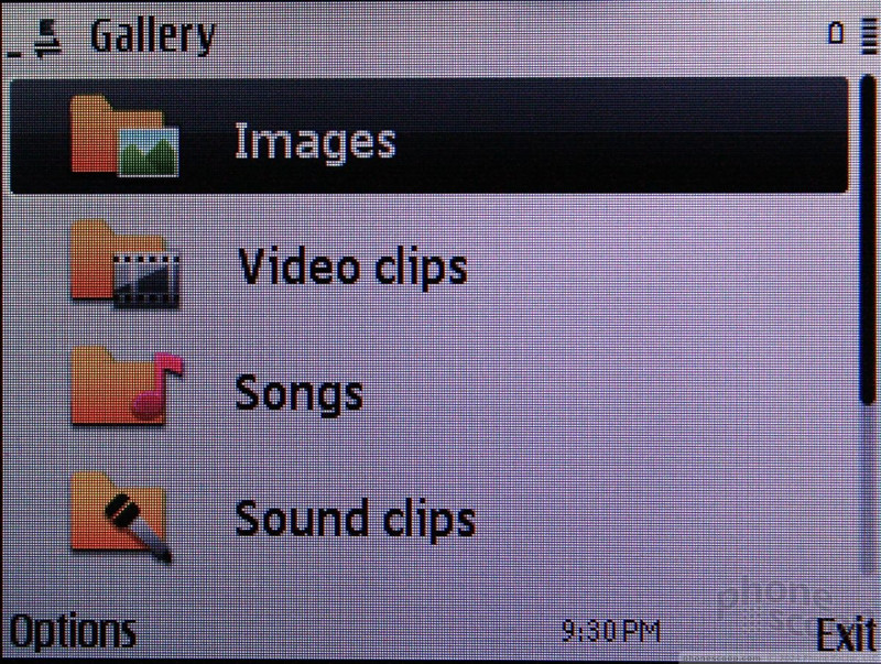
The E73 presents pictures in a carousel view, meaning you can see the pictures before and after the central image in a 3D-style arrangement. You can scroll down through your images quickly with little to no lag.
Using the left soft key, you can get at the menu system for the gallery, which lets you rename, move and sort photos at will. You can perform all the same actions with an image open, as well as easily set it to your wallpaper.
Photos/Video
Photos
The E73 takes very good photos. They aren't going to land your images in The Louvre, but you'll happily share them with family and friends. Focus was relatively sharp, even when the autofocus wasn't used. Color representation was accurate, images were free of grain and noise, and the E73's response to white balance was more accurate than most phones I've tested in recent memory. Every now and then, the flash would go off when I didn't want (or expect) it to and mess things up, but it worked more often than not.
Video
I was pleased with the quality of the video I captured with the E73. It's not HD, but it wasn't wavy, grainy or dull, either. Every once in a while it would struggle to adjust to drastic changes in light, but most of the time it recovered quickly.
Browse/Customize
Browser
The E73 comes with Nokia's S60 Browser, which is highly capable and does a pretty good job of rendering html web pages.
The S60 browser performed admirably even with EDGE coverage. Using T-Mobile's 3G or Wi-Fi networks to browse the web simply makes it all the faster. The browser offers lots of rich features, including the minimap to let you see an overview of each page you are browsing. The "back" feature also lets you see multiple web pages by giving you a preview of the last pages visited so you can choose the exact page to which you wish to navigate. It sort of mimics having multiple tabs open.
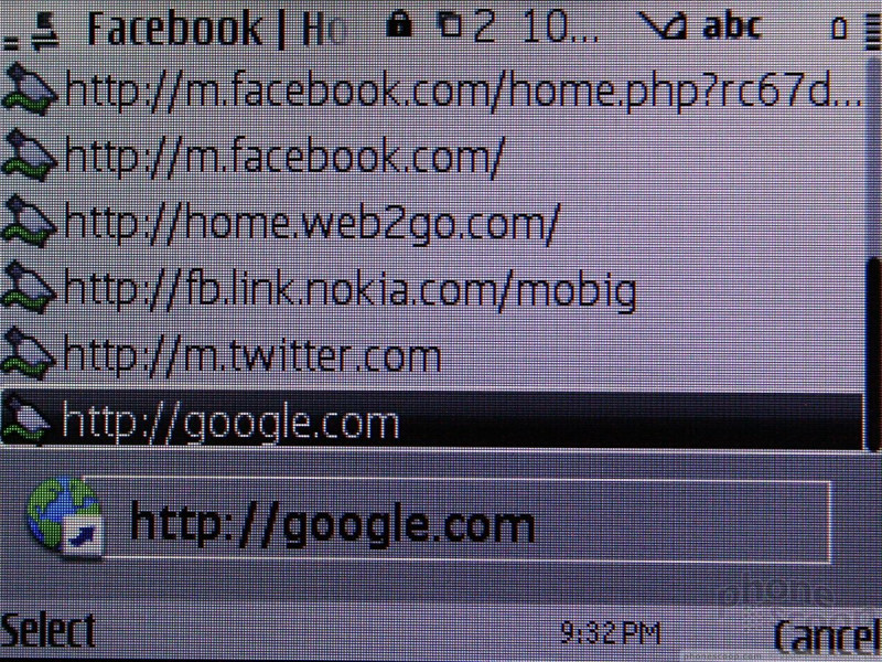
My biggest complaint with the browser is the clunky menus and software. It just gets too cluttered too fast with options, selections and text. Nokia needs to refresh the browser with simpler, easier-to-understand controls. One thing that definitely needs to be improved: the URL address bar. It is too easy to type a partial URL and then accidentally send the browser off to find it before you're finished typing.
Customize
S60 can be customized to such a large degree that we don't even know where to start. Just about every screen, menu, level, setting or option imaginable can be altered to better suit users' tastes.
The home screen can be viewed with nothing on it but wallpaper or with the application dock and today screen. The main menu can be set to grid or list views, depending on your preferences. Ringtones are fully customizable for each contact, and can be set to music files that are on the phone. Wallpapers are easily set from the gallery application.
The ability to move applications and folders to other places on the phone is extremely helpful.
Navigation
The E73 presents so many different options when it comes to navigation, it could get confusing. Nokia's new Ovi Maps and TeleNav's navigation services are both preloaded. Users can also choose to download Google Maps on their own if they wish. Since there are already two navigation options on board, I skipped Google Maps and stuck with what was there.
Ovi Maps was made free by Nokia early this year, and since then it has already seen one major revision. I tested it in three different states (NY, NJ, and PA). It worked really well in all three areas. In NYC, I was able to get walking directions between points A and B with no problem. The software didn't necessarily know about short cuts and other things a native New Yorker might, but a tourist would be more than pleased with what Ovi Maps offers.
As far as driving directions are concerned, Ovi Maps took me from my house in NJ to my brother's house in PA without a hitch. The spoken directions were loud and clear, and I was able to do things such as save favorite locations and check for points of interest. I wouldn't say that Ovi Maps is better or worse than any of the other navigation software I've used, but it is easy to figure out, gets the directions right, and never got me lost.
I also put TeleNav's services to the test. I've used TeleNav many times before. You can tell that TeleNav is a dedicated navigation company. Its user interface is more streamlined and easier to use when driving, and returned perfect driving directions. The one caveat, of course, is that using the TeleNav service requires an extra monthly fee.
Is TeleNav with the extra money, or should you just stick with Ovi Maps? Well, I found Ovi Maps to be better in large cities, especially for providing walking and mass transit directions. TeleNav does better in the car, if only because its user interface is a little bit easier to interact with when driving. If you walk more than drive, stick with the free Ovi Maps. If you drive more than walk, perhaps try TeleNav out for a month or two to see if it works for you.
Extras
Apps
Because the E73 uses S60, literally thousands of applications are available from third-party vendors, many for free. The E73 has built-in access to Nokia's Ovi Store, which is a decent starting place to find applications. It isn't as easy to browse as the iPhone App Store, the Android Market or BlackBerry App World, but it serves well enough. Probably the biggest improvement here is that T-Mobile is allowing users to purchase applications from the Nokia Ovi Store and charge them to their T-Mobile account. That's a major hurdle cleared for Nokia, which used to require credit cards for app purchases.
Bluetooth
The E73 communicated via Bluetooth with every device I tested. That included two different computers, two pairs of Bluetooth headsets, stereo headsets, and an external stereo speaker. All the pairings and connections were easily accomplished and managed. Passing files from the phone to a computer and back was easy. Sound quality via Bluetooth headsets — both standard and stereo — was stellar.
Clock
The home screen clock can be set to analog or digital. The analog clock can be a little tough to read from an arm's length, however. If you want to check the time quickly, the E73 is not going to help you out. With the display asleep, hitting any of the keys doesn't bring the screen to life. You have to unlock the keyboard first, which takes two steps. Alternately, you can press any key and wait for the unlock message to go away. It takes several seconds. After it goes away, you can get a look at the clock.
Wrap-Up
The E73 is the third version of an aging platform. Was the third time the charm for Nokia? Well, I'll say the E73 is charming, but it still misses the market in a few places.
The basic functions — phone, signal performance and battery life — score well. Nokia nearly always gets these right, and if you need a phone more than a PDA, the E73 serves well. The downside is the E73 has a smaller screen than the competition, and it doesn't look nearly as good with its lower resolution.
The S60 operating system is as robust as ever, but some might call it dense. It takes a while to figure out how it all works, and almost offers too many options. Still, it can run powerful software and still has plenty of support from developers (i.e., it will always have access to apps).
The music player is as good as any I've used on a Nokia phone, and the camera — while a bit sluggish — takes good photos.
The S60 browser used to be leading edge, but others have far outstripped it. Nokia needs to improve its browser software. Another area where the E73 falls a bit flat is with messaging and social networking. While Nokia has definitely made improvements, they don't go far enough.
Who would I recommend this phone to? A very small set of people. Since it is one of the few S60 phones available from a U.S. carrier, I'd say Nokia and T-Mobile fans have a near home-run with this device. On the other hand, social networking and browser junkies will be disappointed by the limitations of S60.
Bottom line: If you love S60 and you are a T-Mobile subscriber looking for a QWERTY device, this is the handset for you. Otherwise, you might want to look at the wide array of BlackBerries available from T-Mobile.
Comments
Happy I Got This
the only thing I don't like is the twitter apps, they're not bad but I'm used to the amazing blackberry/android apps
Very nice review...
(continues)




















 Video Tour: Nokia E72
 Summer 2009
 Nokia Launches E73 with T-Mobile
 Nokia E72 Now Available In the U.S. for $470
 iPhone 15 Series Goes All-In on USB-C and Dynamic Island
 Nokia E73 Mode / E72


