Hands-On: Nokia N8
Jun 14, 2010, 2:27 PM by Eric M. Zeman
Nokia recently let Phone Scoop spend a few moments playing with the N8, the company's first Symbian^3 device. The N8 claims to be a multimedia master. Does it deserve the pedestal Nokia is preparing for it?
Nokia was kind enough to brief Phone Scoop on its upcoming N8 device. The N8 will be the first Symbian^3 device, which is the latest version of the Symbian platform to reach the market. Nokia is pitching the N8 as a multimedia monster, and indeed, spent 50% of the briefing showing off the HD movie and 5.1 Dolby Digital surround sound capabilities of the N8. Impressive? Possibly.
Hardware
The N8 is a non-distinct bar-style touch phone. It is about the length and width of an iPhone or Motorola Droid, but is a lot thicker from front to back. This is due mostly to the 12 megapixel camera module with flash that protrudes from the back of the phone.
Nokia was sure to tell us over and over that both the hardware and software are in the prototype stage, and asked that we forgive any quality issues. The N8 feels a little bit plastic-y and cheap in the hand. It is light weight, and should fit into a pocket with no problem, but I am worried about build quality. The N8 is going to be first Symbian^3 handset to market, and will instantly become Nokia's flagship media device. Given Nokia's market position the last few quarters, it can't mess this one up. The seams were loose and creaky, and it just didin't feel "tight." Perhaps these prototype units have been around the block a few times.
The screen looks good. It measures 640 x 360 pixels, and is sharp and bright. It easily outstrips the display on the N97/N97 Mini and N900, but doesn't quite match what some HTC and Samsung handsets are offering. Still, it's one of the best displays I've seen on a Nokia device.
There is but one physical control button on the front of the device, and it takes you to the home screen. It was responsive and easy enough to find. The rest of the controls are all found along the sides. The left houses the microSD and charge ports. The right has the dedicated camera key, sliding lock switch and volume toggle. All of these controls worked well, and had good travel and feedback.
The camera module really is obnoxious. I can't give you measurements, but it sticks out a lot from the back surface of the phone. And the seams aren't smooth at all. In fact, they are a little bit on the sharp side. I can see the module catching on clothing and tugging at fabric. There is no lens cover.
Interestingly, the N8 has penta-band 3G radios. It supports 850/900/1700/1900/2100 WCDMA. Nokia assured us that the N8 will be compatible with both T-Mobile and AT&T's 3G networks, in addition to the 3G networks in Japan and Europe.
In all, the hardware isn't bad, but in its current state, its something I'd expect from Kyocera (no offense, Kyo!). It's not up to the usual Nokia snuff. Let's hope the final product puts my fears to rest.
Symbian^3
The N8 will be the first Symbian^3 handset to reach the market. Just what the heck is Symbian^3? It is the natural evolution of S60 5th Edition (which is now referred to as Symbian^2). In other words, it is S60 optimized for touch devices.
More so than the hardware, Symbian^3 is what worries me most. The user interface did appear to perform well, and I didn't see any lags, hiccups or crashes (which were all too common on the N97).
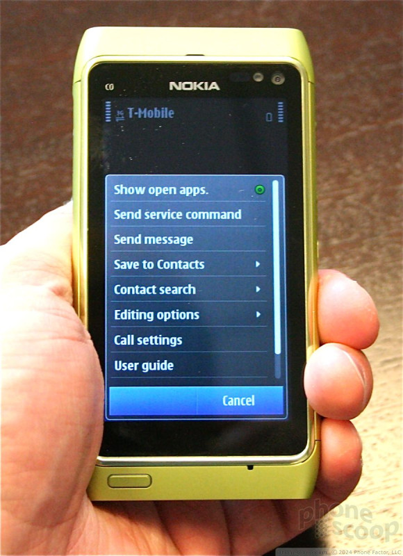
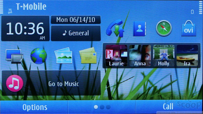
From an appearance perspective, Symbian^3 looks no different from what users have seen on the N97, N97 Mini, Nuron or XpressMusic touch handsets. Fonts, icons, graphics, and the general menu and layout look identical. The underlying code has been optimized, but that's not apparent to the end user at all.
There are three home screens that can all be customized with applications and widgets. The widgets are fairly robust, and worked smoothly. The contacts application has been updated a little bit, and it is easier to see what contacts are doing on Facebook and Twitter, but the messaging software and email software looks identical to the current versions of S60. These are pieces of software that desperately need to be overhauled, if not completely scrapped.
Nokia pointed out that it has adopted (stolen?) Apple's "CoverFlow" concept for sorting through the media library. Nokia even referred to it as CoverFlow. I have to wonder if Apple's legal department knows about this. It worked fast, and the library flowed through album covers swiftly and smoothly.
Nokia also showed us the improved media applications, photo gallery, video recording/editing, and the camera. The applications feel and behave like S60 apps, though offer richer experiences. Swiping through photos is more fluid, the editing tools are richer, and the slide show software is impressive. The HDMI-out feature is definitely neat, and Nokia is going to package the N8 with an HDMI adapter. It will be up to users, however, to find and load HD content worth streaming through the HDMI cable to an HDTV.
Nokia was not able to show us a working version of the browser, so we can't comment on that. The Facebook widget looked the same as the one that's on the N97.
Obviously, given the prototype nature of the handsets we saw today, we can't make any final judgments or offer any final opinions. This was a first look. Nokia said we'll be able to provide an full review when the devices become available later this year. Hopefully Nokia will tighten things up between now and then.
Nokia said that the N8 will be available to U.S. buyers "through the normal sales channels that they are used to for Nseries devices." That means you're going to have to order it from the web.
Comments
so!!!?????
Sad attempt
Many S60 phones run on slower...
(continues)
raulr said:...
I said it on the phone specs discussion board, but this is SO underpowered to be a flagship device. Also looks like they they didn't really work that hard at doing anything innovative on Symbian 3. Not looking good fo
(continues)
Plasticky???






 Review: Nokia N8
 Hands On with the moto g stylus 5G (2023)
 Hands On with the Motorola razr and razr+ (2024)
 Hands On with the Boost Summit 5G
 Nokia N8-00
