First Look: Motorola Droid X
Jun 23, 2010, 2:51 PM by Eric M. Zeman
Phone Scoop goes hands-on with the new Motorola Droid X. Based on our first impressions, it is the finest handset Motorola has ever produced. Verizon has a winner on its hands. Full review coming soon!
Motorola and Verizon Wireless unveiled the Droid X today at an event in New York City. Here is a small taste of what the Droid X is like. We're going to provide a full review of the device as soon as we can.
It's big. Like, HTC HD2 / EVO 4G big. The 4.3-inch display, which looks amazing by the way, pretty much requires a large footprint. Some may think it is too big, others just right. The massive display is bright, sharp, and gathers finger oil grime with ease. HD video content looks good on it.
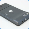
The Droid X is very thin. Aside from the goofy-looking camera bulge, it is thinner than an iPhone 3GS (based on side-by-side comparison). It is dense, but lighter than you'd expect it to be. It feels great in the hand. The quality of the materials is spot on. It feels well designed and well manufactured, with a good mixture of glass, metal, and plastics.
The four usual Android buttons are situated below the screen. They feel good and have excellent travel and feedback. I am glad the capacitive buttons from the original Droid are gone.
The Droid X has a 1GHz processor. Even so it felt a tiny bit slow, or hesitant. Verizon warned us that the review units we have a pre-final software, so we should expect some bugs. This hesitancy of the UI is probably because of the pre-final software.
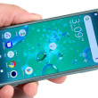
There are seven home screens, which can fit gobs of user content, apps, widgets, shortcuts and so on. Motorola and Verizon have pre-loaded pretty much every screen with at least a few apps and widgets. One thing that's awesome: the widgets can be resized. They aren't locked into one size. You can crop and resize them at will.
The Droid X runs Android 2.1, but Motorola has taken some of the elements of its Motoblur software and incorporated them into the user interface. It is not nearly as in-your-face as Motoblur itself is. Rather, it adds nice elements to the user interface here and there, such as the social networking apps.
My favorite new feature is the visual bookmarks Motorola is now using in the Android browser. Similar to Apple's CoverFlow, you can scan through your browsing history and bookmarks and float past 3D images of your favorite sites. Very cool.
Based on the few moments we've spent with the Droid X, it is a sure-fire winner. Verizon Wireless and Motorola are going to sell bazillions of these things. It impresses all the way around. We can safely say that Motorola knocked it out of the park.
Comments
Why does this phone look so so so familiar... ?
you're going to have to try a LOT harder than that.
errr....
"[The massive display is bright, sharp], and gathers finger oil grime with ease."
p.s. i liked how the phone looks too to be honest(definetely a lot better than the 1st one)..though i would agree with blue that the very minute details arent really classy..but i guess the features would make it look good in the eyes of the fans, i still remember back when the first droid was announced everyone here saying something about the phone being ugly, keypad and all..only menno(was it him?i remember one person atleast saying something about him liking the gold key) liked the gold key, but now everybody seems to li...
(continues)
camera quality? any good?
The Inspiration of the Droid X's design
http://img.phonescoop.com/img/a/p/25572_605.jpg »
Loving that seamless integration of the charging/HDMI ports. How elegant!
http://img.phonescoop.com/img/a/p/25574_605.jpg »
Those side buttons were clearly inspired by the best: An old LG Slider. They couldn't quite pull it off but oh well, LG has really high standards!
http://img.phonescoop.com/img/a/p/25571_605.jpg »
Now the front of the device was truly inspired. http://4.bp.blogspot.com/_bQ0SqifjNcg/StP8hXu hOZI/AAAAAAAAExk/l7E4MIDWvvQ/s400/madonna-gap -teeth.jpg
🤣
1: At least you can find these ports.
2: I don't see a problem with that.
3: ...no comment
It feels well designed and well manufactured
I've held and used it, too, and I agree with Eric. It feels well-designed and well...
(continues)
Jeebus
I don't like it. I'm not so much for the movie on phone guy anyways. I would think though the web browsing will be the best of all. Thats a crazy looking phone lol. I'm sure people would love it. I wish I had the money to get if for my little brother, he would love it.
Too many capabilities for me to ever take advantage of. I wish I didn't work so much. Oh well. I can't wait to see this phone in person. 😎


 Review: Motorola's Droid X
 Verizon Wireless and Motorola Launch Droid X
 Motorola Droid X


