Review: Samsung Captivate
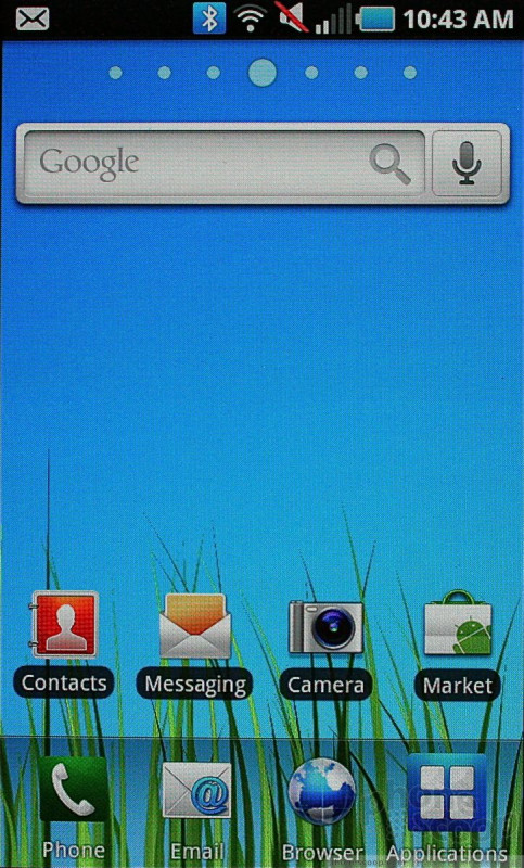
The Captivate, like all its Galaxy S brothers, runs TouchWiz 3.0 on top of Android 2.1. TouchWiz 3.0 is leagues better than 2.0 was, but I still find it pointless and somewhat annoying.
First problem? The home screen. There are seven of them, each customizable, but only to a degree. Along the bottom of all seven home screens are four permanent app icons. They are Phone, Email, Browser, Main Menu. These four icons can only be changed when the main menu itself is set to "customizable." It's awkward and difficult to find. Adjusting these apps should be much easier.
Beyond that, the main menu looks different when compared to other Android handsets. Rather than a long, vertical menu, it is split into pages. Each menu page holds 16 apps (plus the four permanent icons). There are three such menu pages when you get the Captivate out of the box. The number of pages will grow as you add more apps. You swipe from side to side to access the different pages.
The main menu can be viewed in an alphabetical grid (stock), a customizable grid, or in an alphabetical list. The list is pointless to use, if you ask me, because the icons are so huge and the number of applications so vast that you'll scroll forever to find what you want. The customizable grid at least allows you to put apps where you want to. The process is identical to the way apps are rearranged in iOS. Copy much, Samsung?
My last complaint is that the icons in the main menu are all placed on dippy-looking colored tiles that look exactly like iPhone apps. The effect is this rainbow-smattered menu that is just too happy and cheerful for my tastes.
Samsung has also added some action tools to the drop-down notification shade. When you pull the shade down, you'll see controls to turn Wi-Fi and Bluetooth on/off, and set the Captivate to silent or vibrate. It's nice that Samsung buried them in the drop-down notification shade rather than take up screen real estate with them.
The rest of the menus for the settings and individual applications are exactly as on any other Android 2.1 device.
Performance (read: speed) is impressive all around. All applications open in an instant, and respond immediately to controls. The 1GHz "Hummingbird" processor that Samsung created for the Galaxy S line does a good job of giving the Captivate the oomph it needs.


 Hands-On with Samsung's Galaxy S Phones for the US
 AT&T Captivated by Samsung Galaxy S, Launching This Summer
 Samsung Captivate (Galaxy S)


