Review: Sharp FX
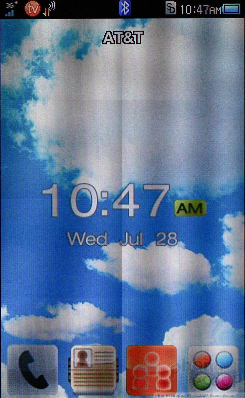
The Sharp FX uses a proprietary touch menu. The home screen is tricky to get used to. It has four permanent icons at the bottom for the phone, main menu, contacts and the iSkoot Social Net application. Many touch phones on the market allow users to swipe between home screens to get at more content. The FX is different.
Similar to the way d-pads can be customized to launch certain applications, the FX's home screen will launch apps when swiped in certain directions. For example, swipe up to launch the Social Net app, or to the left to launch the browser. It's a neat idea, but for regular users of touch phones, it is maddening. Rather than take you to a new menu screen, accidental swipes launch slow-loading applications that you are then forced to quit. It's something you might get used to over time, except....
The main menu is laid out in grid fashion. There are three main menu pages, and these you really do swipe left and right to access. This inconsistency with respect to the home screen can make for a confused user.
The settings menu lets you make some adjustments to the phone's behavior (placement of the clock, for example), but you're mostly stuck with what you get out of the box.
The Back/Menu key will bring up a task switcher when pressed and held. This lets you jump quickly to one of six other apps. What stinks is these are pre-defined by Sharp and/or AT&T, so you can't add your own to the list of fast-access apps.
The one thing I'll say in the FX's favor is that there are almost no folders. Nearly all the apps are laid out in the main menu. This means you don't have to dig too far to find stuff, and that helps speed up performing some tasks on the device. The exceptions are the MyStuff (user photos, videos, ringtones and wallpapers), Apps, and Games folders, each of which is explanatory enough.
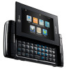
The home screen menu changes when the phone is opened. It prioritizes apps that require use of the keyboard and offers shortcuts to the Email, SMS, IM, and Social Net apps, for example. If you want to get at apps other than messaging services, you have to choose the "More" option, which takes you to an annoying list of applications and tools rather than the nice grid that's available when the FX is closed.


 AT&T Adds Sharp FX to Quick Messaging Phone Lineup
 Hands On with JLab's $30 ANC Earbuds
 Hands On with Anker's Largest "Pocket Size" Power Bank
 Fairphone 5 Goes Higher-End
 Apple Intelligence Promises Personalized AI, Requires iPhone 15 Pro
 Sharp FX


