Review: BlackBerry 9800 Torch
The 9800 Torch is the first handset to run BlackBerry OS 6, RIM's newest mobile operating system. RIM wasn't kidding when it pitched the OS as "fresh but familiar." There are tweaks aplenty, but schooled BlackBerry users will feel right at home using BlackBerry 6.
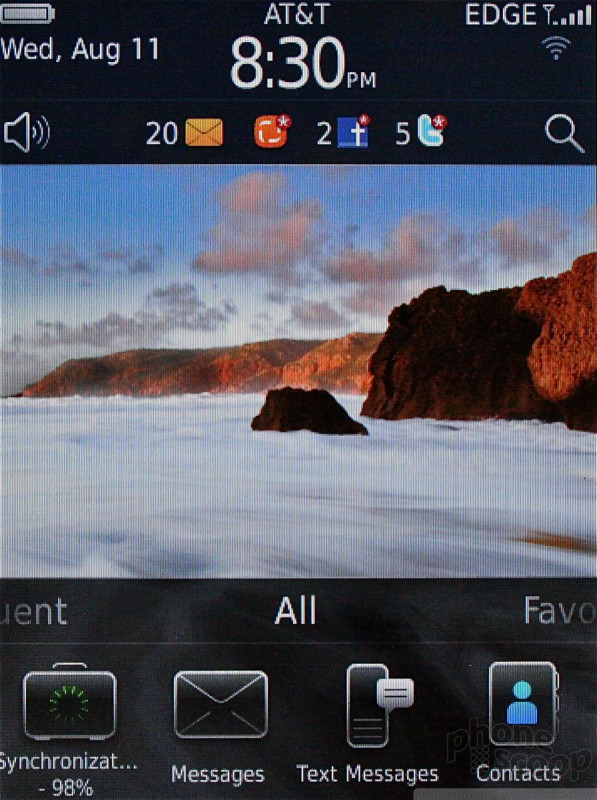
The biggest changes have been applied to the new home screen. It offers far more features and tools than it did before. From top to bottom, the basic home screen has the status bar, the notification bar, main screen/wallpaper, and the app tray with four visible apps.
The notification bar acts similar to the drop-down notification shade in Android. Tapping it lets users quickly get a look at all the unread messages they may have received. This includes email, SMS, MMS, BBM, Twitter replies/DMs, and Facebook notifications. You can see the first handful of each message type, and view info such as the sender and subject. Need to see who just sent an email? Now you can see the email without actually opening the email application. That saves time when the emails (or other notifications) happen to be unimportant. Want to hide all the notifications? Tap the bar again and it goes away. If you do want to read a message, select it and the notification app will open the message in whichever messaging service it belongs to. Perhaps my only complaint about the notification bar is that it is only accessible from the home page. It won't open when using other applications. That seems a silly limitation to me.
The app tray is where users will really be able to customize BlackBerry OS 6 handsets. Rather than a boring grid of apps and folders, the tray offers five different user-configurable home screens / menus. The first (and default) screen lists all the apps. The second lists those used most frequently. The third shows all downloads. The fourth is reserved for media. And the fifth is for user-chosen favorites.
When the app tray is either closed or open, users can swipe sideways between these five different home screens. When the tray is closed, only the top four apps, widgets or shortcuts are visible on each screen. It's neat that you can slide sideways even with the tray closed to see those other apps.
One of the biggest new features introduced by BB6 is the Universal Search tool. It is best used to parse for correspondence with a particular contact. For example, I type "R-I-C-H" and the Universal Search pulls up all the contacts in my database going by the name Rich. I press on Rich Brome's contact card, and I see all his contact info, as well as all the recent phone calls (Rich, why don't you ever call me???), recent emails, IMs, BBMs, Twitter replies and Facebook messages. Very useful. If you're not looking for a contact, it will also help find media (pictures, video, music), applications, and other data stored on the phone. If what you're looking for isn't on the phone, it offers web-based tools (YouTube, Yelp, Yellow Pages, etc.) to continue searching.
Other notable changes include press-and-hold gestures to open secondary menus in some applications. For example, in the contact application, the press-and-hold gesture conjures up the options menu, offering shortcuts to calling, texting, emailing, editing the contact and other actions. Use press-and-hold on the home screen, however, and the options will include moving, opening, deleting, or hiding the selected app, among other actions. Pressing the ever-present BlackBerry key offers many of the same tools, and works as it does on older versions of BlackBerry OS.
The menu system used to access the Torch's settings has also been overhauled. Rather than a simple (and deadly boring) list, the settings tools have been lumped into fewer groups that are easier to understand. For example, the Display setting lets users adjust the date and time, theme, font, back lighting, message coloration, and more. On older BBOS versions, many of those were placed in separate folders, which required further drilling down.
In all, the new home screen user interface is a definite step up from older BlackBerry operating systems. It has more tools, and tighter integration between apps and services, and is easier to figure out, to boot.


 AT&T and RIM Announce 4G BlackBerry Lineup
 BlackBerry Torch Web Site Reveals New Slider
 BlackBerry Torch 9800


