Review: Motorola Droid 2
Aug 16, 2010, 8:18 PM by Philip Berne
The Motorola Droid 2 succeeds the hot-selling Droid with an improved keyboard and a smoother design. Is this still the phone that should carry Verizon's Android flag?
Form
Is It Your Type?
Is It Your Type?
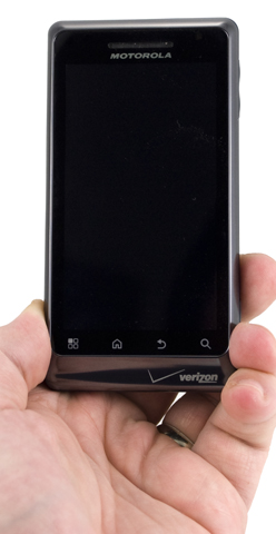
The Motorola Droid 2 doesn't update much from the original Motorola Droid, but the small tweaks and additions add up to a significantly new experience. Motorola's new MotoBLUR features are a nice addition to Android, but this phone has always been about trade-offs, balancing a smartphone made for enthusiasts with its mass market, action hero appeal. Is the Droid 2 still Verizon's flagship smartphone, or has it been surpassed by so many competitors?
Body
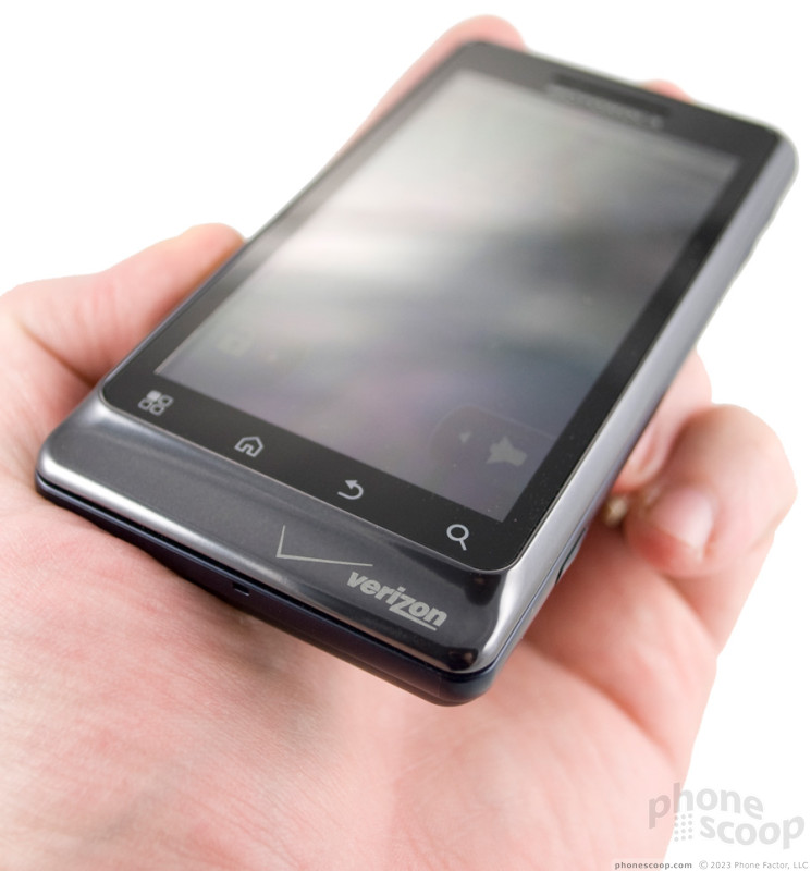
I'm not a fan of the overall look and feel of the Motorola Droid 2. I didn't like the form of the original, and the new model isn't improved enough for me to come around. At least the original Droid could be excused as aggressively masculine, but after adding just a hint of color and rounding out some of the edges, I now find the phone even less appealing. I've heard from other users who appreciate the design, I'm just not one of them.
The Droid 2 is almost the exact same size and weight as the original. It's big and heavy with defined edges, so it won't be comfortable in a pair of jeans.
I did not care for the buttons, either. The volume rocker, on right side, was almost completely flush with the phone. It was difficult to find without looking, and difficult to jack the volume up or down in a hurry. The screen lock / power key up top is likewise flushed. It was so difficult to press that I found myself opening and closing the keyboard to unlock the screen, since that move was more convenient than an expedition to find the Lost Lock Key. There's an open microUSB port on the left side that gapes like a small flesh wound. On the bottom right is a camera key, the best button of the bunch. It's a two-stage key, so you can easily focus first then shoot your picture. Up top, near the power key, is a 3.5mm headphone jack.
The slide mechanism on the Motorola Droid 2 is very stiff, like it was on the original Droid. It does not spring open with a snap. It requires some pressure, and it feels too tight. It was also troubling that the slide loosened considerably during my test run, to the point that it was comfortable after a few days of continual use.
Once the slide is open, though, you get access to Motorola's great keyboard. It wasn't as springy as some other keyboards I've preferred - like the keys on the HTC Touch Pro2 - but it's still among the best on any smartphone today. The keys are large and roomy, but more importantly, they are aligned perfectly, exactly like your desktop keys. So, the M key falls under the J and K, instead of being pushed off to one side or the other. The balanced, symmetrical layout helped my typing considerably, and I could type without looking after a few days' practice.
Besides the full QWERTY alphabet, the keyboard also gets some nice shortcuts. There's an inverted-T arrow layout. The Droid 2 lacks a trackball or optical joystick, so this is the best way to fine tune your text. There's nothing fancy like a “.com” key, though “@” and “/” get their own keys for easier Web work. There's an Alt button and an Alt Lock button, a weird choice. There is also a key for search, a standard Android key, and a key for Voice Search. That Voice Search key is a nice addition, since the Droid 2 is the first Android phone to launch with Google's new Voice Actions software. Too bad that key is hidden under the screen; it would be even more useful with the keyboard closed.
The Three S's
Screen
The screen on the Motorola Droid 2 is unchanged from the original, and that's a very good thing. With 854 by 480 pixels, it's among the highest-resolution screens on the market. Text and graphics look fantastically sharp, and the difference is instantly noticeable going from a lower-res, HVGA screen with 480 by 320 pixels, for instance, to the Droid 2. The LCD display, which uses IPS technology similar to the new iPhone 4, is not quite as bright as some OLED screens I have on hand, but it performed much better than those screens outdoors in bright sunlight.
Sound
Sound quality on the Motorola Droid 2 was excellent all around. Call quality was great. My callers sounded crisp and clean through the Droid 2's earpiece. Volume was solidly loud enough for all conditions. On their end, my callers also said I sounded decent, better than with most cell phones. The speakerphone is also plenty loud and clear enough to crank the volume all the way up. That speaker makes for blaring ringtones, which is how I like them. Some of the available ringtones milk the robotic “Droid” advertising sound, and I wish there were some more mellow tunes in the lot, but they were audible and original, nonetheless. With the sound turned off, the vibrate feature was adequate, but I'm always looking for even stronger vibrating alerts.
Signal
Signal issues were a disappointment in a few ways on the Motorola Droid 2. First, just surfing Verizon Wireless' EV-DO Rev. A network, I was disappointed with the signal strength. The Droid 2 show often showed a couple bars lower coverage than other Verizon phones I have on hand. In the PhoneScoop West Vault (a local movie theater with horrible signal), the Droid 2 chugged along on Verizon's 1xRTT network, but couldn't catch the faster 3G signal I craved.
Thankfully, this didn't hurt performance much, but it did make a slight difference. When reception was weak, or dropped to the 1x network, calls could have some digital chopping, but this usually didn't last more than a minute or so. Even so, all of my calls went through and the phone didn't seem to miss any incoming calls, either.
Second, I had trouble with Wi-Fi, as well. The phone uses 802.11n for WLAN networks, so it should be fast and receptive. Instead, the Droid 2 had trouble finding my home router, an Apple Airport. Once it did find my hotspot, the Droid 2 was never able to connect properly, even though other devices, like the original Moto Droid, have no problem. I was able to connect to some open networks, like the network at my local Starbucks, with no trouble.
In researching specs for the phone, PhoneScoop discovered that the Droid 2 uses the exact same FCC ID as the original Droid. We got in touch with the FCC for an explanation, and they said this means that, in terms of radio hardware and any significant internal components that would affect radio transmissions, the two phones are identical. There are a few obvious changes, like the faster processor and the improved keyboard, but otherwise the two phones are fraternal twins.
Battery
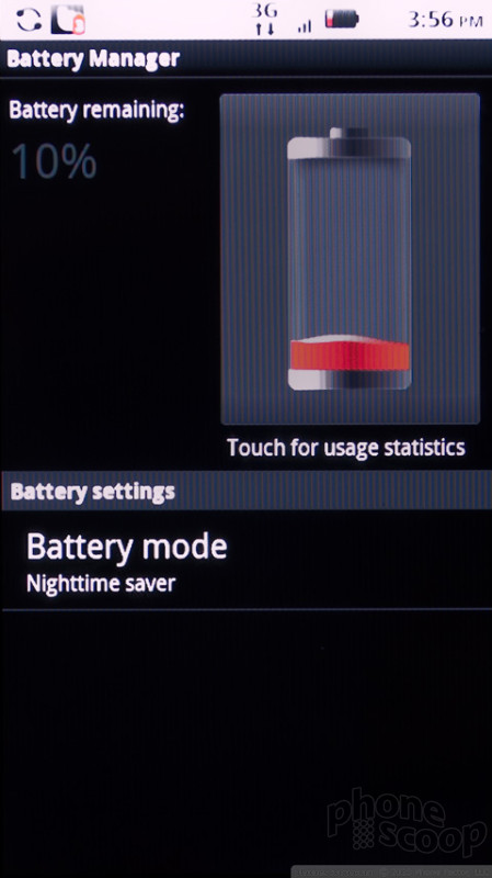
Battery performance on the Motorola Droid 2 can be deceiving. Motorola promises almost 9 hours of talk time out of this phone. In a straight talking test, I came close. I managed almost 8.5 hours of talking time. But this excessive talk time is not a fair indicator for real world battery performance. I drained the battery on the Motorola Droid 2 very quickly in normal use. Forget about charging every night. I had to charge the phone during lunch or it would be dead by bed time. This happened even during casual use times, not just extensive testing periods. Android gives a good indication of which apps and features are draining the battery. Though the screen was the biggest culprit, as I expected, it turns out the custom Motorola services, (for social network synchronization, I assume,) are the next biggest hog. Then, the camera consumed an unusually large amount of power, considering I only snapped a couple dozen shots and about 30 seconds of video each day.
If Motorola's social networking services and background actions are draining this phone so quickly, they aren't worth the hassle. Unfortunately, you can't turn them off without digging through the active processes menu in the Application Settings, a complicated procedure that might leave the phone unstable. Though I think the social tools on this phone are improved over previous MotoBLUR devices, the original Droid didn't waste time with MotoBLUR, and I wonder how battery would be improved if the new Droid 2 followed in its footsteps.
Touch
Touch sensitivity on the Motorola Droid 2 was fine, but could have been much better. The phone relies on touch sensitive buttons beneath the screen, and I did not like the choice. I have never used touch sensitive buttons that I felt were better than the real thing. On the Droid 2, they were slow to react, and often didn't feel my taps unless I moved my finger around a bit to find the right spot. I've felt worse (some Samsung Galaxy S phones, for instance), but hardware keys would be a much better choice.
The screen itself is fine, but not the most sensitive touchscreen I've used. Flicking between screens occasionally has no effect whatsoever, and sometimes the screen merely lagged behind my swiping. When you swipe from one home screen to the next, dots at the bottom of the screen tell you at which panel you're looking. I found these to be jerky and tough to use effectively. Again, I wonder if Motorola's flash and dazzle has actually hurt performance, now with touch sensitivity in addition to battery life.
Basics
Menus
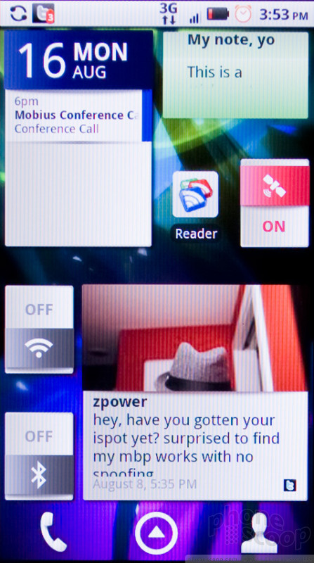
Motorola has made some nice additions to the standard Android interface without completely redesigning the look and feel. The basic paradigm is the same. You get a multi-panel homescreen - 7 panels on the Motorola Droid 2 - and you can drop onto these panels a number of app shortcuts, interactive widgets, folders or other such tools. Most of Motorola's work has come in the selection of widgets Moto offers on the Droid 2.
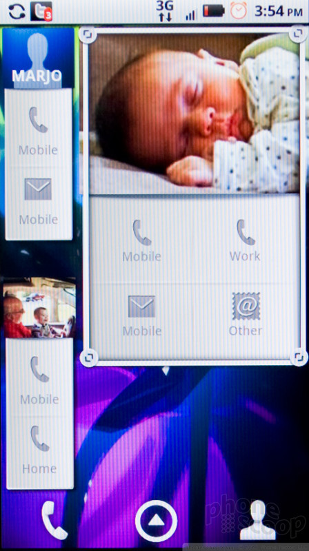
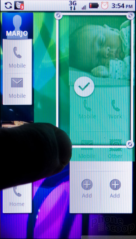
Motorola's widget tools are fantastic and adaptable, some of the best widgets I've seen on Android. You get a selection of system toggles for Wi-Fi, Bluetooth or Airplane mode. There are widgets for calendar and contacts, photos and social networking status updates. Motorola has made all of these resizable, a unique feat among Android devices.
All Android phones offer a 4 by 4 grid on which you fit widgets like Tetris pieces. Motorola's contact widgets, for instance, may start as a 1 by 2 rectangle with a picture and a phone shortcut. Then, you can drag the edges of the widget to expand it to a 1 by 4 rectangle, now with multiple contact shortcuts. Or, you can make it 4 by 2, for a larger picture and even more shortcut to make calls, send messages or even start a navigation trip. The widgets rearrange themselves automatically to fit whatever size you choose. It's a bit difficult to manage what shortcuts show up on a contact widget, but it's easy to create a unique homescreen layout that is incredibly useful, customized to your taste.
I found the interface on the Motorola Droid 2 to be surprisingly sluggish. With a full palette of custom widgets, scrolling from one panel to the next caused a noticeable lag. Sometimes the phone would stall halfway, then resume after a second's thought. There were many instances of lagging response throughout the phone's menus.
The Droid 2 can be used in portrait or landscape mode. The phone had trouble redrawing my homescreen panels in landscape. Pictures would disappear from contact icons and text would get clipped.
Otherwise, Android is a fine interface, but it can be a bit confusing, and the design could use an overhaul deeper into the phone's guts. The system settings menus are a confusing mash of white text on a black background, and it can be difficult to jump directly to the setting you need to change.
Calls / Contacts
Making calls with the Motorola Droid 2 is easy thanks to the great contact shortcuts, but it could have been improved even further. You can't simply open the phone's QWERTY and start typing a name. First of all, performance is so slow that if you start typing right away, the Droid 2 will always miss a few letter. I tried search for my father, “Alan,” and was offered a list of Google search results. This seemed very odd, but it turns out you have to select Contacts as a searchable item. It's not available by default, and the setting is hidden layers deep in the Settings menu. Even when I did turn the option on, Google Search still offered me a long list of Web links before the local contacts, in case I was more interested in searching for info about Alan Turing than calling my own father.
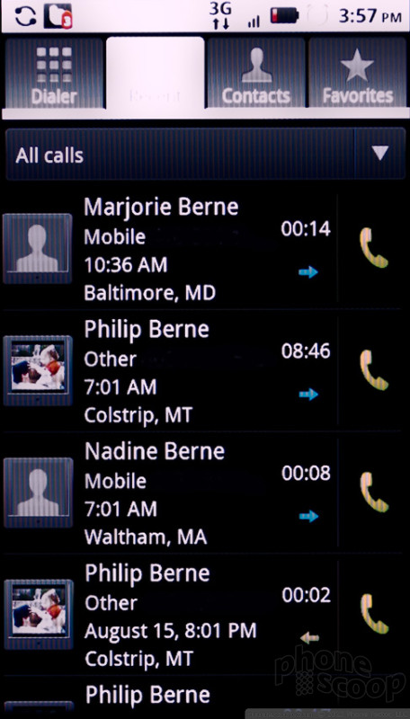
At the bottom of the homescreen panels on the Moto Droid 2, there is a phone button. Press the button and you return to whichever phone feature you used last. If you were just browsing your Favorites, that's where the phone button takes you. If you just used the dialpad, pressing the button gets the dialpad. I found I preferred this to a phone button locked to the dialer or recent call logs. The call log offers a bit more information than a standard Android log, and you get a drop down menu to sort all calls or just view missed or outgoing calls.
The calling screens are the same as stock Android phones. You get a button for the speakerphone, a mute button and even a button to activate a Bluetooth connection. You can tap a button to add a third call for a conference. I found it could be hard to hang up on the Droid 2. If I moved away from the calling screen, to check an e-mail, perhaps, I had trouble getting back to the call screen again. You can jump back quickly by pulling down the notification shade from the top of the screen, but this would often activate the phone's proximity sensor, and the screen would go dark. Not a huge problem, just an annoyance.
The phone comes with voice activated dialing, and it worked well in my tests. I had trouble getting the voice dialing features to work over Bluetooth. My headset seemed to activate voice dialing, but commands never worked properly. The Motorola Droid 2 also uses Skype. Verizon Wireless holds an exclusive over Skype on Android phones, so if Skype is important to you, your smartphone options are more limited. The VoIP service worked very well on my Droid 2 test unit.
Though I liked Motorola's contact widgets very much, the address book doesn't match the competition. Besides the wealth of information that can be stored about each contact, Moto also gives you separate screens in each listing for social networking status updates and also your communication history with that person. These screens were very sluggish. They took a long time to open, then took even longer to populate with recent info. The social networking screen almost always failed to find recent friend updates, and the communication history seemed incomplete. On HTC Sense phones, you get all of these address book features and much more, all from an interface that works faster with smoother transitions.
Messaging
Messaging on the Motorola Droid 2 works well, with plenty of options on board. On Android phones, there are Google services, and then there is the rest of the universe. Gmail and Google Talk get their own apps. Gmail is the best e-mail experience on this phone, and Talk is the only IM option available out of the box. There are plenty more available for free and paid download from the Google App Market. If Gmail is not your preferred e-mail client, there is an e-mail app for all other POP3 and IMAP4 services. You don't get the labels or the conversational view of the Gmail client, but it should do the trick for your Exchange or Yahoo needs.
Text messaging worked well on the Motorola Droid 2. Messages are presented in a colorful, threaded format to keep track of entire conversations. You can easily attach pictures, sounds and videos to outgoing MMS messages, and incoming pics show up in line with the threaded conversation view.
Social Networking
The Motorola Droid does integrate well with plenty of social networking sites and services. At startup, you can add accounts for Facebook, MySpace and Twitter, as well as a number of photo sharing sites like Picasa and Photobucket. I missed the lack of built-in Flickr support, though there are plenty of options on the App Market. Strangely, some services, like Twitter and Facebook, were listed twice, so I logged onto both listed options and never had any other trouble.
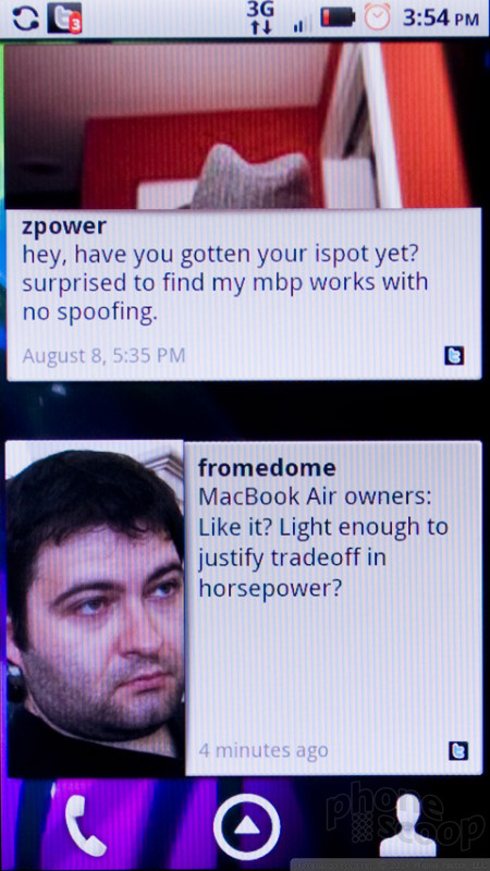
Motorola uses a universal inbox on the Droid 2, which covers everything beyond Gmail, and I do mean everything. Twitter and Facebook messages are grouped in with every other incoming message service besides Gmail for an inbox that gives you a complete look at your communications. Messages even show up in a threaded format, so when you look at recent Facebook e-mails, you can see both sides of the conversation, and you can reply directly from the Messaging app without opening up Facebook itself. It's a solid experience and it looks great.
Motorola has also included some widgets for social networking, and these have some interesting customization features. There's a status update widget that lets you send a message to one or all of your favorite social sites. There's also a widget for incoming messages. While I found the original MotoBLUR widgets to be a bit overwhelming, the newer widgets help you manage your friend flow by letting you choose from which person or group you want to see messages in the social networking widget. So, if you have a thousand Twitter friends, you can limit your widget to just a few of those, and catch up with the rest later.
Tapping on these social networking or messaging widgets from the homescreen will not open a respective application, but instead opens a window with messages or recent updates from friends shown as flash cards that you can flip through. It isn't the quickest way to catch up on hundreds of messages, but it looks great and works well if you choose to only receive updates from a select few.
Extras
Music
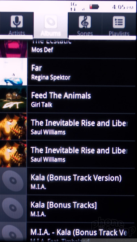
The music player is unchanged from other Android phones, which is disappointing. The player looked aged and basic when it first hit the scene almost 2 years ago. By now, it's completely behind the times. I like being able to search from the music player by holding down a finger on the artist, song or album name. You can jump directly into a Google or YouTube search with a simple action. But I'd trade this feature for much better playback control, a better interface design and some cool additional features. On any Apple iPhone, for instance, you get genius playlists and variable speed music controls, not to mention equalizer options and other features.
At least the Droid 2 has good music hardware. There's a standard headphone jack up top, so you can use your own earbuds. There's 8GB of internal memory thrown in, besides the 8GB microSD card hidden under the battery. If you spring for a 32GB card, you could have 40GB of storage on this phone. Stereo Bluetooth worked very well, better with my wireless speakers than with my smaller wireless headphones.
The phone also includes DLNA support. At the moment, that makes it the only DLNA device in my house, but if you have DLNA devices as part of your home theater, you'll be able to play music and videos wirelessly from the phone on your big screen.
Camera
Camera
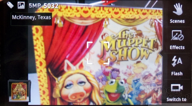
The camera app on the Motorola Droid 2 is a flop from start to finish. The entire experience is very slow. You open the camera by pressing the camera button, and this can take up to five seconds. Some times it fails to open altogether. Once in the camera app, the interface could also be very slow to respond. The app uses a simple onscreen menu, but often the menu would not appear when I tapped the camera screen.
There are a variety of scene modes, but most of these made little difference. There's a sport mode, a macro mode and a steady shot, among others. There's also a panorama stitch mode, but this is hidden under a separate menu accessible by the menu key, which makes this menu feel disconnected from the rest of the camera's onscreen controls.
Under that separate menu you'll also find a self portrait mode that is supposed to recognize a face before it takes a picture. In my tests, it never once recognized my face. This seems like a silly mode. Taking a self portrait, your face will almost always be front and center, so it seems like a face detector is unnecessary here.
Once you've taken a shot, you can hit the camera button again to shoot another or tap the picture for more options. From this option screen, you can send your picture to a number of sites and services. Besides e-mailing and messaging your pic, or sending it to Facebook or Picasa, you can also send the file via Bluetooth or choose a “Print to Retail” option. “Print to Retail” sends your picture to a local CVS or CostCo of your choice, and you can pick up a printed version of your photo there.
Image Gallery
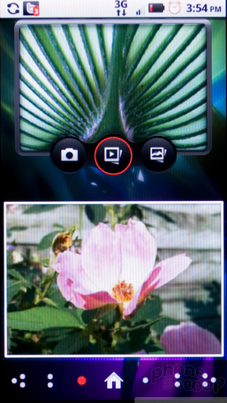
The Motorola Droid 2 has a very nice image gallery with a solid range of editing features. You can tweak a wide range of settings, from brightness to color levels, and add some color effects, like sepia tone or solarize filters. You can crop and resize an image, add text or fun frames, or stamp the image with tiny little pictures. There are surprisingly no auto modes for color or contrast balance.
The gallery app displays images as a grid in portrait mode, or as a timeline in landscape. In landscape mode, the gallery looks similar to Apple's Cover Flow, though it isn't animated quite as smoothly. The gallery groups photos by the date they were taken, but this feature seemed way off. Pics I took this morning show up in an album labeled “Last Week.”
Image Quality
Photos
Image quality on the Motorola Droid 2 was a mixed bag, mostly filled with coal. On a few occasions, I managed to coax a picture from the Droid 2's 5 megapixel camera that looked great, even print-worthy. But pictures of the same subject snapped just before and after could show dramatically different lighting and color. In fact, no two pictures I took back-to-back looked identical, they all varied in terms of white balance and lighting.
There's no easy way to tell when things will go right, but it will usually happen outdoors. Outdoor pics looked much better, though some still faded into a hazy mass of pixel noise at full crop. At best, though, I saw plenty of detail, accurate colors and even a nice depth of field. Indoors, colors were mostly washed out. Even under good lighting, noise trumped fine details in images. The flash completely blew out the lighting balance in most pics, overexposing white areas and creating a dark gloom over the poorly lit parts.
The camera has modes for macro and panoramic shooting. Macro did not work at all. The camera insists on controlling the flash with macro shots, so most were poorly lit. Even under bright light, macro mode allowed shooting no closer or more detailed than the normal mode.
Panorama, on the other hand, worked very well. The camera takes pics automatically as you pan slowly around a scene. The final image stitched together looked great, and the camera take a larger, higher resolution panorama than most other cameraphones I've seen.
Video
Videos taken with the Motorola Droid 2 camcorder were surprisingly bad. I saw plenty of choppy motion, and the camera had a very hard time switching from indoor to outdoor light quickly. The camera shoots in 720 by 480 resolution, an odd size that is halfway between VGA and real hi-def.
Check out my video sample below. For the most accurate quality, be sure to change the vertical resolution from 360 to 480.
Browse / Customize
Browse
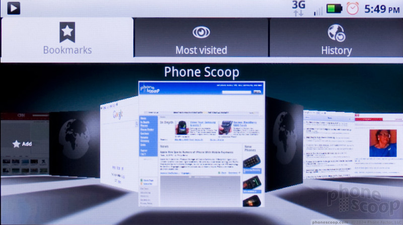
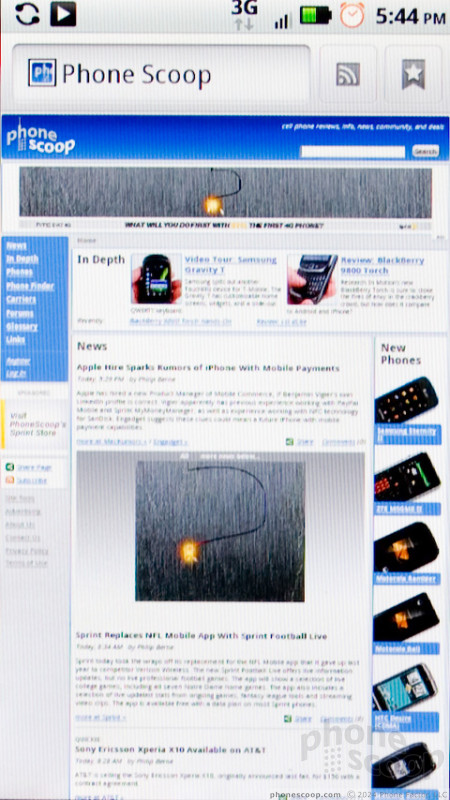
The Web browser on the Motorola Droid 2 is one of the phone's highlights. Though the phone uses a standard Android browser, it's very powerful on Android 2.2, and the Droid 2 even comes loaded with Adobe Flash 10.1. All the Web pages I viewed looked great, nearly identical to their desktop counterparts. Flash isn't perfect, but Flash 10.1 on Android is best Flash experience you'll find on a mobile phone. Some sites would crash, especially pages that were made entirely of Flash animations. But for watching video clips embedded within pages, Flash did a terrific job.
Customize
I could write an entire review simply covering the ways you can customize an Android phone, and the Motorola Droid 2 is no exception. Stock Android lets you customize the homescreen panels, wallpapers, sound notifications and plenty more. With Motorola's software, you get even more widgets, and all of these can be custom fit to whatever space you have available.
The real question is whether the phone will be easy to upgrade and root. The original Motorola Droid had no custom Motorola interface software. This made it very easy to unlock the phone and run custom ROM software and other interesting tools. The new Droid 2 uses more invasive features from Motorola, and I doubt that it will be so easy to crack open. Most users won't care much about sophisticated custom ROMs that void your warranty, but among all smartphone platforms, Android has some of the best support in the hacker community, so this will be important to a distinct audience.
Extras
Bluetooth
Most Bluetooth features worked well on the Motorola Droid 2. I had no trouble pairing my headset with the phone, and calls sounded fine. As I mentioned in my calling section, I did have strange trouble getting voice dialing to work, and this was never resolved. Stereo Bluetooth worked well, sending music to my favorite Bluetooth speakers. I also had no trouble sending picture files over Bluetooth to my laptop.
Clock
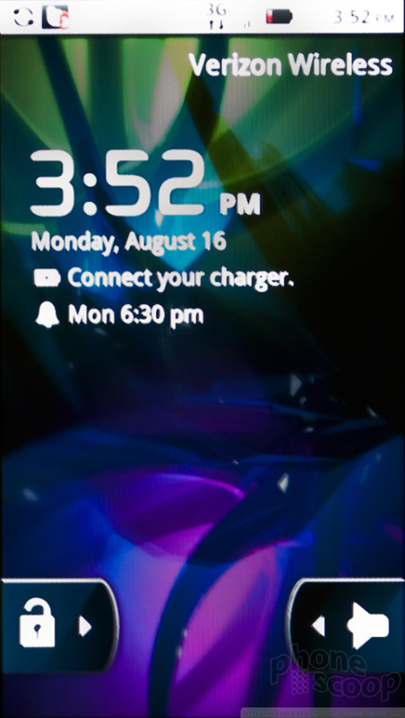
There are a lot of solid clock options on the Motorola Droid 2. There's a nice clock on the lock screen that you can check without unlocking the phone, and another in the menu bar. There are clock widgets that you can customize. There is an alarm clock, timer and stop watch all built in. If you spring for the dock accessory, you even get a bedside mode that gives the Droid 2 interface a look that is friendly for the bed table.
GPS
Verizon Wireless sticks with the included, free Google Maps for navigation on the Motorola Droid 2, and it works well. The app did a fine job finding my location and directing me on my travels. I especially like the navigation shortcut option that is part of the contact widgets on the homescreen. With one tap, you can start a trip to any of your favorite friends. If you need more location-based services or travel help, there are dozens, if not hundreds of apps available in the Google App Market to satisfy your GPS needs.
Other Extras
The Motorola Droid 2 comes with Wi-Fi hotspot support. With a few taps, you can set up the phone to generate its own Wi-Fi hotspot. The service costs an extra $20 per month, which seems a bit steep. The Google Nexus One on T-Mobile offers this feature for free as part of the Android 2.2 system, while on the Droid 2 the feature gets its own app, and it's own price. Even on Verizon's Palm Pre Plus, this option is free. The service worked very well in my tests, and I was able to connect a handful of devices to the phone for a network connection.
Video Tour
Wrap-Up
The Motorola Droid 2 is a definite improvement over the original Droid. The keyboard, my biggest problem with the original, has been dramatically improved, and it's now one of the best smartphone keyboards around. While the original offered no interface enhancements from Motorola, with the Droid 2, Moto has added some slick, useful yet unobtrusive extras that make the phone easier to use. The contact and social networking widgets, for instance, are among the best examples of these features on any smartphone.
It isn't all good news. I still think the hardware design is plain ugly, even more so now that Motorola has smoothed out some of the sharp edges and dulled down the aggressively black, stealthy paint job from the original. Though I love the new widgets, the customized address book didn't perform well, and the few other changes to the system had me wondering if these tweaks will keep Google from offering updates compatible with the Droid 2 as quickly as they were available for the original Droid, which is to say - before everyone else got them.
There were also performance problems, a surprise since the phone uses a TI OMAP processor at 1 GHz. Every feature, from the interface and menus to the address book to the camera app, seemed to lag often. At best, the phone could be fast and responsive. But it would occasionally slow for no apparent reason, and sometimes features wouldn't respond at all.
That said, the Motorola Droid 2 is the best full QWERTY smartphone on Verizon Wireless' lineup, at least until HTC makes a Touch Pro2 that doesn't run Windows Mobile. The few problems I have didn't come close to outweighing the positive experience I had with this phone. A sluggish Droid 2 is still much faster than an LG Ally, for instance. Plus, with that great keyboard, fantastic, hi-res display and all the extensibility that Android offers, the Motorola Droid 2 is an easy phone to recommend, though it might want to keep that Droid eye looking over its shoulder as stiff competition approaches.
Comments
So lemme get this straight
Sure it's better than an LG Ally, but what isn't? That's like saying it is better than a PCD Quickfire or Motorola Q.
This is just a big bucket of fail. At least I agree with you on the aesthetics of this. Then again, you also whined about the aesthetics of the iPhone 4. A VCR is right twice a day.
Are you worried about bias in And...
(continues)
Voice search button, among other things...
The battery on mine seems to be okay for my purposes. The only function that tends to deplete the battery life is Google's Navigate.
I also do not suffer the "signal loss" that many people are complaining about. The signal strength for the Droid 2 has been consistent with other phones I've owned. It does not do better nor worse in any dead zones which are notorious for dropped signals.
Most importantly, the Droid 2 addresses many issues that I felt were unacceptable with the Droid 1. For example, the microphone has been relocated to a less vulnerable area, the key...
(continues)
(continues)
Don't agree with the review
Their is a known problem with the D2 involving Exchange. While mail and calendar syncs great, contacts do not. There is some chatter about deleting the categories of the contacts but this has not helped me. Also the D2 applies a security pin when using exchange, even if you server does not, and forces you to use a pin to...
(continues)
Missed: Cases cause a problem with typing....
The Droid 2 uses a two-part case since it's a slider. Since it has no hole in the body to put a wrist strap through, most would want to use a case to protect the phone. Well, when you snap the top portion of the case on, it then semi-blocks the top row of keys on the physical keyboard, making it MUCH harder to type on that top row. Motorola should have designed this phone so that when you slide it open, it opens maybe 1/8 of an inch more to give more space above that top keyboard row. Any case will now interfere with typing. "Duh".
My unit is experiencing the wild up and down bar situation. Sitting on a desk, it goes from 0 to 3 bars in my home, and the 3G connects, disco...
(continues)


























 Samsung S24 Series Adds More AI, Updates the Hardware
 Motorola Gets Serious About Foldables with New RAZR Lineup
 OnePlus' New Mid-Range Phone Has a 108 Megapixel Camera
 Qualcomm's New Chip for Entry-Level Phones Moves to 4nm
 Motorola Droid 2

