Review: Pantech Jest
Aug 23, 2010, 11:26 PM by Philip Berne
The Pantech Jest is a cute messaging phone for Verizon Wireless that skips the expensive data options but still offers messaging and social skills.
Form
Is It Your Type?
Is It Your Type?

The Pantech Jest is a short little messaging phone with a cute look and a slide-out, QWERTY keyboard. It lacks 3G networking, which means you don't have to pay for a more expensive data plan, but tries to keep up with social networking trends by adding a few shortcuts to the mix. If you're interested in a very basic phone that can handle some light messaging tasks as well, the Pantech Jest has the right mix of features. But did it deliver? Find out in Phone Scoop's in-depth look.
Body
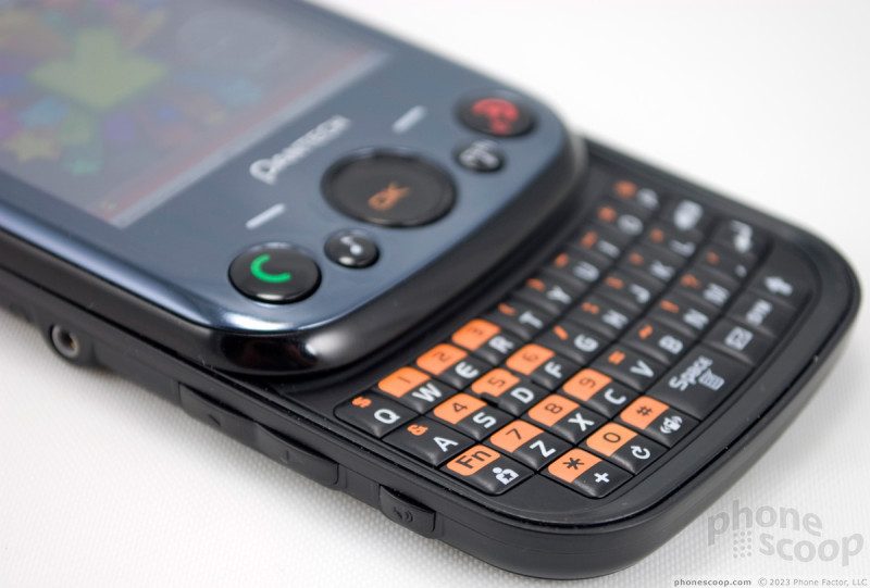
The Pantech Jest joins the ranks of squat messaging phones with little fanfare. It's a small, rounded phone with an array of buttons up front. The phone has a nice weight and a solid feel to it. The slide opens with a loud, spring-loaded snap. The back is textured and easy to grip, and most of the phone is coated in a glossy, but not too cheap-feeling plastic. The design is simple, not daring, and I can see it appealing to a wide audience.
Beneath the screen, there are two touch sensitive soft buttons and five hardware buttons. It's an odd mix. The touch sensitive buttons don't work very well. You have to jab at them, or better yet, slide your finger around to actuate them. On the periphery, there are Send and End keys, then a music key on the left side and a Clr / voice command key on the right. With the voice command key up front and a speakerphone key on the left side, I liked the selection of calling shortcuts offered by the hardware buttons.
In the middle of the phone is the so-called 'direction key,' which became my arch-nemesis over the testing period. The direction key is actually an optical joystick. Instead of a four-way button, you swipe your finger up and down, side to side over the key, and the selection on screen is supposed to react. It doesn't react, not usually. I would estimate that one out of every three swipes actually worked, and that's probably a generous estimate. This made for a horribly frustrating experience, and this was definitely a dealbreaker for me recommending this phone. The unresponsive optical key made every menu action and most apps much more difficult to use.
On the left side of the phone, above the speakerphone key you'll find a nicely raised and rounded volume rocker. Up top, there is a microSD card slot protected by a cover, as well as a slot for a wristband or dangling charm. On the right you'll find a covered microUSB slot. Beneath the USB slot there is a camera button and a Task Bar button. These were too close together. My finger always wanted to reach for the task bar when I meant to turn on the camera. Plus, at a quick glance these two look more like a volume rocker. The tiny icons on the keys are embossed, and hardly visible.
The keybaord is a bit small for my fingers, and my hands are not very large. Clearly, teens and young adults are the target audience. I like the shape and the feel of the keys very much. They are nicely raised in a dome shape, and the plastic has a matte finish that keeps the keyboard from feeling slippery. Still, there was not enough room for the keyboard, and I found myself typing with the tips of my thumbs to ensure accuracy.
The Three S's
Screen
The screen on the Pantech Jest is unimpressive. It looks washed out, with whites that tend towards grey. Indoors, the screen had a shimmering sort of screen door effect. Colors looked bright, and edges were mostly smooth, not jagged looking. But the screen had a relatively cheap look to it. Outside, the screen faded dramatically under bright sunlight. It was still usable, but I always had to block the glare with a hand or find a shadow if I wanted to perform any task more complicated than dialing a phone number.
Sound
Sound quality on the Pantech Jest was not very good. Voices had a muddy sound to them, with some digital noise in the background on many calls. My callers also reported a tinny, digital sound to my voice on their end. The speakerphone sounded clear, but it was very quiet. It was not useful even in a quiet room if my air conditioning was running. The ringtones, likewise, could be difficult to hear over any sort of background noise. On vibrate, the phone was difficult to feel in a stuffed pants pocket.
Signal
Signal strength on the Pantech Jest was not very good. The phone uses Verizon Wireless' slower 1xRTT network, and it had trouble holding a signal even on the legacy service. A few calls did not go through in my test time, and the phone lost many outgoing text messages, too. In the PhoneScoop Vault West, a local theater in a dead zone, calls were a no-show, and the data network, already sluggish, came to a crashing halt.
Battery
Battery life on the Pantech Jest was not bad. Verizon Wireless promises four and a half hours of talking time, but I got just over five hours on my test unit. The phone also easily lasted through a few days of use. I used the phone casually for three days without needing to charge, so it clearly sips power on standby mode. I stayed away from data apps that continually run and update themselves in the background, like the email and Social Beat apps, so you're more likely to see these results if you stick to basic calling and text messaging and stay away from data.
Basics
Menus
The main menu on the Pantech Jest is a simple icon grid design. You can replace four out of nine slots with your favorite shortcuts, which is a nice option for a basic feature phone. For the most part, all menu options lead to another menu. You can jump right into Bing search, VZ Navigator or the Social Beat app, but the other menus require more drilling. Some of these are redundant. For instance, there is a Messaging menu with an email option, or an Email menu, which leads to the exact same choices. The Media Center menu is a hold out from the worst Verizon Wireless menu designs. Want to browse the Web? The browser is hidden under Media Center, then Mobile Web. There is also a Browse and Download option under Media Center, which confuses things, but this leads to a download store online where you can find new applications.
There are a few shortcuts you can take on the Pantech Jest. On the right side of the phone is the Task Bar button. The Task Bar will only open on the idle screen, and it includes a number of shortcuts for dialing or accessing Verizon Wireless features, like VZ Navigator or the Mobile Web app. You cannot customize the taskbar. You can assign some shortcuts to the direction button, so that when you swipe up, for instance, the phone will open the call log. You can even assign a "My Shortcuts" list to one of the directions, doubling the total number of custom shortcuts you can create; sort of like wishing that the genie will give you more wishes.
Calls / Contacts
Making calls with the Pantech Jest is as simple as can be. Open the slide to reveal the keyboard and start dialing numbers. Or, with the keyboard closed, you can press the Send key to open the call log, then hit Send again from a recent call entry. You can also open the contact list, then hit send with a contact highlighted. This will automatically dial the first number listed for that contact. You don't get to choose between Work and Home numbers unless you open the contact listing and select the appropriate number manually.
Once your call is connected, you can mute the call with the left soft button near the screen, or turn on the speakerphone using the dedicated speakerphone button on the left side. If you'd like to join a third party for a conference, simply dial the number and once the third person has answered, press the Send key again to join the calls. There is no indication onscreen that this has worked, and no way to manage the calls to swap or drop one of the lines.
The contact list on the Pantech Jest is very basic. There is room for four phone numbers, two email addresses, and a postal address. When you open a contact, clicking on a number or email address with the center button does not start a call or email. The default action is to edit the contact listing, which seems counterintuitive. To start a call, press Send. To begin an email from the address book, you have to dig through the Options menu. You cannot synchronize the Pantech Jest with GMail or Facebook, etc., just the Verizon Wireless backup assistant. If this is your first time storing numbers with Verizon Wireless, you'll be entering your contact information manually.
Messaging
As far as I'm concerned the Pantech Jest needed to get one feature right, and that's messaging. Unfortunately, Pantech did not succeed. The messaging experience on the Jest is barely functional, let alone satisfying. The text messaging app looks good, with threaded messaging and big, colorful balloons to help you track both sides of a conversation. When the Jest receives a message, it doesn't take you to the threaded screen by default, instead you're shown the message with too much unnecessary header information. You have to close this message and open the Messaging app to see the threaded view. Every aspect of text messaging is equally complicated. You can send a silly graphic through the threaded text message view, but not a photo. Once you figure out how to send a Picture Message, taking a new picture requires a lot of menu digging. Pictures do not show up in line with the rest of the conversation. You have to open them separately, and wait a few seconds for each image to load. Worst of all? Some of my outgoing test messages never went through.
Beyond text messaging, things only get worse. The phone supports email with Verizon's Mobile Email client and a Mobile Web Mail service. I tried to use the Mobile Email, but the phone would not accept my password. This will become a running theme on the Jest. I tried numerous times, using all sorts of hoodoo magic on the function and shift keys, but my somewhat complicated password was never accepted. It was only when I changed to a simple, short password with all lower case letters that Mobile Email finally worked. It was not worth the effort or the lapse in my personal security. The app runs quite slowly. Opening a simple text message took more than ten seconds, sometimes much longer. Text looked skeletal and thin, which made it difficult to read. Even worse, Verizon charges $5 per month for the privilege of Mobile Email, on top of whatever data fees you accrue. Mobile Web Mail relies on the simple WAP browser, but it only works with Yahoo, Verizon.net and AOL accounts, and I use none of these. If email is your preferred method of communication, best skip the Pantech Jest. Doesn't Verizon's Mobile Email Client require a $10 monthly fee? -Eric Zeman 8/23/10 5:23 PM
For social networking, the Jest uses the Social Beat app from iSkoot. Social Beat seems like a very convenient option. Like the Social Net app on AT&T, Social Beat collects status updates from Facebook and Twitter, and also displays your Gmail inbox and even conversations from Google Talk. Unfortunately, I could not get any of these services to work. I use a different password for each of those services, and the Pantech Jest would not recognize any of them. Like with the Mobile Email client, I tried every permutation I could manage, and I could never successfully log on. Once again, changing to a very simple new password granted me access. I wonder if there is some issue with the function and shift keys that interferes with the password fields in these apps, because they seemed to only accept my passwords made of lower-case letters.
Once I got Social Beat working, I was again disappointed. In my Facebook feed, the app loaded a single status message from a friend who updated hours ago. Looking at my desktop, I knew there should be more, but constant digging and refreshing on the phone offered no new updates from friends. At the very least, Gmail users have a way to avoid the fees of the Mobile Email client by using Social Beat, but Gmail is the only supported email service on this app.
As a last resort, the Pantech Jest uses a somewhat clever trick for updating your status and sending photos to Facebook and MySpace. Basically, the phone has text messaging and MMS shortcuts for these sites. Both social networks accept updates and photos by text message, so on the Jest you only have to click on a link and the phone automatically fills in the recipient field for you. Then, you type a text message, with a 160 character limit, or send an MMS picture message, and they show up on your favorite social site. Though I'd prefer a more advanced version of the Social Beat app, I like having these shortcuts on the Pantech Jest since users with an unlimited messaging plan will be able to update their feeds without paying for any data service.
Extras
Music
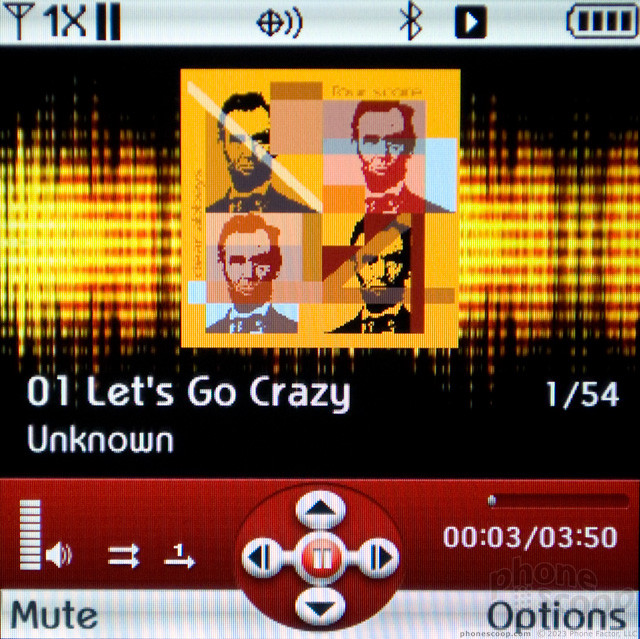
The music player on the Pantech Jest is a simple affair, though loading music can be somewhat complicated. The phone has a microUSB port, and you can connect to your desktop in a music sync or mass storage mode. The microSD card folder showed up on my Macbook Pro with no trouble, and I dragged my music to the card, but my files did not show up in the player. The Pantech Jest is not smart enough to look for your files, you have to place them in just the right spot. On this phone, the right spot is under a folder called "Root," then under a subfolder called "synched." If there is one piece of advice I've heard over and over in technology, it's not to mess with anything called "Root" if you don't know what you're doing. To hide the music folder two layers deep under a "Root" folder on the Jest is simply dumb.
Once my files were sideloaded, my music showed up fine in the onboard player. The Jest uses the same music player as other, basic V Cast Music phones, but since the phone lacks 3G networking, it also lacks the expensive V Cast Music Store. The player is very basic, though it does take advantage of the scrolling features on the navigation button, so you can hold to scroll up or down through your song list, or right and left to shuttle through an individual song.
You can play music in the background on the Jest, though a few apps, like Social Beat and the Web browser, will force the music to stop playing. If you need to silence your tunes in a hurry, you can jump back to the music player by pressing the dedicated music key next to the Send key. Pantech made a bad choice with the 2.5mm headphone jack. I could find a compatible headset or an adapter, but I'd obviously prefer a more standard 3.5mm port.
Camera
Camera
The camera app on the Pantech Jest can be somewhat confusing. To open the app, you press the camera button. The shortcut menu button is too close to this key, as close as volume up is to volume down, so you'll have to remember camera is on top, menu on the bottom. That camera button doesn't actually take the picture, though. For that, you press the center key. If you press the camera button in the camera app, it switches to camcorder mode.
There are very few imaging options in the camera. You can use color effects like black and white or sepia tones. You can adjust the white balance and brightness. That's it. Once you've snapped a shot with the center key, the same key is used to send an image. If you want to get back to the camera, you need to press the left soft key or, strangely enough, the camera button. I found this all a bit confusing. I'd like to have one button that opens the camera, shoots the picture, then gets me back to taking my next shot.
Image Gallery
The image gallery on the Pantech Jest offers a simple grid of photograph thumbnails. Click on a picture to see it full screen. You can remove the file info from the screen by entering "Full View" mode, but you cannot zoom in at all. The gallery loaded files very slowly. It took four or five seconds to load a picture, and the same time to move from image to image. There are no editing tools in the image gallery, not even simple crop or rotate tools.
You can send images, and these options are simple, perhaps even a bit clever. You can send via email or MMS, and the gallery menu also gives you the option to send pics to Facebook or MySpace. However, it really sent pics via MMS to the social sites' upload address, so it's not a full resolution upload. This seems a smart compromise for users who are more willing to buy unlimited messaging plans than unlimited data plans. You can also send pics via Bluetooth, and if you need to move pictures between the phone's minimal internal memory and an external microSD card, the gallery lets you transfer photos easily.
Image Quality
Photos
Photo quality was a strange issue on the Pantech Jest, and I don't mean that in any good way. All of my images looked bad, and all for different reasons. One picture might be blurry and washed out, with a grey haze covering the image. Another might have a red cast over everything, making me look sunburnt in a self portrait. Sometimes the problem was over sharpening, which gave my pictures a look like a still image from a VHS tape. Other times, images were blown out by backlighting, and white spots took on an ominous blue aura. The only consistency was that photos looked consistently poor. I didn't expect much from the 2 megapixel camera, and the Jest still managed to under-deliver.
Video
Video quality on the Pantech Jest is horrendous. Videos had a layer of pixelation and blur that came down in columns and made me feel like I was looking through The Matrix. Videos can only be recorded at a small QCIF resolution (176 by 144 pixels), and clips are limited to 15 seconds. The Jest was unable to capture audio while I recorded my video samples. The camcorder is only meant for MMS messaging, but even for this basic task, I would avoid the camcorder altogether.

3GPP2 / MPEG-4 format (viewable with QuickTime)
Browse / Customize
Browser
The browser on the Pantech Jest is a true mobile browser. It will not load HTML pages, only more basic WAP mobile sites. Pictures are mostly hidden, but that's a good thing, since most buyers will want to skip the more expensive data plan and will probably load Web pages paying a la carte fees for data. Keeping things simple cuts down on those data fees. The browser is remarkably slow. It took more than 10 seconds to simply load the Verizon page where you enter a URL address. Sites like CNN and the New York Times take more than a minute to load their simplified mobile versions. Browsing pages was also clumsy and sluggish. Problems with the touch pad made scrolling very difficult, even when I had fast, smooth scrolling enabled in the browser settings. To add a final insult, even quitting the Web browser could take a long time. It took six seconds or more to exit the app, during which time I couldn't start a phone call or do anything else on the phone. Overall, I would say browsing on the Jest is for true emergencies only.
Customize
I wasn't expecting many customization options from the Pantech Jest, but for a feature phone, the Jest does have a few nice options. You can change up many of the notification and action sounds on the Jest. The main menu is a 3 by 3 grid of app icons, and four of those are replaceable, so you can bring your favorite features up top for faster access. There are three display themes to choose from, each unique in color and style. You can also choose from three different system fonts, including "Sleek Modern Font" and "Dandy Round Font," and two different font sizes. There are even separate fonts for dialing. The phone offers a small selection of clocks for the standby screen, but none of these were large enough for my taste.
Extras
Bluetooth
The Pantech Jest paired with my Bluetooth headset with no trouble and little effort on my part. Sound quality was pretty good, on par the quality I've heard on other quick messaging handsets. Reception wasn't great, and sound would drop occasionally as I moved the phone from one pocket to another. I was also able to connect to my Bluetooth stereo speakers for music playback. From the My Pictures gallery, you can send picture files via Bluetooth to your PC, and this worked just fine in my tests.
Clock
The phone has a medium-sized clock on the lock screen so you can check the time at a quick glance, but I wish it were just a bit larger. That same clock persists on the standby screen. You can customize the clock to use either an analog or digital style of timepiece, but none of the options, large or small, were satisfying. There is no way to tell time when you are using the phone's apps; there is no clock in the notification bar up top.
GPS
The Pantech Jest uses VZ Navigator for turn-by-turn directions. With its 1xRTT network connection, the Jest could be quite slow updating maps and directions. A few times, I fell off course to see if the Jest would offer a new route, but had to pull over to wait for the phone to adjust. The app was still very useful, and GPS performance was good. But if you get lost often or if you need to find a point-of-interest in a real hurry, best to look at a phone with a faster connection.
Video Tour
Wrap-Up
I could excuse many flaws on the Pantech Jest, but I can't forgive the problems I had with every aspect of the messaging features. Messaging is the most important draw for this phone. Forgetting the slow and ineffective Web browser, the lousy camera, the confusing music transfer and the lackluster calling options, if the Pantech Jest had only delivered on the messaging options, I might have been able to recommend this phone. Instead, when I tried sending messages, connecting with my social networks and checking my email inbox, everything came to a standstill.
Text messaging was unreliable, with a mystifying mix of menus and interface screens. The social networking and email apps simply did not work for me, no matter how many hoops I jumped through. I had to create dangerously simple passwords to access these services, and then found the effort, and the risk, was not worth the payoff. Even if my fingers were dainty enough to enjoy the small keyboard, the email and Social Beat apps didn't provide a reliable experience to make typing worth while.
Messaging wasn't the only fatal flaw I found, though. The optical direction key stymies all enjoyment of this phone's design. I like having plenty of customization and shortcut options, an impressive array for a basic quick messaging phone, but mostly I used these options to avoid the direction key. The optical button up front was unresponsive to the point of almost complete failure. There wasn't an app on the phone that wasn't hurt by this poor navigation choice.
The market for feature phones with a full QWERTY keyboard is thriving, second only to smartphones, so there's no need to settle for a device like this. Almost every other full QWERTY phone I've tried has performed better, especially in the messaging features that truly matter to interested buyers.
Comments
No 3G?
So, in conclusion--
I can't wait to get this thing.








 Pantech Pleases the Court with Jest
 Samsung S24 Series Adds More AI, Updates the Hardware
 Google Pixel 8 Series Saves the Best for the Pro
 Google Making Maps Location History Private, Even from Police
 Motorola Upgrades its razr Foldables Across the Board
 Pantech Jest

