Review: Samsung Intensity II
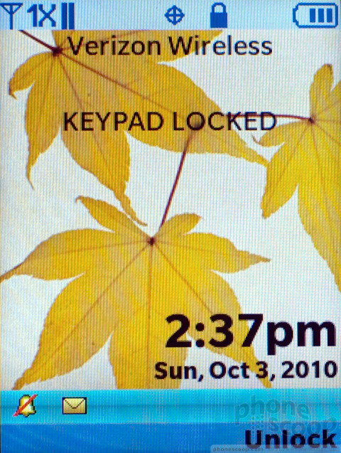
There is really not much to speak of in the menus on the Samsung Intensity II. The main standby screen displays the time and alert messages, but you can't add any widgets or change anything beyond the wallpaper. The main menu is a 3 x 3 icon grid. Samsung gussies it up a bit for the trio of themes on the device, but it's still quite simple, which is a good thing. You can swap out four of the nine icons on the grid for your own choices.
Digging a little deeper, you'll find an uninspired set of menus and settings displayed as textual lists. There are a few redundancies. I'm still not sure why Verizon buries the Mobile Web app under the Media Center menu, but you can plant your own Web shortcut on the main menu screen if you'd like to do less digging.
One thing that bugged me was how long it took to unlock the keyboard on this phone. The phone locks up quickly, and unlocking is a two-step key combo. But there seemed to be a delay that lasted seconds. It was always much quicker to simply open the phone then snap it shut, which also unlocks the screen.


 How To Scan a QR Code with Your iPhone
 How To Scan a QR Code with Your Android Phone
 Samsung Stays The Course with its Entry-Level Model
 Samsung Brings its Military Phones to First Responders
 iOS 18 Overhauls Home Screen, Messaging, Photos
 Samsung Intensity II


