CTIA Fall 2010
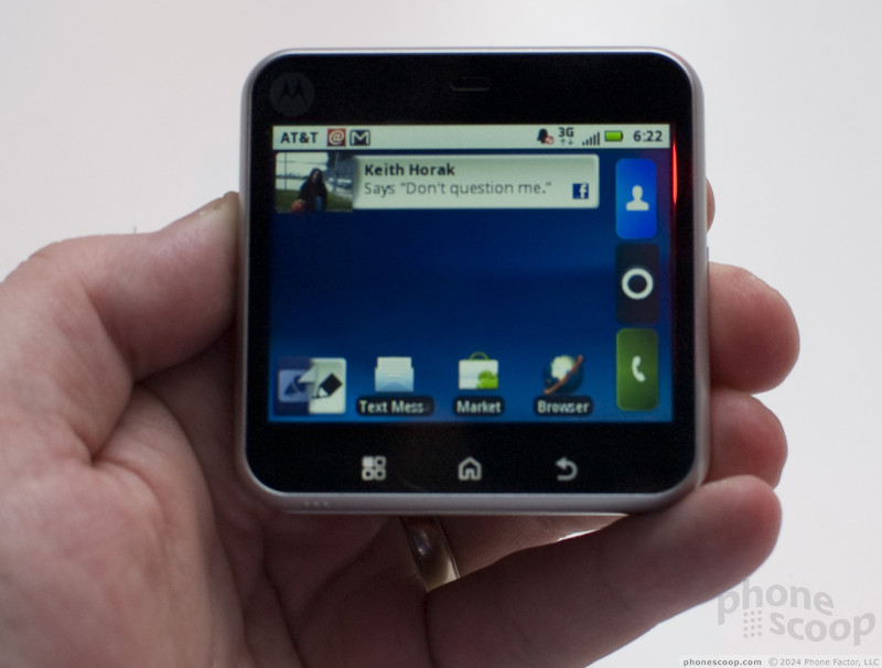
It would be easy to dismiss the Motorola Flipout looking at the pictures. The device is small and squat, somewhat silly looking, though it's appealingly cute in its tiny square package. In person, though, the Motorola Flipout is surprisingly cool. The phone has a great, solid feel. The hinge slides open with a nice clacking feel to it. The phone feels solid and dense, high quality for a design that might fit a more budget conscious or whimsical crowd.
The keyboard on the Motorola Flipout feels great. The keys are raised high like a range of hills with a grippy texture on each letter. Keys felt springy and easy for typing, at least in my brief hands-on look.
The phone is also surprisingly responsive. There was no lag on the screen as a flipped through the Motoblur interface over Android 2.1. The screen uses a very low resolution, only QVGA, so it's pushing only 320 x 240 pixels. At that size, I know from my experience with the Motroola Charm that some Android apps might look funny, and some might not work at all.
Still, in person, the Motorola Flipout looked much better than the Motorola Charm I reviewed. The screen was crisp and clean, and I might have been fooled into thinking it was twice the resolution. The Motoblur interface was bright and colorful, and I saw almost no jagged edges on fonts or blurry pictures like I saw on the Charm.
The phone packs a 3 megapixel camera. It will come in two colors when it's released on AT&T in Q4 2010.




 Review: Motorola Bravo
 Review: Casio G'zOne Ravine
 Review: Motorola Citrus
 Review: Motorola Droid Pro
 Review: Huawei Ascend
 LG Neon II
 Sanyo Zio by Kyocera
 Pantech Laser
