Review: Samsung Transform
Oct 19, 2010, 2:37 PM by Philip Berne
The Samsung Transform offers the new Sprint ID features in a slider package. Will Sprint ID on the Transform change your world?
Form
Is It Your Type
Is It Your Type?
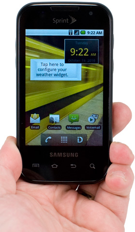
The Samsung Transform offers a large sliding keyboard and the new Sprint ID app pack feature to help new users transition smoothly into the smartphone world. With lifestyle packs for home life and working out, plus branded packs from EA and Yahoo (plus more on the way), will the Transform turn quick messaging users into smartphone experts?
Body
The Samsung Transform looks something like a Samsung Epic 4G lite. It's a bit thick, with nicely rounded corners. It's a QWERTY slider with a large touchscreen up front, like the Epic, and it also uses the same layout for the touch keys beneath the display. But that's where the similarities end. The Transform is a sort of nondescript phone. It's well rounded on every edge, so it feels good in the hand, though it is a little bulky. This also means it will fit into a pair of cargo shorts, but this isn't the phone for you if you like tight pants.
In a dimly-lit room, the icons for the touch buttons fade from view, and the front looks like a plain black slab. There's a chrome waistband around the middle, separating the glossy top from the soft touch paint on the back battery cover. The entire back peels off easily, revealing the battery and the microSD card slot, though thankfully the slot is on the side of the phone, so you don't have to remove the battery to swap cards.
On the right side of the phone you'll find the power / screen lock key, the voice dialing key and, farther down, the camera button. All of these were nicely raised with just enough action. The camera button, especially, was easy to use with its two-stage, auto focus feature. The volume rocker is on the left side of the phone, also well raised, so it's easy to find during a call without fumbling. Up top, there's a 3.5mm headphone port so you can use whatever earbuds you like with the Samsung Transform. There's also a microUSB port, hidden beneath a sliding port cover. I'm neutral on Samsung's recent sliding port cover fetish. On the one hand, the covers are well designed and certainly won't break off, like many port covers I've used. On the other hand, I'm just not dusty or messy enough to feel a port cover is worth the hassle.
The keyboard snaps open and shut with a pleasantly stiff, reassuring clap. Samsung uses a 4-row keyboard design, and the number keys are hidden in the top row as "Fn" keys. I like the layout of the letter keys. They seem symmetrical and nicely balanced, but I am not a fan of this keyboard for a number of reasons. First, the top row butts up against the top half of the slide, which made typing those keys less comfortable. Second, Samsung makes some strange choices for punctuation keys and shortcuts. The period, question mark and the @ symbol each get their own keys, which is nice. There's also a dedicated key for smileys, which is fine for the right user, but also a dedicated $ key. A dollar sign key? I can't imagine a user who would prefer a $ to a dedicated .com key (it's a Fn alternate for the period on the Transform), or even a simple comma. Finally, the keys themselves are flat without a nice tactile break between them. It was very difficult to type without looking, which is one of the great benefits of a hardware keyboard over a virtual, onscreen keyboard.
The Three S's
Screen

The 3.5-inch, 320 by 480 pixel LCD display on the Samsung Transform is lackluster. It's not very bright, and it loses much of that brightness outdoors on a sunny day. It wasn't impossible to read outside, but it was very difficult, and I couldn't see the camera viewfinder when I held the phone over my head. Indoors, the screen looked much better, but it wasn't perfect. With the brightness turned all the way up, the Transform still had a grey palor on white screens. Against a darker background, icons were nice and colorful, though still not very bright. Text looked just a bit wiry and jagged, but it was still legible enough to read long Web pages with no trouble.
Sound

Sound quality on the Samsung Transform was pretty good. Through the phone's earpiece, calls sounded clean and plenty loud. There was a slightly metallic twang to my callers' voices, but only enough to remind me I was on a cell phone. The speaker on the phone was also impressive. Ringtones came through nice and loud, easy to hear across the house or when the phone was tucked into a deep pocket. Music also sounded great coming through the speaker. The phone lacked a bass kick, obviously, but sound quality was good enough to use the Transform as a complete dedicated sound system in a small office space. With the sound turned off, the phone still had an adequate vibrate mode. It wasn't strong enough to shake furniture, but I had no trouble feeling it when calls came through.
Signal
I had serious problems with radio reception on the Samsung Transform. The phone uses Sprint's EV-DO Rev. A network, but signal often dipped very low. The phone would report only a bar or two of service, and data would slow to a crawl. Phone calls also had trouble going through when network reception was poor. Troubles weren't limited to the cellular network, either. The Transform often had trouble connecting to my home Wi-Fi network. Sometimes it claimed the network was out of range, even though all of my other devices were connected, and other times the phone would not load data, even though it showed an active Wi-Fi link.
Battery
If the phone's signal strength was bad, battery life was nearly catastrophic. I would unplug my Samsung Transform review unit at 7AM, and by noon it needed a charge. That was with very little use. No camera, no GPS, and few phone calls. It was not unusual to have to charge the phone completely two or three times a day. There is something clearly wrong in this system. The phone uses a 1500 mAh battery, which is among the larger batteries you'll find in a cell phone these days. I suspect that radio problems or power management issues with the system are draining the battery life at an alarming rate.
Touch
There is a serious lag to the touch sensitivity on the Samsung Transform, especially on the main homescreens. I'd swipe my finger to move from panel to panel, and the phone would think things over for a few seconds, then react. Sometimes, I saw no reaction at all, the screen would simply sit idle, and I had to swipe a few times to move the panels right and left. Even though the screen is capacitive, the phone's poor response reminded me of the cheaper resistive screens you'll find on Samsung's touchscreen feature phones. The touch sensitive buttons beneath the screen were not much better. Often, there was a delay after pressing these buttons. Sometimes, I would feel the vibrating haptic feedback from the phone, but nothing actually happened on screen.
Basics
Menus
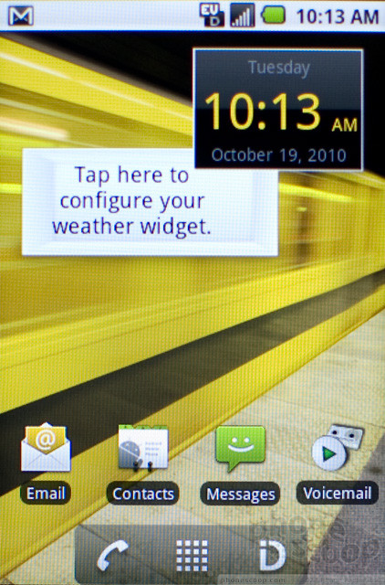
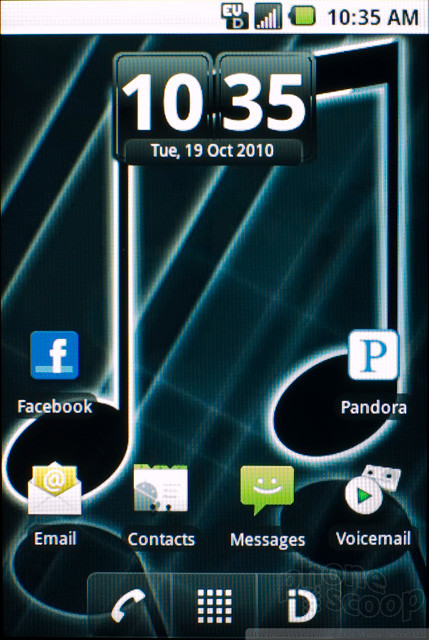
The Samsung Transform uses the new Sprint ID interface concept on top of Android 2.1. It's almost entirely a stock Android interface with no improvements, except for the Sprint ID shortcut where the Browser shortcut is usually located. Sprint ID is meant for people who find customizing and setting up an Android phone confusing. I can certainly empathize; I like Android but I've always felt the system has a steep learning curve (especially after I tried to teach my 60-year-old mother how to use her Android phone). Sprint ID offers its own download store, nearly identical to the standard Android App Market, where you can choose from a number of Sprint ID packs. Right now, ID packs are all free, though Sprint has hinted that it could charge for premium ID pack content in the future. ID packs include apps, ringtones, wallpapers and widgets. In the future, Sprint will give packs some control over settings, so they can set brightness levels or activate Airplane mode, that sort of thing.
Some ID packs are based on lifestyles, like the Fashion and Beauty pack, the Golf Enthusiast pack or the Home Base pack. Others are based on brands. Yahoo has an ID pack with some apps that seem to be unique to Sprint's lineup, like a Flickr app. Electronic Arts has an app pack, though it doesn't offer much beyond a few quick demos and some Sims 3 wallpapers (even though Sprint reps claimed earlier this year that the EA pack would ship with full game versions on board). More branded packs are coming. MTV, E! and Oprah have all apparently signed on to create new packs, though it doesn't seem like much would be involved in creating an ID pack, so the lack of support at launch may indicate a wait-and-see attitude. In other words, I wouldn't recommend buyers count on more ID packs coming unless these phones sell well.
The key feature on the Samsung Transform, the new Sprint ID interface concept, will not work over Wi-Fi. Though the Sprint ID packs each require a large download, you can only download the apps and pack data over Sprint's EV-DO network. Because the Transform had such an unreliable and often slow network connection, this seriously hurt the Sprint ID experience. At best, ID packs might load in four or five minutes, but at worst, it could take 20 minutes or more to load a new pack.
I have a lot of problems with the Sprint ID concept, but it all boils down to this: Sprint ID is supposed to make setting up the phone and downloading the apps you want much simpler, but it does nothing of the sort. The entire process was long, complex and confusing. Downloading packs took a long time, then more time to actually "Install" the pack, then even more time to switch between packs. Long enough that if you are using the "New Yorker" ID pack and you suddenly feel like living la vida Yahoo!, the time it takes to switch packs will discourage you from making that move.
Even worse, though, is that the payoff is slight. There is no imagination to the organization of apps or widgets onscreen after you've switched from one pack to another, and sometimes the app choices don't even make sense. What about the "Home Base" pack, which is supposed to be for managing a household, implies that I want a download link for the game "Collapse!"? Nothing, but it's there, nonetheless. Sure, you also get ToDo lists (for Astrid Tasks, which I don't use), as well as recipes and exercise apps. But E!, or Pandora, or a car finder app? That just doesn't make sense. This is the case with most app packs. They are a mix of apps that are cool and useful, apps that relate to services you may or may not use, and apps that come seemingly out of left field.
At least Sprint makes it easy to delete what you don't want. Instead of having to go to the confusing Manage Applications submenu, when you delete an ID pack from your phone, you get to pick and choose which apps, wallpapers and ringtones get deleted. So, if you didn't use the Socially Connected ID pack much, but you want to keep Tweetcaster (included instead of the official Twitter app, strangely), you can delete the pack and keep the apps you liked. This also works with the Sprint branded ID pack. You can delete the Sprint pack, removing some unwanted, carrier-branded apps from your phone, but you can still keep the NASCAR app if you're a racing fan.
Beyond the Sprint ID features, there really isn't much to the Samsung Transform that you wouldn't find on any stock Android device, like the slightly smaller Samsung Intercept, also on Sprint. Actually, for an Android phone, the Transform offers a sub-par experience that is sluggish all around and somewhat unreliable. Beyond the problems with touch sensitivity I mentioned above, the phone crashed often, and problems with the network wreaked havoc on the ID pack features. Widgets that continually update in the background would often fail, leaving an error message on screen where the widget usually offers information. Some apps did not open at all. The Transform supposedly has a USB mass storage mode, but my computers, both my Windows and my Mac OS machines, never found the device. After so many problems, I tried a hard reset, wiping out all the phone info. Then, after a few more days of testing, I decided to hard reset again. I've never reset a phone twice in a testing period.
Calls / Contacts
Making calls with the Samsung Transform is exactly the same as calling with any other Android phone. There's a shortcut onscreen that takes you to the phone app, where you can dial from the keypad, or use the Call Log, the Contacts list, or your own list of Favorites. You can create dialing shortcuts on the homescreen. You cannot simply open the keyboard and start typing. Some of the letter keys are inexplicably mapped as shortcuts to apps on the phone, with little logic or reason (Y for YouTube; P for, um, Music). There is a voice dialing feature on the phone, but it failed in every attempt to dial my number correctly. I tried six times to ask the phone to dial 10 digits, and it never got those digits right.
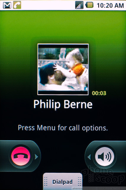
The in-call screen is slightly different from the basic Android design, but not by much. Basically, some of the shortcuts that are normally visible on screen are now hidden under a menu. Mute, Bluetooth and Add Call buttons are now hidden. No big changes, just an annoying extra step, especially if you use Bluetooth often. You can open the dialpad if you need to enter numbers during a call, but if you want to make a conference call, you need to hit that Add Call button, then dial.
The phone can synchronize contacts with Google and Exchange accounts. Most Android phones ship with official Facebook and Twitter apps already installed. Even with the social networking ID pack loaded, the Samsung Transform doesn't come with these apps. I'd recommend downloading them from the App market if you use those services, because the official apps also offer sync capabilities for the phone's address book.
Messaging
Despite all of the capabilities that are added with various Sprint ID packs, messaging on the Samsung Transform remains quite basic. It's the same setup you'll find on most Android phones. Text messaging looks good and works well, with a threaded, conversational style that makes it easier to follow.
For IM, you get Google Talk, and the Yahoo ID pack also adds Yahoo Messenger. But that's it for instant messaging. I was surprised that the social networking ID pack didn't add any IM features. I'd like to see Windows Live support at the least (fat chance Microsoft will offer an ID pack for a Sprint Android phone), and also support for Facebook and MySpace chat features. If you're an IM fan, there are plenty more options available to download from the App Market.
For email, you get Gmail, and the general Email app, which covers Exchange, POP and IMAP accounts. If you download the Yahoo ID pack, you also get a Yahoo Mail app. Yahoo mail falls somewhere between the Email and Gmail apps. It isn't quite as feature rich as Gmail, but it's much more polished and attractive than the plain old Email app. If you use Yahoo Mail, definitely download this app. Still, it's annoying that all the Yahoo features don't tie together well. After I entered my Yahoo ID into Flickr, I had to add it again in Yahoo Mail. And the Yahoo ID pack didn't offer the opportunity to synchronize the phone with a Yahoo address book, which is a silly oversight.
Social Networking
I was surprised by what did and did not accompany the social networking Sprint ID pack on the Samsung Transform. Official apps for Twitter, Facebook and MySpace were all left out of the mix, even though those apps are free downloads from the App Market. Instead, the pack loads only Tweetcaster, and offers a download link for Facebook. Tweetcaster is fine, but it doesn't grant the phone Twitter contact sync capabilities, so you'll probably want to download the official Twitter app as well.
In fact, the Socially Connected ID pack is not very social at all. You get Bump, which is a cool way to transfer files and information between two smartphones. But otherwise, Sprint seems to confuse social networking with celebrity watching. Thus, you get a Celebrity Tweets app, which is as bad as it sounds. Also, Fandango, IMDB, Horoscopes and Wikipedia mobile. Oh, and of course there's a small selection of completely unnecessary games. This is social? Sprint blew a big opportunity here. With rumors that Facebook is working on its own phone, and with Microsoft (with Windows Phone 7) and other Android manufacturers integrating social networks deep into their operating system, there is clearly a demand for a dedicated social experience on a phone. On the Samsung Transform, though, you get one useful app, a bunch of non sequitors, and a lousy smartphone experience.
Extras
Music
Out of the box, the Samsung Transform comes with only the stock Android music player, which is the same player that shipped with Android 1.0 two years ago. I loaded the Entertainment ID pack, and while this didn't offer an improved music player (no DoubleTwist? WikiTunes? Nothing?), it did provide a couple of third party music services, namely Rhapsody, for music subscribers, and Pandora, for the music streaming types. You also get Shazaam for music identification, but the other apps and widgets in the Entertainment app are a hodge podge of entertainment news apps, and more non sequitors. I understand why the TMZ app or the E! Online app should be part of the Entertainment pack, but why a World Series of Poker game? Or Farm Frenzy Lite?
What I really wanted when I loaded the Entertainment pack is a focused, improved multimedia experience. A better music player, better music widgets, and some streaming services for music and video clips. All of these things exist for Android, so it just seems lazy that Sprint couldn't gather together the best of these for the Entertainment pack. Plus, the inclusion of unnecessary games and apps (Tweetcaster in Entertainment, too?) smacks of cross-promotional deals.
Camera
Camera
The camera app on the Samsung Transform is the basic Android camera app. That's a shame, because Samsung has some nice looking camera apps on their higher-end phones, with more controls available onscreen. The Android camera app has some basic exposure controls, like white balance and color filters for sepia or black and white photos, but it's a hassle having to open the drawer and scroll to the right setting everytime I want to switch from auto focus to macro focus, which is fairly frequently. Also, the camera app has a large, unnecessary border all the way around. It would have looked much better with a full screen viewfinder.
If you download a Sprint ID pack with Pixel Pipe, the camera automatically launches the app after every picture and tries to auto upload your images. This might be convenient, but wouldn't it be polite to ask first before opening a new app? You can turn the feature off, or you can set up Pixel Pipe to automatically upload pics to a specific site without prompting you.
Image Gallery
The Samsung Transform uses the basic Android photo gallery app. It isn't as pretty or advanced as the newer version found on Android 2.2, but it's still clean and effective. It's easy to view pics individually, in a thumbnail grid, or as a slideshow. It's equally simple to share pics with a variety of sources. One of the best parts about Android is that every time you add a new app with photo sharing capabilities, that app gets added to the gallery's Share menu. So, with a few ID packs loaded, I get the ability to share my pics via Bump, Pixelpipe, Yahoo Mail or Tweetcaster, in addition to the standard email and messaging options. The phone is supposed to support Bluetooth file transfers, but there was no option to send pics over Bluetooth, like there is on other Android phones.
There are almost no editing options in the gallery on the Samsung Transform. You can crop or rotate pics, but that's all.
Image Quality
Photos
Image quality from the 3 megapixel camera on the Samsung Transform wasn't bad. A few images even looked pretty good. Indoors, there was more grainy noise than I would have liked, even in a room with lots of wide open windows. My indoor shots were also a bit blurry, but colors were fairly accurate, and pictures weren't unpleasant. Outside, on a bright, sunny day, the camera took shots that were reasonably sharp, for a 3MP shooter, without obvious problems from mixed light or bright, direct sun. The small sensor had trouble with deep red colors, as most small sensors do, but it wasn't as bad as other cameras I've used recently. The camera's macro mode even provided some detailed close-ups.
I wouldn't say these pics are all print-worthy, though you could probably print the occasional 4 by 6. Good shots will definitely be worth sharing on Facebook or other social networks. Most importantly, you won't be embarassed by lousy pictures if you set Pixel Pipe to automatically upload every single shot you take.
Video
For low resolution videos, again I was pleasantly surprised by what the Samsung Transform delivered. Video quality wasn't great, not even very good, but videos didn't exhibit many of the common problems I see on mobile camcorders, like wavy motion or faded colors. Videos looked bright and somewhat clear, though there was plenty of blockiness and fuzzy details to go around. Sound quality on videos is lousy. My voice sounded very muffled recorded with the phone's mic.

3GPP / MPEG-4 format (viewable with QuickTime)
Browse / Customize
Browse
The Web browser on the Samsung Transform is the stock Android browser, and that's mostly a good thing. Pages rendered accurately, almost identical to their desktop versions. Our own PhoneScoop homepage looked great, with sharp images and text in its proper layout. While I was able to load the CNN homepage properly, the New York Times only offered its mobile version. This is an ongoing problem on even the best Android handsets, not only the Samsung Transform. Some pages will only recognize this app as a mobile phone browser and will not offer a full desktop page.
The browser was slow to load pages on Sprint's EV-DO network, and the data connection often stalled on me. I had a much better time using Wi-Fi for data, but this still didn't make the browser feel speedy. The browser was also less responsive to touch than I would have liked. While it was better than the phone's homescreen panels, there was still some lag and occasional delay moving about large pages.
Customize
I've talked extensively about the customizations options with Sprint ID in the Menus section, but here I'll add a few details. With Sprint ID, you can load up to 6 ID packs at once, including the My ID pack, which is just the basic Android interface, arranged however you like. There is also a Clean pack that strips away all the other apps and widgets. Once you've loaded your Sprint ID pack, you still get all the standard Android customization options. So, if you have the Electronic Arts pack loaded, you can still add a Twitter widget, application icons and other shortcuts to your homescreen panels. Each ID pack comes with a selection of wallpapers and ringtones. You can use these or your own pictures and sounds, and if you remove an ID pack, you can keep the wallpapers and ringtones that accompanied it onto your phone. Some of the ringtones and wallpapers are actually pretty cool, too, especially the branded ringtones from EA, from the FIFA game, for instance. Too bad the phone can't use Android's Live Wallpapers, because there are not many good live wallpaper options available and the ID packs could have been a great source for new, cool animated screens.
The best use for Sprint ID might be to cherry pick from all of the options and app and widget suggestions that come with the various ID packs, then create one super My ID pack with all of your favorites.
Extras
Bluetooth
For calling and music, Bluetooth worked just fine. I was able to connect to my handsfree device as well as my Bluetooth stereo speakers with no trouble. Sound quality was pretty good, too, even for calls. There were some occasional Bluetooth reception issues, but no worse than on other, comparable devices. The phone is supposed to support a number of other profiles, including OPP for object transfer, but there was no option on the phone to push photos or other information from the Transform to my laptop.
Clock
Pressing the lock button on the phone lights up the lock screen, which features a nice, big clock up top that you can check quickly. The clock is usually the easiest part of the screen to read, even on a sunny day, though judicious wallpaper selection obviously helps. Different Sprint ID packs also come with different clock styles. I was surprised to find some using a free clock from the App Market that is a direct ripoff of HTC's Sense design (it's even called Sense Clock). While you're using the phone, there is a clock in the notification bar up top, though this bar isn't visible from every app. There is also a clock app on board with alarms and stopwatches.
GPS
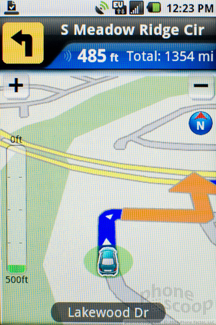
The Samsung Transform gets tons of GPS options with all of the apps loaded by the Sprint ID packs. The phone comes with Google Maps, which includes free navigation. Sprint Navigator is also a free app, created by TeleNav, as part of the Sprint pack. Beyond those two solid options, it's hard to find an app these days that doesn't rely on GPS for location data.
In terms of GPS performance, the Transform did fine, but it did fail occasionally. I had to remove WeatherBug manually because the app was never able to find my current location, though it kept looking (and draining the battery). In navigation, the phone performed better, following me through my trips in and out of the downtown area and helping when I got lost.
Other Extras
The Samsung Transform has a front facing video camera. It can be useful for low resolution self portraits, but it did not work properly for video chat. Samsung and Sprint do not include any video chat software with this phone, and none of the apps I tried, including Qik and Fring, let me chat using the camera.
Though the Samsung Transform is the more powerful of the new Sprint ID phones, with an 800 MHz processor, it was unable to run the 3D games I threw at it. Speed Forge Extreme would not load at all, in fact.
Video Tour
Wrap-Up
I honestly believe that, on paper, the Sprint ID concept is a good one, and there is an audience for phones like this. People who find setting up an Android phone confusing would appreciate an improved version of Sprint ID. The Sprint ID feature should offer these folks a well organized, thoughtful interface, broken down into lifestyle options and fun, branded packs with unique content. Switching between these should be fast and seemless. Unfortunately, the Samsung Transform delivers on none of these promises. Sprint ID packs are a hodge-podge of ill fitting and confusing options. They are bloated with junk apps that have nothing to do with the ID pack, and they seem to actively avoid the best and most obvious choices. No official Twitter app for the Socially Connected ID pack? Sprint, what were you thinking?
The worst part about Sprint ID is that it seems to absolutely crush the phone's performance. The Transform is sluggish and unresponsive, and bugs cause features to fail or not work properly. Switching between ID packs takes an eternity in smartphone time, and what you get in return seems more focused on the products and partnerships Sprint is trying to sell to you, rather than focused on the user experience.
There were still some bright moments. Call quality was great. I also liked the camera on the Transform, it seemed to perform better than other 3 megapixel cameras in the same product range. But there were also hardware problems that might be caused by bad software. The battery life was inexcusably short, for instance, and both EV-DO and Wi-Fi networking were unreliable.
With some polish and some tweaks, and a whole lot more effort on the part of Sprint and the ID pack designers, the concept could be put to good use. But if you're looking at the Samsung Transform as a phone that will make your mobile life easier, stay away, because life with this phone can be hard indeed.
Comments
Static button hard reset?
Sprint ID
I am rather concerned that the My ID function, which is pre-installed and cannot be removed, may drain the battery. I guess we'll see.










 CTIA Fall 2010
 OnePlus' First Foldable Aims High
 Google Making Maps Location History Private, Even from Police
 iOS 18 Overhauls Home Screen, Messaging, Photos
 Samsung Transform


