Review: Sony Ericsson Xperia Play
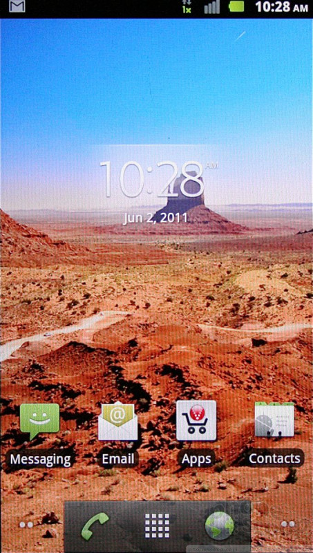
The Xperia Play runs Android version 2.3.2, though I wouldn't be surprised if you couldn't tell. It has been given a light skin by Sony Ericsson that leaves functionality intact but gives everything the same vibe as found on Sony Ericsson's earlier Xperia-branded devices.
Sony Ericsson's treatment of the home screens is typical for an Android device. There are five panels to the home screen, which are littered with a mish-mash of apps and shortcuts. The main app menu is the same alphabetized grid of icons, and the settings menus are identical to those of other Android handsets. Sony Ericsson has given them a hint of color, but otherwise they are left mostly alone.
The five home screens can be adjusted per individual tastes, but the main menu is stuck in the alphabetical grid. No rearranging it or shifting it to a list-style view.
One thing worth pointing out: when the Xperia Play is opened (but not necessarily being used for a game), the arrow keys on the left side of the game pad help with on-screen navigation, and the secondary keys can be used for faster access to the menus than reaching up to hit the four standard Android controls.
The Verizon CDMA version of the Xperia Play is slightly different from the GSM one. The look and feel have been updated slightly, and the user interface elements I've mentioned here take place of what was a stock Android build on earlier models we've handled.


 Sony Ericsson Reveals Xperia Play for Verizon
 Sony Ericsson Xperia Play (CDMA)


