Review: Motorola Droid 3
Jul 25, 2011, 2:48 PM by Eric M. Zeman
Motorola takes a third shot at the famed Droid for Verizon Wireless. The Droid 3 follows the bigger-is-better approach, with a massive display and new 5-row keyboard. Despite the improvements to the hardware, the Droid 3 isn't perfect.
Form
Is It Your Type?
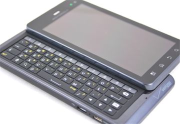
If you're into trilogies, you'll be happy to know that Motorola's Droid 3 is a worthy follow up to the first two installments. With a bigger, better display and a bigger, better keyboard, what's not to like? Well, we found a few things.
Body
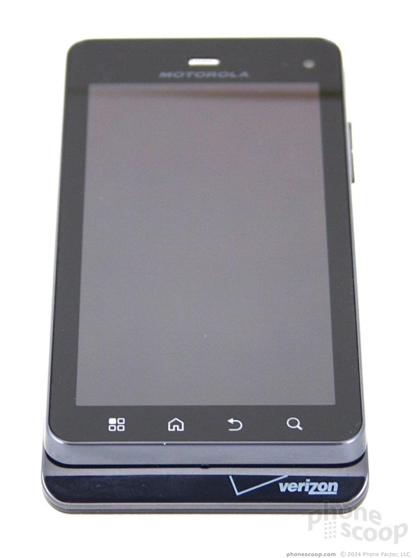
The Motorola Droid 3 is outrageously huge. With the larger display, the overall dimensions of the device have stretched to wow-that's-big proportions. It is taller, wider, and thicker, and thanks to the blocky, sharp edges, it feels enormous. It still has the chin at the bottom to maintain family lines.
It feels big in the hand. While the back surface has a pleasing soft-touch paint job and rounded edges, the top is slippery plastics and sharp edges. It's like Jekyll & Hyde in one phone. The build quality and materials are solid and the Droid 3 certainly doesn't feel cheap. Pocketable? Yes, but the weight and size will always remind you that it is stuffed in your pants.
The large front surface is nearly all display, save for the four capacitive Android controls at the bottom. These buttons worked most of the time, but I noticed they required a second press from time to time.
The microUSB and microHDMI ports are in the same spots as on the first two Droids, on the left, tucked close to the bottom. Neither has a hatch. The volume toggle is on the right side, near the top. It's a bit on the small side, but has excellent travel and feedback. Sadly, the Droid 3 loses the dedicated camera button that appeared on the Droid and Droid 2. Motorola offers no explanation, but I find this to be a disappointing change.
The power/lock key is on the top, and is easy to find and use. It has good travel and feedback. The 3.5mm headset jack is next to it.
The slider mechanism is not spring assisted. You have to slide it all the way up and all the way down. The Droid 3's full QWERTY keyboard is one of the best ever from Motorola. Motorola did a fantastic job improving the shape of the buttons and the action of key presses. The addition of a fifth row just for numbers is also a great help.
The space bar at the bottom of the keyboard is huge and can be pressed easily with either thumb. The keyboard includes dedicated period, comma, @, and forward slash keys for easier web site and email address entry. It has four directional keys to fine tune on-screen text editing, and, unusually, includes a Tab button, which will push the cursor to the next available text field. Handy. If you've been somewhat disappointed with the keyboard on the previous Droids (and, honestly, who didn't think the first Droid's keyboard stunk?), then you'll be much happier with the Droid 3.
The battery cover was a bit difficult to remove, but once you do, you'll be glad to know you can swap microSD cards without pulling the battery.
The Three S's
Screen
The Droid 3's screen jumps from 3.7 inches to 4 inches, and improves the resolution to qHD (540 x 960) quality. Translation? A great display by any standard. It's bright, colorful, sharp, and looks fantastic. Text, web pages, images, and such pop from the screen, and it's nearly impossible to spot individual pixels. Its only downfall is outdoor performance, where it is easily obscured by glare from the sun.
Signal
The Droid 3 is a 3G phone. It doesn't support Verizon's 4G LTE network. As far as 3G phones go, the Droid 3 performed well. I had no trouble using the Droid 3 no matter where I took it. I didn't miss any calls, drop any calls, nor need to redial any calls. Data sessions were solid, though not blazing fast. The Droid 3 was able to make calls even when the signal indicator showed zero bars of coverage.
Sound
Call quality wasn't great, but it wasn't a disaster, either. I noticed a lot of choppiness in phone conversations, with the sound dipping in and out frequently. Voices in the earpiece were often garbled. At least the earpiece volume was good. Set to the loudest setting, it was acceptable for most situations, though you might have a hard time hearing in loud environments. Call quality via the speakerphone wasn't great, either. Calls were just as choppy, and the volume was good, but not great. Ringers and alert tones were decent, though, and the vibrate alert was nice and strong.
Battery
The Motorola Droid 3 performed very well during my review period when it came to battery life. The first charge cycle was short, and the battery drained in about a day. Once past that initial bump, it did much better, lasting the better part of two days between charges. Step up use of the camera or video camera with flash, and I noticed a decrease in battery life. Normal use — browsing, social networking, playing music — didn't seem to tax the battery at all. Bottom line, you'll want to charge every night, but you won't be in trouble if you forget to.
Basics
Menus
The Droid 3 runs the latest version of Motorola's customized Android interface, though it is no longer being referred to as Motoblur. It's not stock Android 2.3 Gingerbread, but it's not far off, either.
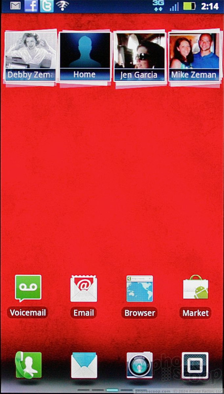
Motorola hasn't done anything interesting or innovative with the lock screen (such as what HTC does with its Sense software.) Instead, it mirrors what we've seen on other Motorola Android devices. The Droid 3 has five home screens. Verizon and Motorola have preloaded content on three of them, leaving two blank. As with any Android device, the home panels are yours to do with as you please. Load 'em up, or leave 'em empty. It's all on you to make it yours.
There's a set of four icons that are at the bottom of all five home screen panels, which provide access to the phone, messages, camera, and main app menu. The main app drawer is navigated from side to side, rather than up and down. There are 60 applications on board, 20 appearing on each screen. They are arranged alphabetically, but can be sorted into groups such as favorites, most recently used, and so on. There's a nice animated effect when you swipe from screen to screen.
The settings menu is essentially unmodified and works as expected. I wish Motorola had added some basic controls to the notification shade, as other manufacturers have been doing as of late. It didn't, and instead the notification shade only provides notifications.
Motorola hasn't done anything to really spice up the way Android works, but it definitely feels like a Motorola phone thanks to the (very light) interface skin.
A note on system performance: During initial set up (when you're syncing your myriad accounts to the device) performance is very sluggish. Any time you see the syncing symbol in the notifications bar (two arrows circling one another), the phone is talking to the network to get everything up to date. When those circles are visible, the phone will run a bit slow. Once beyond the initial sync, however, I noticed no problems in terms of speed and performance. Basically, give it a few hours to settle down before you freak out.
Calls/Contacts
Calls
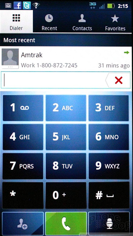
The phone application itself is a stock Android calling tool. You can use the software dialpad to peck out new numbers, or use the contact application to search for those whose numbers you already have. In-call features are unaltered from stock Android, which is simple to use.
Contacts
The main contact application is stock Android, but Motorola has developed a cool home screen widget for your favorites.
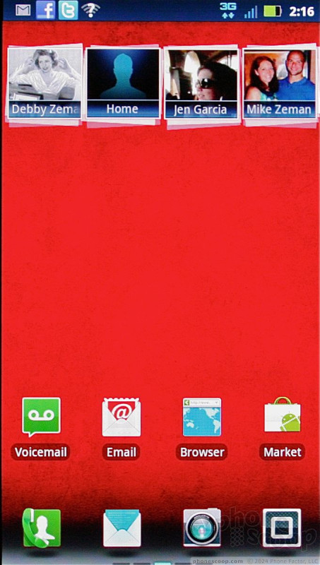
At the top of the central home panel, you'll notice four empty boxes at the top, with what appear to be other boxes stacked behind them. These are your favorites. Drag the set of boxes down, and the stacks will open up to show you a grid of your top 20 contacts, complete with photo ID. Tap the photo of your contact, and it will open a drop-down menu that offers a handful of quick actions, such as calling them, messaging them, or sending them a Facebook message. It's a neat little tool.
Messages
The Droid 3 comes with the usual flotilla of messaging and communications applications. It offers the standard Android email, Gmail, SMS/MMS, and GTalk applications.
The Droid 3 also includes a generic mobile IM application that is compatible with AIM, Windows Live Messenger, and Yahoo IM. This catch-all IM app does a decent job of handling IM conversations, and can manage a number of convos at a time.
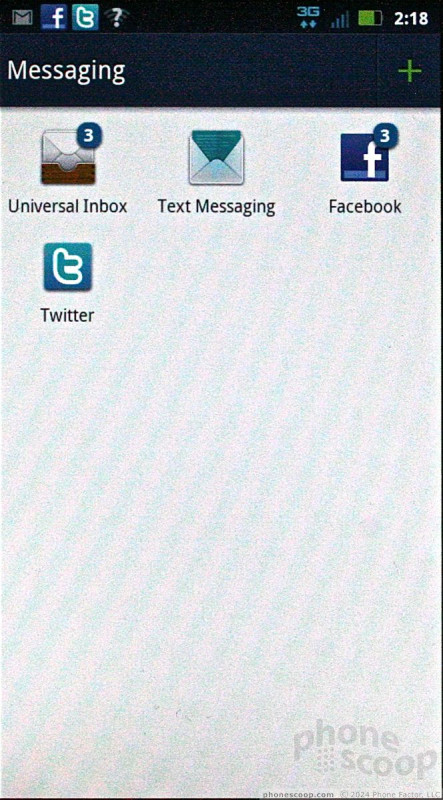
The Droid 3 also has a few carry-overs from Motoblur. It offers the master inbox, which catches messages from SMS, Twitter DMs, and Facebook messages all in one place. This tool is a decent way to manage direct communications for these social networking services rather than directly in those apps.
The Droid 3 also has a catch-all social networking application that helps manage status updates. It includes a home screen widget, from which you can scan through your Twitter, Facebook, and RSS feeds, as well as post your thoughts and musings. The stock Facebook and Twitter apps are not included, so if you want the full functionality that they offer, you'll have to snag them from the Android Market.
Extras
Media
Music
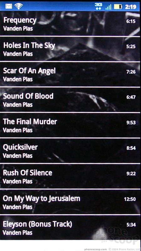
The Droid 3 offers several ways for users to enjoy music. First, you can side-load tunes to the stock Android music player application. This app is bare bones, but can interact with MP3s, AACs, and so on. Thankfully, Motorola has at least included some of the basic equalizer tools so you can shape the sound to suit your tastes.
The Droid 3 also includes Slacker for those of you who prefer to stream music to their handset. Slacker allows users to cache stations for offline use, which can come in handy when you're on an airplane.
Last, the Droid has access to Verizon's V CAST Music store, Media Manager software, and Tones. The Music Store and Tones Store offer music and ringtones for download at a cost of $1.29 per track for songs and $2.99 per ringtone (usury!).
You're welcome to download tons of other music apps/services from the Android Market.
Video
Video that has been captured by the Droid 3 or sideloaded to it is played back in the gallery application. I wish the Droid 3 has a stand-alone video player, because the Gallery isn't an obvious choice, but you can download a separate video player if you want.
The Droid also has the BlockBuster application for renting/buying movies, and the stock Android YouTibe application.
The Droid 3 includes DLNA sharing software, so content (images, video, etc.) can be shared via Wi-Fi with other DLNA devices, like you TV. You can also use the microHDMI port to attach the Droid 3 directly to an HDTV.
Camera
Camera
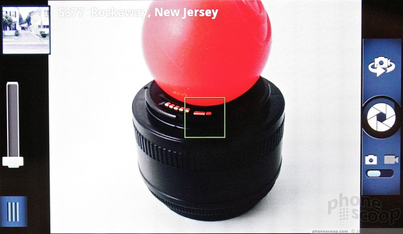
The Droid 3's camera is slower to open than I'd like it to be. It can only be launched using the app icon. The camera controls are nicely arranged and easy to figure out.
There is a focusing box that floats in the middle of the screen. Sadly, the Droid 3 does not include touch-to-focus. Instead, it focuses on whatever is in the box. On the left side of the screen, the Droid 3's camera has access to the photo gallery via a thumbnail located in the top-left corner. Below that is a slide for zooming in and out (the volume key doubles as a zoom key). Then there's a too-small button in the lower-left corner to access the Droid 3's full settings.
Press this tab and a little drawer slides out that provides access to six different control panels: Settings, Effects; Scenes, Sooting Modes, Brightness, and Flash. There's plenty to choose from when it comes to adjusting the camera's behavior. The effects are limited to colors, but the scenes range from portrait to landscape, and from close-ups to sunsets. It has an easy panorama mode for taking shots of wide vistas, which will help on that family vacation.
The shutter control is on the right side, as are the tools for switching to the video camera or the user-facing camera for self portraits.
The Droid 3's camera takes too long to focus. Well more than a second. Then there's an odd pause between when the camera finishes focusing, and when it actually snaps the shot. I wish the entire camera app performed much quicker.
Gallery
The Droid 3's gallery application is perhaps the most unique thing about it. It is entirely different from any other gallery app I've seen on an Android device before.
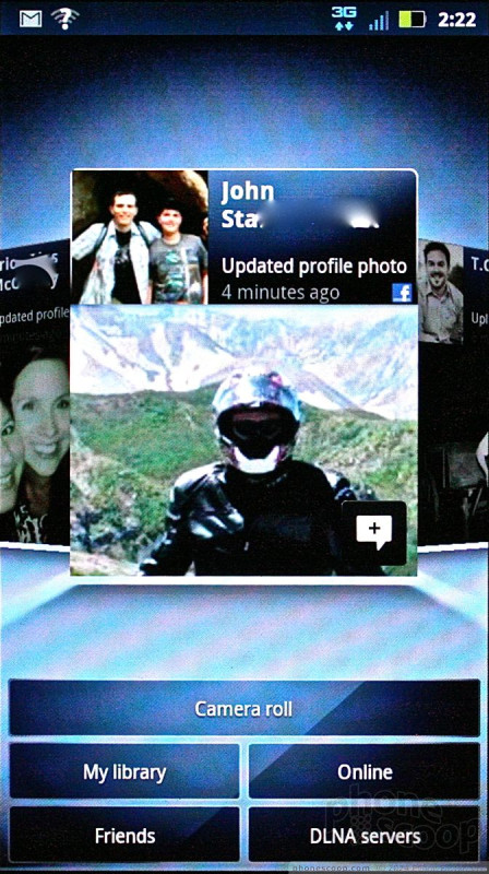
The first thing it does is segregate photo libraries. The default view, believe it or not, is not your own photos, but those of your Facebook friends. The images appear as cards floating in a carousel and you can scroll through them sideways. It's a breeze to add a comment, or open the photo in the Facebook app for full interactivity.
There are buttons below this carousel that open the camera roll, your image library, your online accounts (defaults to Picasa and Facebook), and DLNA devices. Its an interesting way to view images, and it places an emphasis on the social nature of sharing pictures with your friends and family. You can upload/share with tons of photo/social services, and even add comments to your own photos. The gallery can be set to support automatic uploads, which means photos will be sent to the one social network of your choice in the background with no further action required by the user.
As for the main device library, it lays things out in a grid of thumbnails and supports slide shows. The editing features are robust. The Droid 3 can adjust effects, colors, and brightness, as well as crop, rotate, flip (horizontal or vertical), and even resize the image.
The gallery app is another application that behaves a big sluggishly, but the wide array of features makes up for this a little bit.
Photos/Video
Photos
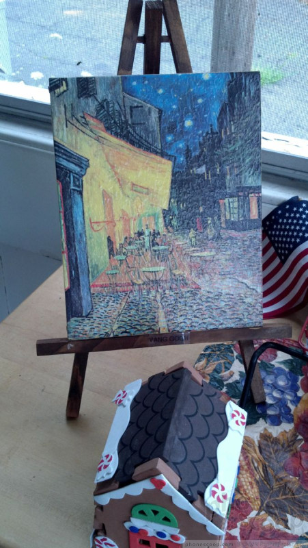
For an 8 megapixel camera, I was expecting much better. Focus was inconsistent, and never truly razor sharp. White balance was also inconsistent, though mostly correct. Color representation was typically good, but bright colors were very prone to overexposure and losing detail. The biggest disappointment, however, was the grain and noise in the photos. Even outdoor images showed too much graininess for my tastes. Can the Droid 3 take some really good shots? Sure, but excellent results are few and far between.
Video
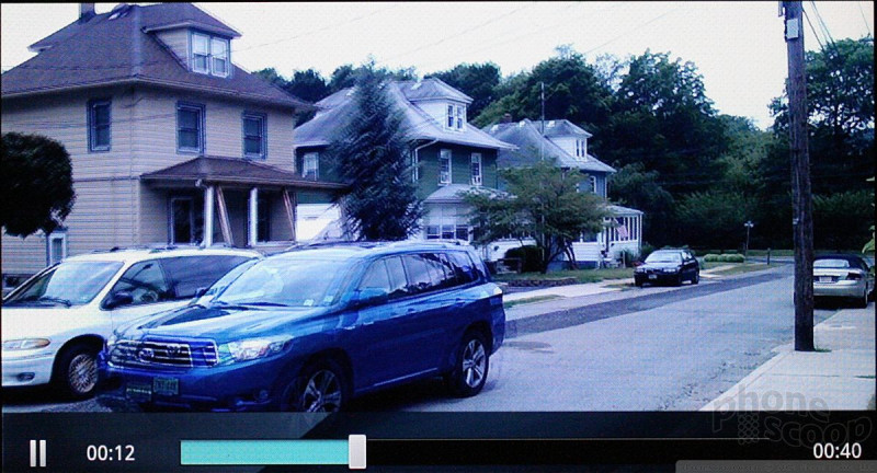
The clarity and sharpness of video captured with the Droid 3 (set to 1080p) was fantastic. It's a shame, then, that the Droid 3 has such an image stabilization problem. Even though I was holding the Droid 3 perfectly still, the video wobbles all over the place as if I were a crack addict going through withdrawal. While white balance, color, and that all look good, the jittery nature of the results gave me a headache.
Browse/Customize
Browser
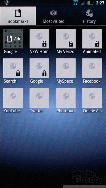
The Droid 3, as with every other Android device in creation, comes with the stock Android browser. It is a capable browser, and does well at rendering web sites on the Droid 3's display. Web sites load quickly, and the browser has a rich set of tools for interacting with bookmarks and so on.
Customize
With five home screen panels, the Droid 3 offers users plenty of room to adjust the phone's appearance, behavior and functionality.
The items unique to the Droid 3 include several Motorola widgets, such as the social networking widget, the favorites widget, the photo gallery widget (which also includes friends' Facebook photos,) and so on.
Extras
Apps
As mentioned earlier, there are 60 apps preloaded on the Droid 3, many of them Verizon and Google's own software/services. Some of the stand-outs include Amazon's Kindle app, BlockBuster, Golf, MotoPrint (lets you print via Bluetooth to compatible printers), and QuickOffice.
Bluetooth
The Droid 3's Bluetooth radio connects to phones, headsets, PCs, and speakers. I had no trouble pairing it with half a dozen different pieces of equipment. Phone calls placed through mono headsets sounded terrible. The same goes for music played through Bluetooth stereo speakers. Sending files between phones and PCs, however, wasn't a problem, and I was able to connect the phone to my car and see my address book just fine.
Clock
The Droid 3 has a large digital clock that is easily seen when the power/lock key is pressed. Reading the time outdoors, though, can be hit or miss. The Droid 3 also has a clock widget for use on the home screen panels. This widget is widely customizable, but the lock screen clock is not.
GPS
The Droid 3 includes both Google Maps and VZNavigator. Both are capable applications at providing voice-guided driving directions. The latest version of Google Maps supports 3D city views (in select cities) and map caching for offline use. VZNavigator doesn't do that, and costs $10 per month to use. VZNavigator's GPS performance is a little bit better and more accurate in my experience.
Video
Here is a video tour of the Motorola Droid 3. You can watch it here:
Or visit YouTube for more viewing and sharing options.
Wrap-Up
The Motorola Droid 3 is mostly good, but has a few glaring problems that bug me.
The hardware, while huge and chunky, works well and offers the best QWERTY on a Motorola phone that I can remember. Lovers of the physical keyboard will surely enjoy that of the Droid 3. Signal and battery performance were great, but sound quality of calls was a real problem in my book. If you spend a lot of time on the phone, you might want to look elsewhere. If you don't often make use of the gift of gab, then perhaps this fault can be overlooked.
The software tools on board the Droid 3 are as good as other smartphones. It handles messaging with ease, and offers a few unique tools when it comes to social networking, such as the universal inbox.
Media playback is good and the Droid 3 offers plenty of options for the media savvy user. The camera software and gallery in particular are very good. It's a shame the results of the camera and video camera were so average.
The Droid 3 is a satisfying sequel in the way that Toy Story 3 was. It's not as unique as the first, not as polished as the second, but still an overall good device.

Comments
oh hell naw
What, then?
Army of Darkness?
Chasing Amy?
Spiderman 3?
X-Men: The Last Stand?




















 Video Tour: Motorola Droid 3
 Samsung S24 Series Adds More AI, Updates the Hardware
 Motorola Previews razr fold
 Motorola Refreshes moto g power for 2026
 This Year's moto g stylus is a Better Value
 Motorola Droid 3


