Review: Motorola Droid Bionic
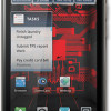
The Droid Bionic runs Android 2.3.4 Gingerbread and shows only the faintest of skins from Motorola. It acts very much like Gingerbread does on the Droid 3 and Photon 4G. It includes some nice widgets from Motorola, and the main menu slides left and right, rather than up and down. Most of the menus behave like stock Android.
There are five home screen panels that users can adjust at will. Only three of them have content loaded out of the box. There are four permanent icons (phone, messages, camera, main menu) in a dock at the bottom of the screen, but those icons can be changed if you wish. There is the usual flotilla of Android and Motorola widgets available to make the home screen more dynamic.
The settings menu is essentially unmodified and works as expected. I wish Motorola had added some basic controls to the notification shade, as other manufacturers have been doing as of late. It didn't, and instead the notification shade only provides notifications.
Motorola hasn't done anything to really spice up the way Android works, but it definitely feels like a Motorola phone thanks to the (very light) interface skin.
As for performance, the Droid Bionic is incredibly fast. It has a dual-core 1GHz TI OMAP 4 processor inside. Add this to the LTE radio and the 1GB of RAM and what you get are lightning fast screen transitions, smooth application performance, and no stuttering as the Droid Bionic moves from screen to screen and app to app.


 First Look: Motorola Droid Bionic
 Motorola Droid Bionic Goes On Sale Sept. 8 for $299
 FCC Docs Show Revised Droid Bionic in Full Form
 Motorola Refreshes razr Lineup with Better Batteries & More
 Motorola Droid Bionic


