Review: Apple iPhone 4S for AT&T
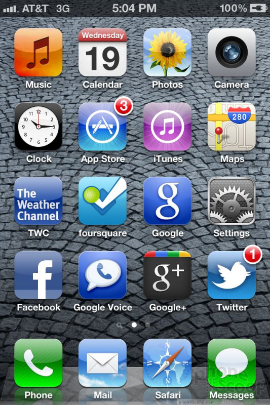
The iPhone 4S ships with the latest version of Apple's mobile operating system: iOS 5. The basic behavior of the menus, home screens, and such remains the same. The biggest and most important change to come to iOS is the behavior of notifications.
iOS 5, thankfully, completely rewrites the notification functionality. Most applications that can send/push notifications (email, SMS, Twitter, Facebook, etc.) have their own notification controls for the tweaking. In earlier versions of iOS, incoming notifications popped up in the middle of the display, interrupting your current task and generally pissing most people off. With iOS 5, they more gracefully pop up at the top of the display, don't need to be dismissed, and can be ignored if you so wish. If you want to act on a notification, simply swipe it to the left and you'll be taken to the incoming message/alert. Some notifications can be sent to the lock screen. This means you phone lights up when there's a new message. Use this with care, you don't want the screen turning on every time you get an email. Text message and Twitter DMs are the only apps I granted "lock screen permission." You can also turn off notifications completely.
Notifications eventually pile up in the notification tray, which acts just like it does in Android. Swipe down from the top of the display, and you see a list of missed calls, unopened emails, and unread SMS messages. It also shows the weather, stocks, Facebook and Twitter messages, and more if you want it to. Press the notification in the tray to do directly to that message.
After using the new notifications for several days, this system is much better than the previous system, and is more flexible than the notification system offered by Android. The ability to fine-tune how each individual application notifies you offers a lot of power.
Using iTunes, or on the iPhone 4S itself, it is easy to create folders with multiple apps, to rearrange all the apps on the screens and set up a nearly unlimited number of home screen pages. Swiping back and forth isn't a problem. Doubletapping the home key opens up the fast-app switching tool at the bottom of the screen, making it easy to jump to other open applications.
The settings menu gets longer and longer with each new version of iOS. In iOS 5, users have even more control over minute application behaviors. While this menu used to be easy to navigate, it now takes a lot longer to go through. It is still easy, but if you really want to control everything, you need to keep digging.


 Review: Apple iOS 7 from A to Z
 Google Makes Wallet App Available to iPhone
 Microsoft Brings Office to the iPhone, But Not for Free
 Google+ for iOS Updated with New Photo Tools
 Aio Wireless Kicks Off Today with Nokia Lumia 620
 Apple iPhone 4S


