Review: Motorola ic402
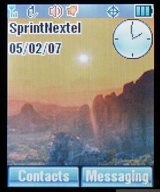
Because the ic402 is a bare bones phone, it takes about 3 seconds to figure out and use the menu system. When the phone is first opened, the screen shows 5 menu selections that correspond to each of the 5 possible D-pad buttons. Up for messaging, right for content, down for call log, left for the calendar, and center for the main menu. The soft keys will jump you directly to contacts and messaging. Of course, this can be changed, slightly.
Using each of these menu features is simple and direct. The ic402 has a truncated feature list, and this correlates to short menus. It's rare that you select a menu item and are presented with more than 3-5 choices in that menu. Three seems to be the average. This equates to quick navigation as there simply aren't a lot of menus to explore.
Hitting the center of the D-pad takes you to the main menu screen and lists all the major selections you'd expect: notes, messaging, contacts, PTT, call log, Web browser, tools, content and settings. Each of the icons performs a little animation as it is scrolled over. The menu can be seen in grid, list or tabbed views. The grid view is the default setting. In both grid and list views, you can use the keypad for shortcuts to the menu selections. This is not true in the tabbed view. You have to scroll sideways to select each menu item, which will appear as a large icon in the center of the screen as you scroll over it. The tabbed view resembles the Verizon Wireless standard UI a bit, but there are few options under each tab. Users can customize the 5 main D-pad selections, but that's about all the leeway you have.
As expected, the settings menu has the largest number of selections in it and is the most extensive. Using the D-pad is intuitive in making selections and adjustments and there are no surprises. One thing of note in here is that some of the selections have quick pull-down adjustment tabs. For example, most selections just state what they are, like "Greeting Banner." If you want to change the banner, you select it and it takes you to another page where you make any changes. Others, like "Menu Style", feature a visible drop-down menu that you can select, and it shows you the two or three choices you can make without jumping to a new screen. This helped speed up making simple adjustments to the phone.




 CES 2007 + iPhone
 iPhone 15 Series Goes All-In on USB-C and Dynamic Island
 Qualcomm Expands Snapdragon 8 Series to Cover More Price Points
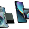 Motorola Gets Serious About Foldables with New RAZR Lineup
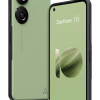 ASUS Zenfone 10 Flagship Keeps it Small
 Motorola ic402 Blend

