Review: Treo 755p
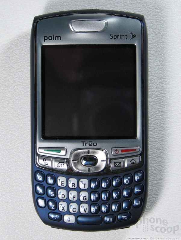
The Treo 755p and 750w share the exact same body. The only thing that is different about it are the navigation buttons that surround the D-pad. Because they are the same shape and even color, they will be difficult to tell apart. The 700w and 700p were equally similar.
The body is a sleeker, and yet more comfortable take on the classic shape of the 700w and previous Treos. It is ever so slightly thinner and narrower than the previous design, but much more comfortable to hold thanks to concave sides and a soft-touch finish. And, of course, it looks sleeker too now that Palm has finally lopped off the antenna.
The 755p retains the thick profile and rounded back of previous Treos, which keep it from fitting nicely in your pocket, but helps it to fit nicely in your hand.
Although the 750w and 755p share the same body, they do not share the same specs, but believe it or not, they are the exact same specs as the 700p. Palm has simply taken the 700p's guts and wedged them in the 750w's body.
Typing with the Treo is difficult. Despite the fact that we now have more experience with its keyboard (having previously reviewed the 750w), we still had the same difficulty typing on it. The keys are small and spaced very close together. This tight spacing combined with the domed shape of the keys makes it very difficult to hit the right letter.


 Video Tour: Treo 755p
 iPhone 15 Series Goes All-In on USB-C and Dynamic Island
 Motorola Gets Serious About Foldables with New RAZR Lineup
 OnePlus' New Mid-Range Phone Has a 108 Megapixel Camera
 Qualcomm's New Chip for Entry-Level Phones Moves to 4nm
 Palm Treo 755p


