Hands-On: Google Nexus 5
Nov 4, 2013, 2:23 PM by Eric M. Zeman
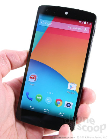
Phone Scoop takes a first look at the Nexus 5 from Google and LG. Here are our initial impressions.
Google recently announced the Nexus 5, a new Android smartphone made by LG that runs the "stock" or native version of Android. Like last year's Nexus 4, the Nexus 5 is a variation of a handset from LG. The Nexus 5 is based on many of the same components as the LG G2, though there are still plenty of differences between the two.
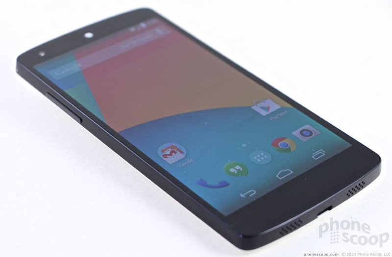
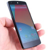
The Nexus 5 is a plain-looking handset. It is almost devoid of any design elements, beyond the basic shape. It has the general look that has come to be associated with Nexus handsets, but is even more spartan in its appearance than last year's minimalist Nexus 4. The Nexus 5 is as simple and boring as it gets, folks.
The Nexus 5 is a big phone. It's significantly taller than the Nexus 4, and even out-sizes the HTC One. Thankfully, it falls well short of Galaxy Note 3 dimensions. It measures 5.41 inches tall, 2.72 inches wide, and 0.34 inches thick (8.59mm). The width is right on the border of being too wide, but manages to keep shy of breaking that barrier. It is delightfully thinner and lighter than the Nexus 4. In fact, that's the first thing I noticed when picked it up: it has a really nice feel to it. It will easily slip into pockets, though the length and width remind you that it is there.
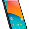
The front of the N5 a clear black panel of glass. There are no buttons, physical or capacitive. The N5 uses Android's on-screen buttons that come and go when needed. The bezels along the sides of the display are fairly thin, though not as impressive as the one's on LG's G2. There's an odd, circular earpiece speaker grill that is plainly visible, as is the small lens for the user-facing camera. Those are the only physical markings on the black glass surface, though.
The back panel is gently curved in an arch to more comfortably fit into the hand. The Nexus 5 replaces the glass back panel of the Nexus 4 with a plain polycarbonate panel instead. It is overly simplistic, but matches the Nexus 7 tablet's design thanks to the large, etched "NEXUS" branding. The camera module is larger than I expected it to be, and it has a pronounced ring that sticks up and circles the lens.
There's something to be said for simplistic designs - the design doesn't get in the way of usability. The Nexus 5 avoids the one critical flaw LG made with the G2: The volume toggle is on the left edge of the phone rather than on the back. According to Google, the buttons themselves are made from ceramic. Both the volume toggle and the screen lock button (on the right side) have sharp profiles. The buttons have edges that make themselves felt and you're thumb is seeking them out. The travel and feedback of both buttons is quite good. I am so glad they are on the side edges and not the back.
The N5's back cover is not removable, which means neither is the 2,300mAh battery. There's a tray for the SIM card placed adjacent to the screen lock button. There's no slot for microSD memory cards, though. The N5 supports wireless charging, NFC, and LTE.
Perhaps my favorite feature of the Nexus 5 is the display. It measures 5 inches across the diagonal and jumps to 1920 x 1080 full HD resolution. It is an in-plane switching LCD, of which LG is fond, and is clear, bright, and crisp. Details look sharp, and the high pixel density means there are no rough edges to text, icons, or graphics. It did tend to get a bit washed out when viewed under a sunny sky, though.
The Nexus 5 is the first device to ship with Android 4.4 KitKat. After spending just a little while with the phone, here are some initial thoughts.
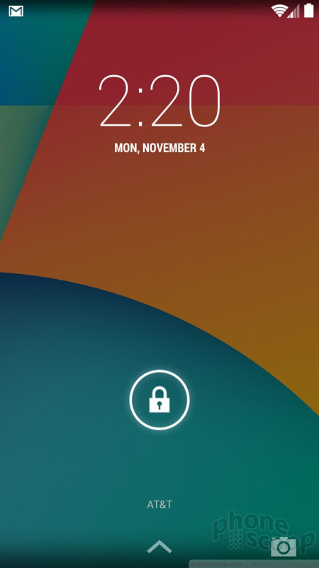
First, the lock screen feels less cluttered than in Android 4.3 and offers more-easily-discerned shortcuts to Google Now and the camera. The home screen panels aren't too cluttered out of the box. The central screen has a handful of apps. New icons for some of Google's core apps, such as the phone dialer, abound. The Hangouts App is now the SMS/messaging application.
Second, Google Now is baked into the home screen set-up. Sort of like HTC's BlinkFeed, the left-most home screen panel is reserved for Google Now. You can customize it to include numerous cards, and it automatically carried over my Google Now settings from the Nexus 4. Further, the search bar is almost always visible when on home screens. Voice search is just a spoken "Ok Google" away.
The main app menu behaves just as in earlier versions of Android, as does the settings menu.
At first blush, before installing too many apps, the Nexus 5 ran smoothly and didn't exhibit any trouble with scrolling, app launches, or screen transitions. A couple of quick test calls were OK, but not great in quality. We need more time to asses that feature, though.
Phone Scoop plans to publish an in-depth review of both Android 4.4 KitKat and the Nexus 5 in the days ahead. Stay tuned for more Nexus 5 coverage!
Comments
Design is actually pretty nice
Why no MicroSD?!
(continues)
The point everyone seems to be missing
And then there's Linux(yes I realize Android is Linux), possibly the most fragmented OS - ever. And no one is complaining about it . In fact, fragmentation is the very thing that has made Linux both awesome and successful.
Heck the only significant OS I know of wit...
(continues)
1) Linux (traditional builds such as Ubuntu, etc.) has practically no consumer desktop adoption. (Rightly so, desktop Linux has not kept pace with OSX and Windows.) Its penetration is limited to server applications. ...
(continues)
disappointed
(continues)
The common m...
(continues)
Also, why I don't think this phone is premium.
Speaker DOES NOT work
I don't recommend LG either...
(continues)






 Use Different Camera Apps to Improve Photo Quality
 Review: Google Nexus 5
 FCC Reveals Photos of Possible Nexus Made by LG
 Google Nexus 5 Now Available in Red
 Google Reveals Nexus 5 with Android 4.4 KitKat
 LG Nexus 5


