Review: Motorola Moto G for AT&T
Dec 9, 2013, 4:30 PM by Eric M. Zeman

The Moto G is a low-cost Android smartphone that might aim low, but it hits the mark.
Is It Your Type?
Motorola is aiming low with the Moto G, a $180 Android smartphone that lacks some of today's must-have features in exchange for solid performance as an entry-level phone. Motorola is selling the Moto G directly to consumers who can then pair it with the unsubsidized plan of their choice. If you're contract-averse and on a budget, find out why the Moto G might be the best choice for you.
Body
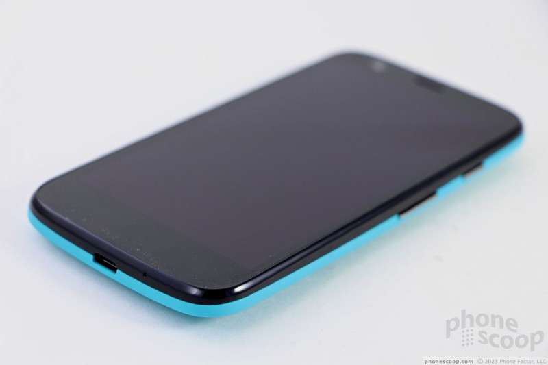
The Moto G strongly resembles the Moto X. In fact, most people won't be able to tell the difference between the two, even held side-by-side. The shape is the same, the button and port placement is the same, the design and accents are the same. It is in no way flashy or high-class. Rather, it's a decent-looking device that's made for the masses.
The G comes in either white or black. Unlike the Moto X, the G's design cannot be customized with Moto Maker. In order to appease people who want to put some personality into their phone, however, Motorola offers exchangeable rear covers for the G. Our review unit is black, but we were happy to remove the boring black shell and slap on the aquamarine one instead.
The front of the G is rather plain, but the overall footprint is compact. The G has the same contoured shape of the Moto X. Motorola said that the sculpted shape of the back surface helps the G (and X) fit better in the hand. The G is a hair bigger than the X is every dimension. The most noticeable increases compared to the X are the thickness and weight. I could tell as soon as I picked it up. It's not terribly thick or atrociously heavy, but at 11.2mm, it's not slender, either.
The sides are rounded to meet the glass panel on the front. This further smooths out the profile. There are no hard edges or corners; everything about the design is round. There's no denying that it's a comfortable device to hold and use. It's very easy to reach any part of the screen with your thumb. It will easily fit into any pocket.
The materials are good, but could be a little bit better. The back surface of both the stock and secondary rear covers has a soft-touch finish to it. The plastic that exists between the G's glass display and the back surface feels a little cheap to me, but all of the seams were snug.
There's less screen filling up the front space of the G when compared to the X (not that you notice when the screen is off). The bezels on the side of the phone are of average thickness, and there's plenty of bezel above and below the screen. There's a small slit in the glass at the top where the earpiece is located.
There are only two physical controls and both are on the right edge of the G. The screen lock key is nearest the top and the volume toggle is below it, closer to the middle. Both buttons have an excellent profile, making them easy to find. The travel and feedback is also quite good. The stereo headphone jack is on top and the microUSB port is on the bottom. There is no dedicated camera button.
The G's back can be removed, but you're not swapping out the battery. The battery is sadly enclosed. There is no memory card slot, so you won't be expanding the device's on-board storage, either. The SIM card is tucked into the right edge of the phone and can be removed by pressing it inward with your thumbnail.
I like the design elements Motorola carried over from the X, but it would be nice if the G had a bit more of its own personality.
Comments
White or Black??
Moto G for T-Mobile?
I love T-Mobile and am not a fan of AT&T, but are you high? My experience with AT&T was far superior to T-Mobile especially while traveling and I don't think I'm in the minori...
(continues)




 Motorola Refreshes Gallery App
 Grip Shells for Moto G Now Available from Motorola
 Moto G Available Directly from Google As Play Edition Phone
 Moto G Available to US Consumers on Motorola Site
 Motorola Announces the Moto G for $179
 Motorola Moto G (GSM, 1st gen.)


