Review: HTC One for Windows
Menus
The One runs Windows Phone 8.1, which is the latest version from Microsoft. Phone manufacturers are not allowed to customize Windows Phone like they are Android, so the One behaves much like every other handset running Windows Phone 8.1, with a few key differences.
Nearly all Windows Phones have permanent buttons below the display for controlling the device. The One for Windows does not. Instead, HTC created a software nav bar that comes and goes when needed, much like Android. I found this hard to get used to. Though the nav bar appears with a swipe up from the bottom of the screen, it's an extra step not needed on every other Windows Phone handset. It also eats into the real estate on the screen, shortening the visibility of apps/menus just a little bit.
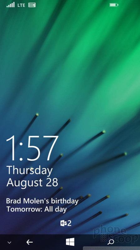
The lock screen is much more customizable than on earlier versions of Windows Phone. It always shows the time, but can also be set to show missed calls, calendar appointments, as well as the number of unread emails/messages, Twitter DMs, and Facebook mentions. The lock screen is dynamic, and can show breaking news stories from CNN, or trending topics on Twitter complete with images and text, if you want.
The Start screen is a fairly flexible space that's quite different from what's offered by Android and iOS. Apps appear as Live Tiles, or dynamically changing squares/rectangles. You can arrange the Live TIles however you wish. Most Live Tiles can be sized in small, medium, or large. Windows Phone 8.1 allows users to create three columns of Live Tiles on the Start Screen. The Start screen can be infinitely long, and also now supports Live Folders. Just like stand-alone apps, the Live Folders will update along with the apps contained therein. One neat trick from WP8.1: the Live Tiles can be made transparent, so you can actually see the wallpaper you've chosen for your phone.
The main app menu is more or less the same as it was when Windows Phone 7 launched in 2010. It's a long, alphabetical list of all the apps installed on the phone. If you have a lot of apps installed, it can take a while to scroll to the bottom. The one thing I really like about Windows Phone is that you can uninstall any app on the phone, even the bloatware loaded by Verizon. The settings tools are also carried over from earlier versions of Windows Phone. They consist of thin white text on a black background. Since they aren't arranged alphabetically, it can take a while to dig through them.
Last, the Action Center is a just a swipe away on nearly every screen. The Action Center, which behaves just like the notification shade in Android and iOS, offers shortcuts to wireless radios, rotation controls, and all your notifications. I like that notifications tell you only how many new emails or phone calls you've received since you last checked, and that notifications from select apps can be deleted in bulk.
The One for Windows Phone's performance is unequalled. It is flat out the fastest phone I've ever used. The four-core Snapdragon 801 is a beast and pushes Windows Phone to its limits. You're not going to have any problems running multiple apps at a time.
Calls and Contacts
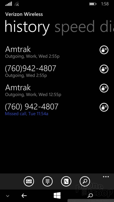
The phone app and People Hub haven't changed all that much over the years. The phone app is spartan almost to a fault. Its stark user interface is plain and simple. You swipe between several different screens that show your call log, speed dials, and dialpad. Connecting calls is a cinch, and in-call options include Skype, Bluetooth, speakerphone, mute, hold, and add a line. They are all simple to use.
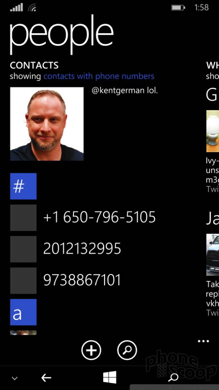
The People Hub is its own bustling social network of sorts, thanks to integration with Twitter, Facebook, and LinkedIn. Not only can you find your friends' and colleagues' email addresses, but you can also see their most recent social network status updates. The People Hub also highlights you, and reminds you of what you last said on those various networks. Of course, the Hub also holds your non-social network contacts and can sync with a number of contact services, such as those that accompany Hotmail, Outlook, Gmail, and Yahoo Mail. The contact cards are easily edited and are chock full of info.
Messaging
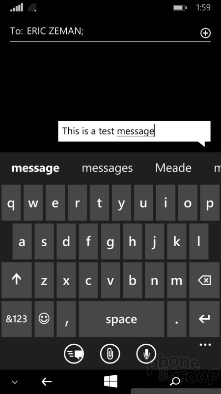
One of my favorite features about Windows Phone 8.1 is the WordFlow keyboard. It supports trace input (like Swype), and is excellent at predicting your next word. It makes typing so much easier and faster.
The SMS/MMS messaging app is decent. It manages conversations well, and of course displays them in threads. I like that you can back up your SMS convos to the cloud, as well as set read receipts. The SMS app also handles emergency alerts, such as those concerning weather or natural disasters. You can turn off all but Presidential Alerts (the most severe type) if you want.
The Windows Phone email client is a solid piece of software. It plays nicely with Exchange, POP, and IMAP, which means most internet-based email services are supported. The setup tools make adding email accounts a breeze. The tools for reading through your inbox are good, and I like the way it handles threaded email conversations. Even better, you can pin individual email accounts to the Start screen, or merge them into a single master inbox.
Skype and Facebook each have their own messaging client for Windows Phone.
Verizon did not place a version of its Messaging+ app on the One for Windows, but it did include its Integrated Messaging service. With Integrated Messaging turned on, users will be able to send, receive, and sync their messages between phones, tablets, and computers. It's handy if you want to be able to send text messages — from your own number — with a computer or other keyboard-equipped device.










 Hands-On: HTC One for Windows Phone
 Motorola Gets Serious About Foldables with New RAZR Lineup
 Fairphone 4 Comes to the US
 Google's New Fitbit Blurs the Line Between Tracker and Smartwatch
 Boost Updates its Celero Phones for 2024
 HTC One (M8) for Windows (CDMA)


