Review: Motorola Droid Turbo for Verizon Wireless
Menus
Like most of Motorola's devices, the Turbo has a relatively clean version of Android on board. The device ships with KitKat, but will be updated to Lollipop in relatively short order after its release. The phone comes with Motorola's suite of apps, which add considerable utility to the device.
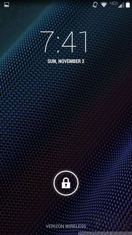
The lock screen uses Motorola's Active Display tool. Active Display brings the clock and notifications to the screen (when it is locked and off) without turning on the whole display. Instead, it only shows the time and select icons in white on a black screen. You don't have to push any buttons to check the time or see if you have any new emails. If the Turbo is sitting on a desk, it will automatically light up the Active Display when a new email or message arrives. It will then pulse on and off with that notification until dismissed. Active Display will turn on when you nudge the Turbo, when you turn it over, when you pull it out of your pocket or bag, when you shake it, and pretty much any time you move the phone. It will also turn on if you wave your hand over the phone or even simply reach for it. It's really, really useful and works whether or not you have a password.
The rest of the menus operate exactly as they do on any KitKat phone. There are three home screens active out of the box, and of course Verizon littered them with widgets and shortcuts. Thankfully, it only takes a few moments to customize the panels to suit your own needs. The app menu is laid out in a clean grid. Apps are listed alphabetically, but you can drop them into folders if you want. There's no list view.
The settings menu is the same old white-text-on-black-screen we've seen from Android since Ice Cream Sandwich. It is simple and straight-forward to use. Similarly, the notification shade is devoid of fancy extras. Instead, it offers only access to notifications (swipe with one finger) and access to the control panel (swipe with two fingers).
The Turbo skips the Snapdragon 801 processor found in the Moto X and uses the Snapdragon 805 instead. This is a big deal. The 805 is the most advanced processor available from Qualcomm and it absolutely screams inside the Droid Turbo. This 2.7 GHz quad-core beast can tackle all of your processing needs. The Turbo showed no signs of lag and none of the apps crashed.
Calls and Contacts
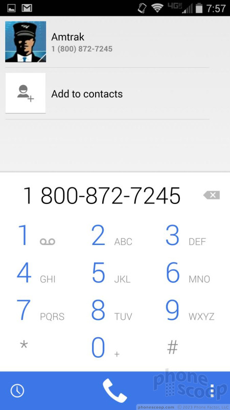
All the core communications tools aboard the Droid Turbo are the stock Android apps from Google. The phone app, which is located in the dock at the bottom of the home screen panels, opens in a jiffy. The call log, dialer, and contacts are sorted into tabs. You swipe sideways to switch between them. Google assumes most people will initiate calls from their contacts or favorites list, rather than actually dial numbers, so the dialer's importance is downplayed.
The contact app can pull in contacts from myriad sources, including Google, Yahoo, and Microsoft/Exchange. Contact details can also be pulled from your social media accounts (Facebook/Twitter) to help flesh out contact cards. The contact app lets you put direct dial/message shortcuts on the home screen if you wish, but there isn't a larger home-screen widget for contacts.
Messaging
The Droid Turbo comes with Gmail, email, messaging, Hangouts, and Google+.
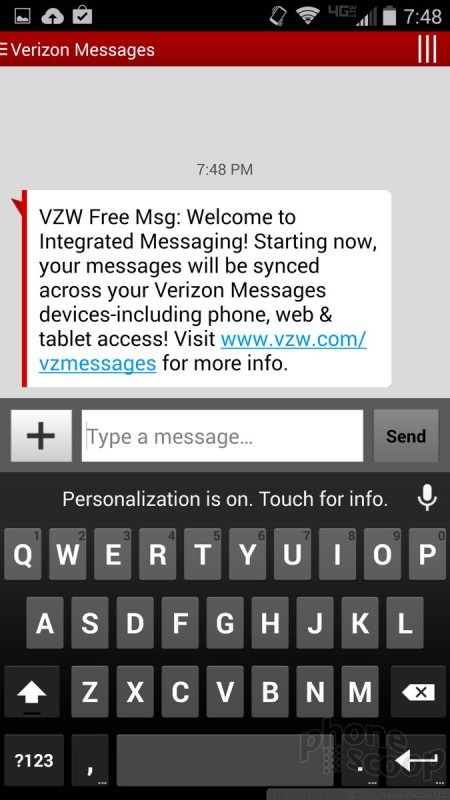
Verizon Message+ is set as the default messaging application and it handles SMS/MMS. Verizon Message+ offers access to some extras. For example, it includes its own set of animated emoticons and can be used to create a postcard, to record a voice message, or to send your location via Glympse.
If you don't like Verizon Message+, you can set either the plain messaging app or the Hangouts app to handle SMS/MMS functionality. Google recently updated Hangouts to include some Google Voice messaging functions. The latest version is a bit sloppy and confusing. (It's not as intuitive as it used to be. Google can do better.)
There are no social networks preinstalled, so you have to snag Facebook and Twitter on your own.


 Hands-On: Motorola Droid Turbo for Verizon Wireless
 Motorola Droid Turbo Boasts 48-Hour Battery Life
 Motorola Refreshes razr Lineup with Better Batteries & More
 Motorola Droid Turbo


