Review: Samsung Galaxy S8+
Apr 18, 2017, 11:00 AM by Eric M. Zeman


Samsung Galaxy S8+
The Samsung Galaxy S8+ is a heavy-hitter that trounces much of the competition. This Android flagship from the world leader in smartphones struts its stuff with pride, despite several pain points that hold it back. The Galaxy S8+ is the bigger brother to Samsung's Galaxy S8 and impresses in nearly every way. Here is Phone Scoop's in-depth review of the Galaxy S8+.
Hardware
Is It Your Type?
Samsung's Galaxy S smartphones are the company's flagship devices. These phones set the bar for the industry, often pushing the boundaries of technology and design. The Galaxy S8+ masterfully combines function and form in a way no other phone company has yet been able to achieve. The Galaxy S8+ is for those who want the best of the best, and are willing to pay for it.
Body
The Galaxy S8+ is a generational leap forward, not only for Samsung, but for all phones. Many aspects of the S8+'s design signal a new path that the rest of the industry will be forced to follow in order to remain relevant. That's what it is to be a market leader, to push boundaries — real and imagined — in a way that challenges everyone. The result of Samsung's hard work is a stunning piece of technology.
Samsung managed to mix evolution and revolution such that the S8+ feels familiar, yet entirely new. The Galaxy S6 saw Samsung break from its plastic past for metal and glass. Samsung refined that design aesthetic in the highly appealing 2016 Galaxy S7. The S8+ takes the metal and glass build of the S7 and smooths out all the rough edges. The glass surfaces of the S8+ curve and flow into the metal frame seamlessly. More so than any phone I've used thus far, the S8+ feels like a singular unit rather than an amalgamation of parts. The metal frame is visually indistinguishable from the glass around it on our black review unit thanks to a matching, shiny finish. The uniformity of the shape, the thin profile, the luscious materials all contribute in making the S8+ something to lust after.
Thanks to the new screen aspect ratio, the S8+, like the LG G6, has an oblong shape. The phone is narrow, yet very tall. The S8+ is the bigger of the two phones and more closely matches the size of the Apple Phone 7 Plus and Google Pixel XL. The S8+ is taller than the 7 Plus and Pixel XL, but narrower. The S8+'s waist is noticeably thicker than the regular S8's but it's still manageable. The phone's thin and rounded profile help it sit more comfortably in your palm. The S8+'s tall shape requires a real adjustment on the part of the user. It's almost impossible to reach the top of the screen with your thumb without really juggling the phone in your grasp.
I'm used to large phones and found I adjusted to the shape and size after a few days. Many people, including those with smaller hands, may not be able to use this phone comfortably. It's often a two-handed device. What's it like to carry the phone around? It almost vanishes into my pocket, but not quite. If you have extra deep pockets, you might forget it's there. It's big, and yet the thin build helps a lot.
You'll be hard-pressed to find a more finely built handset than the S8+. Samsung selected high-quality Gorilla glass and strong aluminum, and pieced them together flawlessly. The seams between metal and glass are practically nonexistent. Samsung has mastered the art of curved glass. The Galaxy S8+ is an expert vision in design, materials, and manufacturing.
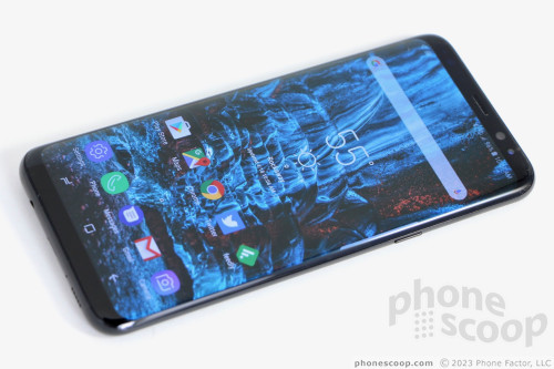
Samsung's marketing team conjured the term "Infinity Display" for the S8+'s front face and the experience is wholly different from past Galaxy S handsets. Bezels above and below the display are all but gone on the S8+; the phone's face is nearly all screen. Samsung practically eliminated the side bezels thanks to the curved screen. The bezels above and below the screen are minimal. I dig it big time. With no interruptions to the glass, the front face is left entirely smooth. The earpiece grille is almost invisible. Your eyes might find the user-facing camera and iris reader easily, but two sensors also located above the screen are nearly impossible to spot in the black glass. (All colors have a black front, to enhance the display design.) Samsung didn't even bother to cram its logo anywhere on the front face; that's how committed it is to the notion of the Infinity Display and the uninterrupted experience it presents.
I love the way the slim metal frame wraps around the outer edges of the phone. The frame is only a couple of millimeters thick along the sides, but it swells up at the top and bottom. You may notice some antenna lines, but they are color-matched fairly well.
Two buttons are located along the S8+'s left edge. The top button is the volume toggle. It's only about an inch long, which makes it a bit too easy to accidentally press up when you mean to press down, and vice versa. The second button is dedicated to Samsung's Bixby personal assistant tool. The lock button is where you expect it to be on the S8+'s right edge. All of the side buttons have an excellent profile, and perfect travel and feedback. Samsung tucked the nano SIM and microSD memory card tray in the phone's top edge. A tool or paperclip ejects the tray, which accommodates one of each type of card.
Thank goodness the S8+ makes the jump to the superior USB-C connector. (Last year's Galaxy S7 perplexingly stuck with the older microUSB.) For many people upgrading from older Galaxy S phones to the S8+, the USB-C port will be a change that may require some new cables and/or accessories. Be prepared. Samsung also squeezed a standard 3.5mm headset jack and the speakerphone onto the S8+'s bottom edge. The headphone jack is nice to have, considering some flagships (iPhone 7, Moto Z, U Ultra) dropped it.

Like the front, the S8+'s rear panel is nearly all uninterrupted glass. One bummer: it is prone to fingerprints. We're talking Fingerprint City here. If you leave it exposed, you'll find yourself wiping oily grime off the back constantly. I'm glad Samsung was able to set the camera module flush with the rear surface (it protruded on the S7). The flash and heart rate monitor are off to the left of the camera, also flush with the surface.
Then there's the fingerprint reader, which is placed immediately to the right of the camera module. If there's one major design flaw in the Galaxy S8+, this is it. I'll tell you why.
Nearly all phones with a rear-mounted fingerprint reader have them in the same spot: in the middle of the phone, below the camera sensor. It's a natural place for your index finger to rest. The S8+ screws with this familiarity but putting the fingerprint reader too high, and too far to the right. It can be hard to reach and tricky to find. Moreover, its proximity to the camera module more or less ensures you're going to get fingerprints all over the lens, hampering photo quality. This is such an issue — and Samsung knows it — that the camera app regularly reminds you to wipe the lens clean. This is exacerbated if you're a lefty.

There's no question the fingerprint reader of the S8+ is harder to find and use than that of the S8. The size of the phone is a hindrance, considering many people grip their phones closer to the bottom. You really have to stretch your finger to reach the reader. Still, I was able to adjust to the fingerprint reader's positioning after a few days. It's worth pointing out that using a case makes the fingerprint reader a bit easier to find.
Like the Galaxy S7 (and iPhone 7 Plus), the S8+ is rated IP68 for protection against water, dust, dirt, and sand. Technically, it can sit in 1.5 meters (~5 feet) of water for up to 30 minutes with no worries. In reality, I found it handled running water, a bath, and other wet abuse just fine. Waterproofing is a table-stakes feature that Samsung has implemented well.

Durability is another matter. The phone may be protected by Gorilla Glass 5, but dual curved glass surfaces mean the phone is twice as likely to shatter when dropped. Putting a case on a phone this pretty is a crime akin to covering a Porsche in armor plating. Alas, this pricey technology investment may warrant a case.
The Galaxy S8+ is close to flawless. It has the fewest compromises of any device I've used. Aside from the oddly placed fingerprint reader, the S8+ is a svelte head-turner that finely balances form, function, and raw emotion.
Screen
The S8+'s display is eye-popping. Similar to the LG G6, Samsung has adopted a new aspect ratio for its flagship phone. Where LG went with an 18:9 (or 2:1) ratio, Samsung went with an odd 18.5:9 ratio. It's nearly 2:1, but slightly taller. The screen measures 6.2 inches across the diagonal, with 2,960 by 1,440 pixels. Of course, the phone relies on Samsung-made Super AMOLED display. The aspect ratio makes it look tall and narrow, and it is. The display also supports mobile HDR video for incredible color range. This "Infinity Display" is infinitely appealing. It's just amazing. I can't heap enough praise on it. The resolution is second-to-none and the S8+ delivers razor-sharp text, images, and graphics. The display is very bright and easy to use indoors and out. Viewing angles are just okay; brightness levels remain good when the phone is tilted side-to-side, but there's a noticeable blue shift which I didn't care for much.
You can control the resolution. Samsung allows S8+ owners to choose between three resolutions: 1,480 by 720 pixels, 2,220 by 1080 pixels, and the display's full 2,960 by 1,440 pixels. Out of the box, the phone is set to the middle option, which Samsung calls Full HD+. The middle option is only slightly less amazing than the phone's full resolution. The benefit of choosing a lower resolution is better battery life.
The full resolution (Quad HD+) is outstanding when it comes to virtual reality content. I checked out the S8+ with both Samsung's new Gear VR headset and Google's Cardboard viewer. The Gear VR knows what to do with the S8+'s extra pixels and the excellent VR experience is just one of many reasons why the S8+ is so good.
The size, shape, and resolution of the S8+ also help withrunning two apps at the same time, in split-screen mode.
Signal
I tested the Galaxy S8+ on T-Mobile's network in and around New York City and came away impressed. Samsung is selling one U.S. model with wide support for the major carriers' LTE bands, (though it is possible that carrier-branded models may not have all the bands enabled.) Notably, the S8+ supports T-Mobile's new Band 66 service. The S8+ always remained connected to the network, whether the signal was strong or weak. The S8+ did particularly well when I attended a packed concert venue in NYC. The phone delivered blazing fast speeds, allowing me to upload photos and videos to Instagram even though I was in a room full of thousands of people. Streaming music from Spotify and video from YouTube didn't present any challenges for the phone. There were no hiccups. Facebook, Twitter, and email updates flew to/from the S8+. Data never disappointed while I reviewed the phone.
The S8+ was able to connect all calls on the first dial. It maintained calls over long distances at highway speeds, and didn't drop any calls while I tested it. The cellular radio does its job well.
Sound
Phone calls made via the S8+'s earpiece sounded very, very good. I'd rate calls as above average when compared to other phones I've tested on T-Mobile's network. The earpiece delivers clear, loud voices that have a pleasing tone. The little speaker in there pushes enough air into your ear canal to ensure calls are audible in a range of environments. I didn't have any trouble hearing calls even with a leafblower raging next door and loud music in my office. I was impressed; you probably will be, too. People I spoke to through the phone said I sounded great.
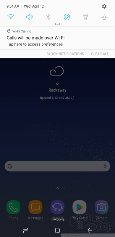
The S8+ supports WiFi calling. Setting this service up hardly takes more than a few seconds (as long as your carrier supports it) and delivers a small but noticeable upgrade to audio quality. If you can make calls over WiFi, you'll appreciate the improved clarity.
The speakerphone isn't quite as impressive. During my tests I found I could keep the volume at about 60% for quiet, indoor use, but outdoor noisy spaces require you to crank it up all the way. Quality suffers at the loudest volumes thanks to gargling, unattractive distortion.
Ringers and alerts are loud enough to get your attention, and the vibrate function always made me take notice. I love that you can control vibration intensity and even select from a dozen or so different vibrating patterns.
I wish the phone had stereo speakers. However, the phone ships with a pair of specially-tuned AKG earbuds and, believe it or not, they work pretty well. They're nothing fancy, but the included software lets you tweak the sound enough that I would consider using the AKGs in a pinch were my favorite buds missing or busted. Coming from me, that's high praise.
Battery
The S8+ packs a bigger battery than the S8 and that may be enough to convince some people to put up with the larger footprint. The S8+ includes a non-removable 3,500 mAh battery (17% more than the S8) and a lot of battery-saving technology. I easily and consistently got through an entire day with the S8+, and it had more power left over at the end of the day than did the smaller S8.
Under normal use, with brightness and resolution set to the middle levels, you should easily cruise through a day with a nice cushion left over. In fact, I was able to get the phone to push to lunch on the second day several times.
I put the screws to the phone for half a day in NYC while sightseeing and used the S8+ to take hundreds of pictures, shoot video, find lunch spots in Google Maps, and more. I still had plenty of battery capacity left when I returned home. The phone pushed through 14 hours of intense use, and was down to about 25% by the time I was ready for bed. I truly gave it a good run and it got the job done with plenty of power in reserve. It is possible that as the battery ages over time it may lose some capacity. Even then, I think most people will safely get through a full day with nothing to worry about.
The S8+ includes three different power-consumption modes: off, mid, max. The off tool means you're not employing any sort of power-savings features, while mid reduces some behaviors and max really restrains the phone. Moreover, each mode can be customized to a certain degree (tweak brightness, CPU output, notifications, etc.) so you get exactly what you want/need out of them. That's cool. You can also take control of individual apps to make sure they aren't draining power in the background.
The S8+ supports Quick Charge and rapid wireless charging. When plugged into the included wired charger, I found the S8+ charged from 30% to 100% in 80 minutes. Wireless charging took only a little longer using Samsung's rapid wireless charging pad. It feels quick either way, and a short 15-minute charge pushes about 30% into the battery.
Bluetooth, GPS, NFC, WiFi
The Galaxy S8+ is one of the first phones to ship with Bluetooth 5.0 on board. That doesn't mean a whole lot for most people right now, but it doesn't hurt. The S8+ is compatible with all of the Bluetooth devices you're likely to encounter, including phones, cameras, headsets, speakers, PCs, and other accessories. The S8+'s Bluetooth software made pairing with a variety of devices a simple, painless process. I didn't encounter any trouble with it. Calls sent to mono headsets sounded very good, while calls routed to my car's hands-free system were just ok. Music pushed to a stereo speaker sounded excellent.
Of course the S8+ includes GPS and the location-enabling radio worked perfectly with Google Maps and other apps. Maps was able to pinpoint me in several blinks of an eye, and location was as good as 10 feet. The S8+ makes for a fine navigation device via Maps, Waze, or the voice-guided app of your choice.
The S8+ ships with Samsung Pay, which is one of many apps that can take advantage of the NFC radio. NFC is also compatible with Android Pay. I mostly used the NFC radio to assist in pairing with Bluetooth accessories. To that end, it worked perfectly.
Last, the Galaxy S8+ packs 802.11a/b/g/n/ac WiFi in both the 2.4 GHz and 5 GHz bands. This means the S8+ is compatible with a wide range of WiFi access points for the best speeds. I had no trouble at all with the S8+'s WiFi.
Software
Lock Screen
There are so many ways to interact with the lock screen that it's kind of ridiculous. To start, the S8+ carries over the Always On display that we saw on last year's S7. This means you can always see the clock, date, battery percentage, and notifications. The notifications can range from simple badges to the full text of incoming messages. Samsung offers plenty of ways to tweak the Always On display, and I appreciate that.
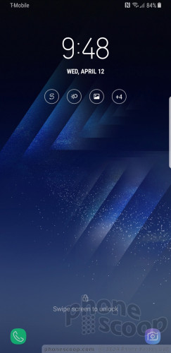
The easiest way to turn the screen on is to press the screen lock button on the right side of the phone. This brings up your wallpaper, full notifications, access to the Quick Setting menu, and lock screen shortcuts. You can also reach this screen by pushing the new “home button”. Samsung replaced the physical home button with a software key on the front. It's a little square that sits at the bottom of the display. A simple tap won't do it; you need to hard-press or double-press the button.
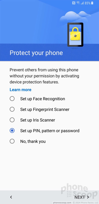
As with all Android phones you can set a PIN, pattern, or password for security. You need to wake the phone and then swipe up on the screen to access these locking methods. The same is also true of the iris scanner and facial recognition tool. Once you've woken the display and swiped up, using the iris scanner is pretty quick. The iris scanner, in particular, can read your eyes in less than a second. However, if you're in near total darkness (lying in bed) or out in super bright sunlight the iris scanner doesn't want to work well. It's better if you don't wear glasses at all, and even contacts can gum it up. The facial recognition tool hardly works. It was able to read my face about 50% of the time. That's way too high a failure rate. Moreover, researchers suggest it can be fooled by a photo of your face. The steps for recording your irises or face are simple enough. Each offers a rich tutorial to walk you through the process.
Really, using any of these five locking methods (PIN, pattern, password, iris, face) takes too much time. You have to wake the screen, swipe to reach the lock, then interact with the lock. Three steps is two too many.
Use the fingerprint reader on the back. It may be in an odd spot and harder to reach on the S8+, but it's easy to record multiple fingerprints and, once you get used to the reader's location, not so tough to use. The fingerprint reader is also by far the quickest and most consistently simple way to unlock the phone. Grab the S8+, touch the fingerprint reader, and the phone skips the lock screen / unlock screen entirely and goes straight to your home screen.
Home Screens
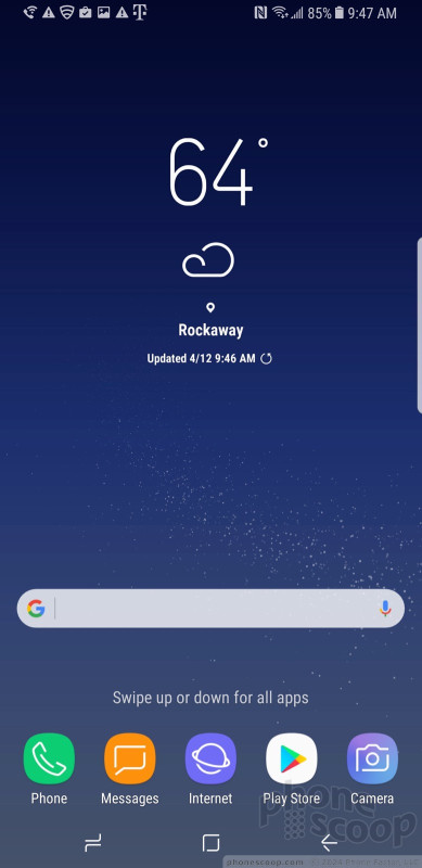
The home screen experience ranges from simple to saturated. Thankfully, you're in full control. The Galaxy S8+ ships with Android 7 (Nougat) on board and the latest build of Samsung's user interface skin that serves as your window into the S8+. It's highly configurable and sometimes annoyingly complex.
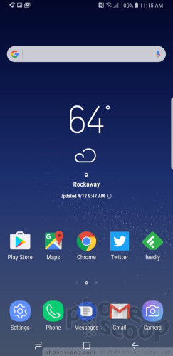
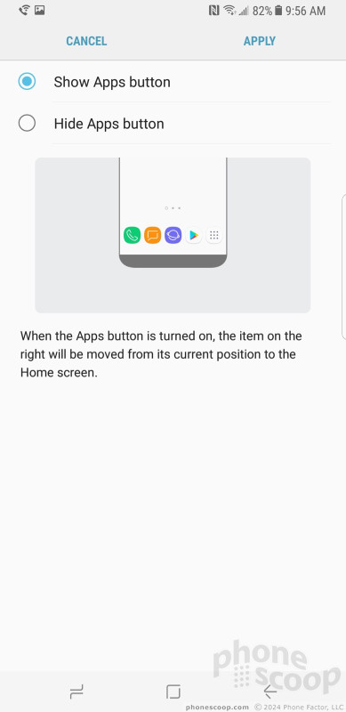
The biggest change to the home screen experience is the app drawer: Samsung ditched it, sort of. Instead of a dedicated apps button, you'll find if you swipe the home screen up or down the app drawer will appear. Samsung's solution is elegant in its simplicity, even if it's not intuitive at first. After a day or two, though, I found the swiping gesture to be quick and easy. You need to be nimble-fingered about it; if you press too long or too hard you might accidentally perform a different action with an icon or widget on your home screen.
The app drawer is organized alphabetically by default. The entire drawer can be arranged however you wish, including folders. Samsung allows you to hide unwanted apps, but I found only a couple could be removed completely.
The Quick Settings panel has clean icons and blue-on-white coloring that helps you understand at a glance what's turned on. You can customize the Quick Settings panel to a small degree. The main settings screen is really nice. Like the Quick Settings panel, it uses clean colors, sharp fonts, and bright backgrounds to facilitate readability. It is arranged more or less how Google arranges the settings on its own phones.
Things I really like about the new Samsung interface: the colors, the fonts, the icons, the symbols, the individuality.
You can spend all weekend customizing the S8+. For example, the phone offers access to Samsung's themes. Only a couple are pre-installed, but you can download more. Some themes are free, some cost a few dollars. All of them will change your entire visual experience, from the wallpapers to the icons to the fonts and colors.
Then there are the small tweaks. How many apps do you want on the home screens (4x5, 5x5, 6x5)? How big do you want the icons to be (small, medium, large)? Which font do you want? Do you want icons with or without borders? Care to re-arrange the software buttons at the bottom of the screen? You can.
You can multitask on the S8+ by running two apps at the same time in separate windows. Not all apps are supported, but those that are have a distinct icon (two rectangles on top of one another) to indicate their compatibility with the tool. It works fine and takes maybe 60 seconds to master. The S8+'s extra-large, extra-tall screen really helps improve this experience.
Thanks to Android's flexible design, a good number of third-party apps already support displays this shape. Google recently advised developers to update their apps, if they haven't already. Apps designed strictly for old-style 16:9 displays have extra black space at the top and bottom. It works just fine.
The S8+ includes Easy Mode, which gets rid of the “complicated” home screen panels and app drawer in favor of larger icons and fewer screens through which to navigate. This tool is meant for people who may be new to smartphones, or for those who have seriously bad eyesight.
You can use a number of different hand gestures to control the phone. For example, you can capture a screenshot by swiping the edge of your hand across the display, or call the displayed contact by bringing the phone to your ear. Incoming calls can be muted by placing your palm on the screen or turning the phone over.
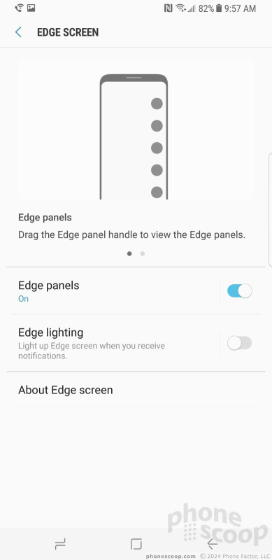
Last, the S8+ includes Samsung's Edge Panels. Edge content is available by swiping a thin tab (Samsung calls it a handle) that appears on the right side of the screen. You can position the handle anywhere along either side of the S8+'s screen. You can choose how large the tab is, as well as how transparent it is.
The phone ships with 15 Edge panels: app shortcuts, contacts, smart select, clipboard, tasks, weather, tools, calendar, sports, CNN, and more. More are available for download. Each of these panels can be customized to suit your individual tastes. Nine Edge panels can be active at any one time.
The panels work fine. Each offers a snapshot of the content you want (such as the weather), with the option to see more details. I find they are best used as a multitasking tool, but you have to spend some time cultivating the best arrangement.
You needn't concern yourself with the phone's performance. The Galaxy S8+ ships with the Qualcomm Snapdragon 835 with 4 GB of RAM. This is Qualcomm's best, and it's a generational leap over earlier Snapdragon 800 series chips. The S8+ crushed everything I asked it to. Every app on the phone runs quickly and smoothly, screen transitions are fluid, and the phone practically begs for a real challenge. Even running it for an hour in the Gear VR didn't seem to task the processor much. The S8+ never became uncomfortably hot. The S8+ does everything instantly.
Camera
Samsung simplified its camera app and made it more fun to use. Several options open the camera, including a double-press of the screen lock button, and the lock screen shortcut. The camera jumps to life in a blink.
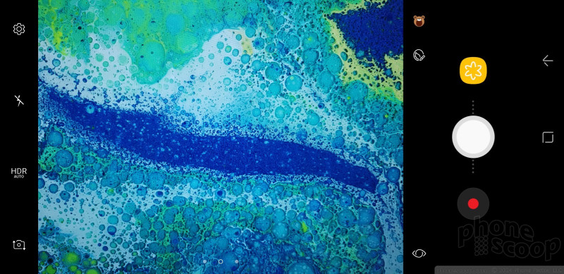
With the S8+'s camera, swiping is everything. The main viewfinder is fairly typical: tools on the left, viewfinder in the middle, shutter buttons on the right. Swipe the viewfinder up or down to switch to the selfie camera, swipe right to open shooting modes, swipe left to open Instagram-style filters. The camera has separate picture and video buttons, which make it easy to snap photos when shooting video. The controls on the left allow you to toggle the flash and HDR to on, off, or auto.
As far as the shooting modes are concerned, the S8+ includes auto, pro, panorama, selective focus, slow-motion, hyperlapse, food, and virtual shot. You can download more (sports, sound and shot, others) if you want. Nothing about these shooting modes is new and they function as they did on Samsung's older phones.
The “pro” mode lets you tweak most of the camera's core settings, including exposure, white balance, autofocus, color, shutter speed (up to 10 seconds), and ISO. It's a little difficult to use. Adjusting the settings requires you to slide your finger up and down the right side of the screen, which is where the control bar appears. If your finger is off just a little bit, however, you'll accidentally swipe yourself into selfie mode and lose the pro mode entirely.
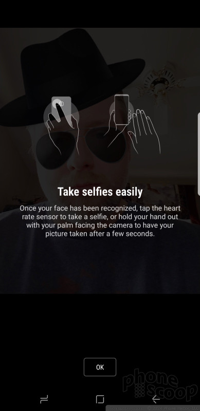
If you love Snapchat and Instagram, I have some good news for you: the S8+'s camera builds in masks, stickers, filters, and other extras for enhancing your pix before you share them on social media. The “masks” tool includes a decent variety and lets you adorn your face with the ears/snout of a dog, cat, bat, deer, rabbit, sheep, and other animals. Moreover, opening and closing your mouth when using a mask generally causes it to animate in some entertaining way (see embarrassing samples below). The stickers are rather simple black-and-white affairs. The phone has at least 16 different filters. These tools are available when using both the main camera and the selfie camera.
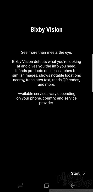
Last, the camera includes Bixby Vision. Once enabled, the Bixby Vision shooting mode turns on Bixby's artificial intelligence to help you figure out what you're looking at. Bixby Vision can read/translate text, read QR/barcodes, and help you shop with location-based suggestions. We've seen these features on phones before, so Bixby Vision isn't particularly eye opening.
One complaint: There's no wide-angle shooting mode. I love the wide-angle camera on the LG G6. It would be a nice feature to have here.
The camera, like every other app on the phone, performs incredibly well. It's fast through and through.
Photos/Video
Samsung did something rather curious with the S8+. The company carried over the exact same 12-megapixel sensor from last year's Galaxy S7 smartphone. Now, the S7 has one of the best cameras around and it still performs really well a year later. Still, why would Samsung make this choice? (My guess it's because the Note 7 also used the same sensor, so Samsung had millions of them sitting around.) That aside, the S8+, with its optical image stabilization and f/1.7 aperture, takes incredible pictures.
I took the S8+ to a concert and was surprised by the ease with which it captured good photos in the challenging bright/dark light environment in the venue. Moreover, I spent an afternoon in NYC taking in sights like Grand Central Station, St. Patrick's Cathedral, and Central Park and came away very pleased with the results. Shooting inside the cathedral, in particular, is difficult due to low light levels. The S8+ got the job done beautifully, and didn't destroy the results with grain. Focus was sharp, white balance was accurate, and exposure was spot-on. The S8+'s camera impressed me in every way.
The S8+ has a powerful 8-megapixel user-facing camera with screen-based flash, auto-focus, and an f/1.7 aperture of its own. The selfie cam does a really, really good job. Seriously, putting auto-focus in the user-facing camera goes a long way to improving the sharpness of selfies, particularly in low light. As noted above, you can make use of the masks, stickers, and filters when using the selfie cam, as well as the “beautification” tool. Use it sparingly, as the effects can be a bit surreal. That Tinder date will know right away that you used your phone's software to mask your warts.
On the video front, the S8+ captures resolutions up to 4K. The best features — HDR capture, video effects, tracking autofocus — aren't available when shooting in 4K or 2K. The S8+'s video camera does an excellent, excellent job. Video is sharp, rich in color, and properly exposed. My only complaint would be about the grain I saw in some low-light environments. The HDR mode helps mitigate this a bit.
Even demanding photographers will be happy using the Galaxy S8+ as their main device for capturing photos and videos.
Bixby
I don't even know where to start with Bixby. It doesn't really work yet, at least not in the way Samsung advertised it. The way Samsung explained Bixby, the assistant is supposed to support amazing, life-changing voice commands inside apps. It can't. In its current form, it's nothing more than a glorified version of the Google Now home screen, LG Bulletin, or HTC Blinkfeed.
As noted above, the small key on the left side of the S8+ activates Bixby. Right now this is all the Bixby button can do; it cannot be customized to do anything else. It's Bixby or nothing!
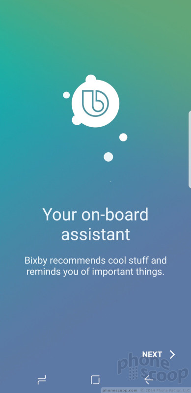
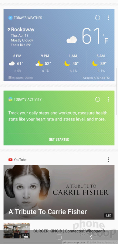
On first launch you'll be asked some simple questions to get started. The Bixby screen includes cards that present a lot of information about you and the stuff you typically do. For example, it details the weather, your next calendar appointment, and highlights from your Twitter and Facebook feeds. This is really no different from competing services from other handset makers.
Bixby will (somewhat aggressively) suggest you set reminders for dumb things. For example, over the weekend I didn't grab the S8+ until about 9:30 each morning. (That's when I managed to wander into my office after breakfast, coffee, getting dressed, etc.) Sunday evening the S8+ suggested that, since I usually wake up at 9:30, perhaps I should set an alarm for that time. Now, I get what's happening here. The phone is smart enough to know the first time it's touched each day is most likely the approximate time I wake up. But it's not smart enough to know the difference between weekend and weekdays. Bixby also recommended that I read the news, look at my calendar, and peruse my photos — all things I already do each day. Thanks for the recos, Bixby?
Bixby Vision, built into the camera but also accessible from the main Bixby app, works more consistently.
Without the voice component, Bixby is lost.
Samsung is making a critical error here. The company should either have held the S8+ until Bixby was ready, or saved Bixby for the Note8 with the opportunity to bring it to the S8+ retroactively. The company says Bixby Voice will arrive "later this spring" but that may as well be never. S8+ owners will use Google Assistant in the meantime and find no reason to bother with Bixby Voice if/when it arrives. A complete and working Bixby should be the first experience S8+ owners encounter when they first boot the phone. That would have been something special. Too bad, Samsung. You messed up.
T-Mobile Stuff
T-Mobile kept bloatware to a minimum. The company added just five apps to the Galaxy S8+. You can't remove these apps, but this isn't a biggie, because all versions of the S8+ shipping in the U.S. have 64 GB of storage and support memory cards up to a theoretical 2 TB.
Wrap-Up
Samsung found the right formula in the Galaxy S8+. It dialed in the exact amounts of high design, technical power, and quality build needed to deliver a near-perfect smartphone. The S8+'s flaws are so few and far between I can hardly bring myself to bother repeating them here because everything else is so darned good, though it perhaps has at least one compromise the S8 doesn't.
The Infinity Display and the metal/glass chassis that embraces it are impressive beyond words. The oblong shape may require a short adjustment period, but I assure you you'll fall in love with the S8+, if not for its good looks then for its proven performance and winning personality. Call quality and data speeds are great, battery life is good, and other hardware facets do their jobs perfectly.
Samsung's software can be overwrought at times. The S8+'s user interface, however, is among the most flexible, allowing you to assert your own creative proclivities when arranging apps, shortcuts, widgets, and all the miniscule tweaks that make this smartphone your smartphone. The camera app, in particular, is powerful and also sometimes fun. Most people will be pleased with the camera's above-average imaging results.
There are two real black marks, as far as I can tell. The first is the fingerprint reader. It is the quickest way to unlock the S8+, but some may never adjust to the odd location. Worse, the larger footprint of the S8+ places the reader even further away from your finger. The second is Bixby. It's just not there, not in any meaningful way, and it leaves the phone's story incomplete at launch.
The S8+ costs $850. That's $35.42 per month for 24 months on a carrier payment plan. It's worth every freaking penny. If you're ready to upgrade from an older Galaxy phone, the S8+ is The One you've been waiting for. Yes, it's that good. Go buy this phone now.

Comments
No messages






















 5 Best Phones to Take On Summer Vacation
 5 Reasons to Buy the Unlocked Samsung Galaxy S8 or S8 Plus
 Review: VRS Design Cases for Samsung Galaxy S8 and S8+
 Review: Samsung Gear VR with Controller
 5 Things to Like About the Samsung Galaxy S8 and S8+
 Samsung Galaxy S8+


