HTC Touch Diamond
HTC's TouchFlo interface from last year wasn't much more than a relatively modest shortcut system. The "Cube" let you access some common functions easily, but didn't come close to replacing Windows Mobile for most tasks.
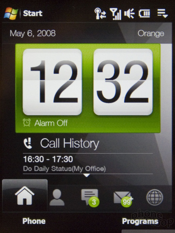
The new TouchFlo 3D interface is clearly based on the original, but it's been vastly improved and expanded. It still doesn't replace Windows Mobile, but it does take a giant step in that direction compared to past efforts. It does completely replace the main programs menu, which is a welcome touch. Now you can easily choose and arrange icons for your most-used applications on a custom menu set up exactly how you like it, and even the list of additional programs has a slick look with finger-touch interaction.
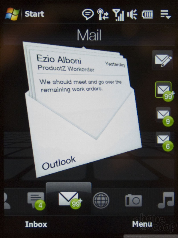
TouchFlo 3D does suffer from the same basic problem as all "UI replacements" on Windows Mobile, though: it only goes so far, and when it ends, the switch to Microsoft's UI is quite jarring. For example, when you're browsing your text message inbox, there's an incredibly slick 3D effect to it, but it's only a preview of your inbox; it's not threaded to include messages you've sent. When you want to reply, you're thrown into the standard Windows Mobile text messaging application. Since the Diamond uses Windows Mobile 6.1, you do see threaded messages in that view, but it's not nearly as pretty as the TouchFlo 3D parts of the UI.
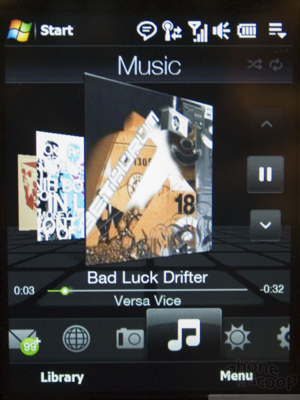
Spiffy graphics and slick 3D animation permeate TouchFLO 3D. Music can be browsed by flipping through album art (a lot like Apple's CoverFlow) and text messages flow in a spinning 3D "string".
Most of the touch interaction is also done very well. The swipe-to-scroll effect is implemented almost exactly like on the iPhone. You can just "grab" a list and flick your finger to send it scrolling at any speed. It's much smoother and easier than the scrolling action on competing finger-touch phones from Samsung and LG.
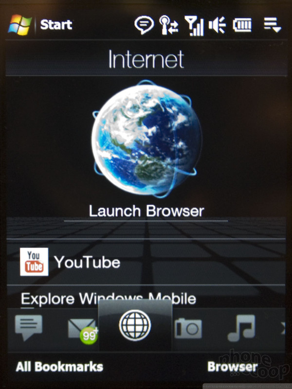
There's a lot - and I do mean a lot - that's clearly inspired (if not downright copied) from the iPhone. (HTC is by no means alone in this; Samsung and LG are copying Apple just as shamelessly these days.) The on-screen keyboard is one example. It looks exactly like the iPhone's, but without the neat pop-up keys and auto-correction. (Although it does have word prediction.) The music player has an album art interface that's not terribly different than CoverFlow, and it offers most of the same options with the same layout. HTC also uses those cute little sliding toggle switches in a few places, as well as a volume slider just like the iPhone's. There's even a zoom in / zoom out effect when opening and closing the full programs menu... just like the iPhone. And of course they worked with Google to create a custom YouTube app... just like you-know-who.
The browser also copies the iPhone, but only in the best possible ways. It's actually a really nice and exciting kind of browser to see on a Windows Mobile device. It's based on the Opera rendering engine, but the interface and touch interactivity are all created by HTC. HTC essentially created their own new mobile browser from the ground up, and they did a great job. You can tap to zoom in and out, view full-screen or with a menu, pan around by dragging, flick to scroll, etc. It's pretty great. A special circular gesture to zoom in does take getting used to, but once you do, it works well.
It also has automatic rotation to landscape mode using an orientation sensor, although this only works in the browser and photo viewer. Perhaps more clever is a feature that lets you silence an incoming call by simply flipping the phone on its face.
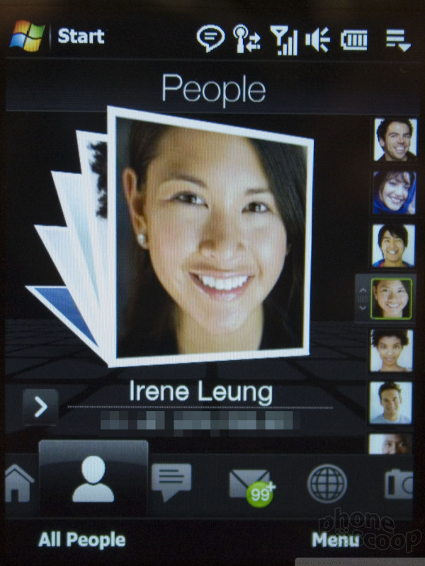
There are other, more unique UI innovations, though. The contacts app does have the familiar touch-and-drag scrolling down the right edge, but instead of just letters of the alphabet, it pops up actual names as you drag your finger, which is pretty handy.
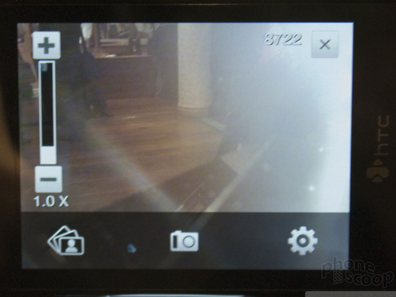
The UI does rely on gestures to some degree, which is the kind of thing you either love or hate. If you're used to the iPhone, it does take some getting used to. There aren't as many awkward gestures as the first version of TouchFlo, but there are still some. The main one is a simple up/down swipe in the center of the screen to scroll or flip through items. For example, to advance to the next message in your SMS inbox, you swipe you finger up to "flick" the previous message up off the screen. You need to be careful not to touch too low, though, or you'll hit the main icon bar, and touching too high will activate the status bar, bringing up a special shortcut control, etc. The other main gesture is a circular motion, which zooms in. Oddly, they've carried this motion over to the touch wheel that doubles as the d-pad. You'd think that would let you scroll through lists, but in fact you can only use it to zoom in. Only certain situations call for a "zoom" type of action, so it's only active at all in photos, web pages, and office documents.
The prototypes we used were running un-optimized software, and it showed. There were parts of it that were incredibly fast, responsive, and slick, but then at other times it would stutter and act quite slow. We trust they will iron out most such kinks before release - especially for the more test-happy American carriers. In our experience Windows Mobile is prone to odd pauses, though, so it might be a necessary evil.
HTC is known for offering carriers a high degree of customization. With TouchFlo 3D, they continue to offer carriers numerous customization options, but they've started to take more control over it by bringing it in house. Whereas before, carriers could slap their own totally custom UI on the phone, now HTC is taking charge and insisting that they be the ones to create the custom interface. Carriers can still link the UI into their special music, photo, and ringtone services, for example, but HTC will craft the interface to ensure it integrates well with TouchFlo 3D. They'll modify the color scheme, etc. as well, but there will be a new level of consistency (in quality and usability) in these carrier-customized interfaces. They demo'd one for Orange (a European carrier) and it was quite slick. It seamlessly integrated Orange branding and services, and customized the graphics and animation quite a bit, but maintained the slick look of TouchFlo 3D, and remained just as easy to use.














 HTC Announces Touch Diamond
 Hands On with the Motorola edge+ (2023)
 Hands On with the 2023 moto g 5G & moto g stylus
 iPhone 15 Series Goes All-In on USB-C and Dynamic Island
 Hands On with the Motorola razr and razr+ (2024)

