Review: Motorola ZINE ZN5
The ZN5 is similar in shape a feel to the MOTOROKR E8. It is a bar-style phone that has fairly good looks and is not too small, nor too large a device. It is just a tad heavier than you expect it to be, but it is by no means a brick. Solid is a good word to describe it. Most surfaces are made of plastics or materials that feel like plastic, save for the bottom, which is wrapped in a rubber-like coating. It is comfortable to hold, balanced, and slips in and out of pockets easily.
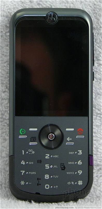
The ZN5 has a generous screen dominating the front face of the phone. Below it is a keypad that I found to be less than friendly. The D-pad is a a little small for my tastes, though the outer ridge makes it easy to find and use. The center select key pokes out of the D-pad like a nipple, making it easy to find, but slightly weird feeling.
The control keys to either side of the D-pad are infuriating. The problem is that they are packed very tightly together. On the left you have the send key, withthe soft key just to its top-right and a camera button just to its bottom-right. They practically overlap. With three buttons crammed into a 1-square-centimeter area, it was all too easy to press the wrong key. To the D-pad's right are the function and back keys. I found myself pressing the back key when I meant end, and the end key when I meant back. A little bit more space between these buttons would have made them less frustrating to use.
The 12-key keypad itself is OK. The pad is flat with tiny little nubs to help you locate each individual key. The nub for the 5 key is only slightly larger than the others. As with the control keys, it is common to mistakenly press the wrong key, especially since the area surrounding each nub is small. The keys do have good travel and feedback, though, and you can definitely tell when you press them.
On the left edge of the phone is a 3.5mm headset jack (which includes TV out) and the microUSB port, which is used for data transfer and charging. The hatch covering the microUSB port peels back with no problem. On the right edge of the phone, the volume toggle / zoom key is nearest the top. This button is no problem to find, but travel and feedback are minimal. Below the toggle is a sliding lockswitch , and near the bottom of the right edge is the camera shutter release button. The shutter release button is subtle. As with many camera buttons, you can press it halfway to focus, and then all the way to take a picture. Learning to feel that half-way point on this button took some practice.
The camera is located near the top of the phone, and is covered by a sliding hatch. Opening the hatch turns the camera on. This hatch opens and closes with no problem. The back cover of the phone itself was easy to pop off,which you'll have to do to get to the slot for microSD cards. The microSD card is not hot swappable. The battery has to come out first. This is a no-no, Motorola.
In all, the ZN5 feels good to use, though we wish the navigation cluster weren't so tightly spaced.


 Preview: Motorola MOTOZINE ZN5
 T-Mobile Snags Motorola's Zine ZN5
 Motorola Sheds Light on MOTOZINE ZN5
 Motorola's new Edge Adds Tele Camera, Among Other Upgrades
 Moto Intros razr Ultra, its New Flagship Foldable
 Motorola ZINE ZN5


