Review: Palm Pixi
Nov 12, 2009, 9:00 AM by Eric M. Zeman
The Palm Pixi swoops into stores just in time for the holidays. Was Palm able to give the Pixi a magic touch, or does it need another dose of pixie dust to really take off?
Form
Is It Your Type?

Did you love the Centro, Palm's other teensie-weensie messaging phone? If so, you're exactly the type of person Palm and Sprint hope will decide to pick up the Pixi. Why? Because it's petite, powerful, and a pretty good looking phone. This dainty gadget is Palm's leap into the mid-market.
Body
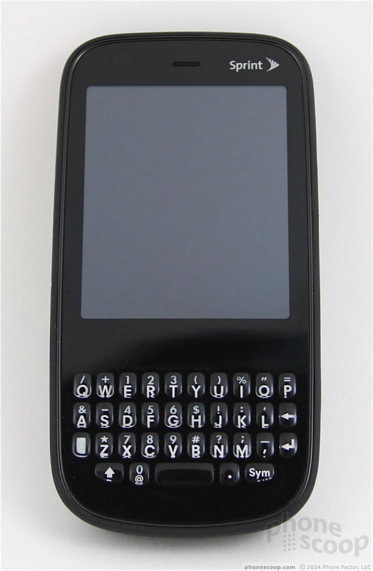
The Pixi is well named. It is a tiny little phone. The back and sides are rounded and smooth, making it extremely comfortable to hold. It feels great in the hand, and is thin and light enough that it will be a welcome companion on any journey. The overall fit and finish of the Pixi feels somewhat better than the Pre did, which launched back in June. The materials are good and the phone feels and looks as though it is put together well.
The front has a decent touch display, though I wish it were larger. Palm has opted to give a hefty percentage of the Pixi's front real estate to the "gesture area", which is the plain, black strip between the display and the QWERTY keyboard. This is where users perform certain touch actions to interact with the device. The full QWERTY keyboard is crunched down at the bottom of the Pixi. The buttons of the four-row keyboard stand out very well. They have a nice shape and feel to them, and travel and feedback is satisfactory (though I didn't care for the "click" sound). The downside is that the keys are packed way too close together to be of much use to anyone with large thumbs. It is all too easy to mash down three or more keys at a time. I found that after several days' use, I was able to adapt a little bit, but it really takes some getting used to. I like that the "@", "." and "," characters all have their own separate key. This makes typing email addresses, URLs, and Twitter handles much faster.
The lock/unlock and power button is located in the top left corner of the Pixi. This key is easy enough to find, though it is positioned a little too far down the curved slope of the edge for my tastes. It is covered in a soft-touch coating and had acceptable travel and feedback, though the definition of the "click" was a little on the weak side. The 3.5mm headset jack is placed on the top of the Pixi, as well.
Just two controls are on the right side of the Pixi. A call-silence switch is positioned close to the top of the Pixi and is flicked back and forth to turn the Pixi's ringer on and off. The volume toggle is below it. The toggle is also coated with the same material that the lock key is. Travel and feedback was OK.
There is a very well hidden hatch covering the microUSB port on the right side of the phone, which is used for charging and data transport. If you're the kind to bite your fingernails down to the bone, you might have trouble opening it. Fingernails are pretty much required to peel it back.
One appealing aspect of the Pixi's design is that the battery cover (which wraps all the way around the sides of the Pixi) comes off and can be replaced with a designer battery cover. What's the big deal? Well, Palm has commissioned artwork from up-and-coming artists to design these back covers, which will be limited to runs of 5,000. Each will be signed by the artist, and will be compatible with Palm's Touchstone conductive charging accessory. As each design runs out of stock, Palm will replace it with a new design by a different artist. Personality comes with a price tag, though, as these designer covers will cost $50 each.
Out of the box, the Pixi lacks a little style with its all black coloring, but its diminutive footprint makes it an easy device to carry about.
The Three S's
Display
The Pixi uses essentially the same display as its bigger brother, the Pre, but minus about 80 pixels. It measures 320 across by 400 up and down. The Pre measured 320 x 480. It looks really good, but I felt it wasn't very bright. Even set to maximum brightness, it looked muted in a dimly lit room. Reading it outside in sunlight was even more difficult. But it was sharp, and colors looked good.
Signal
The Pixi performed better than average on the Sprint network. I was more consistently able to find a strong EVDO signal and remain connected. I didn't miss any calls with the Pixi, nor did I notice any difficulties when browsing the web. I can't say that browsing speeds were super speedy, but they weren't slow, either. The Pixi passed the NJ vault test (the local ShopRite) with flying colors. I had no signal issues in a number of different regions across NJ and New York City.
One major bummer about the Pixi compared to the Pre is that it deletes Wi-Fi from the list of on-board radios. That means if you're in an area with sub-par coverage, you can't switch over and browse via Wi-Fi.
Sound
The Pixi's ringtones are certainly loud enough to be heard in most places. I can't say the same for the earpiece, though. Set to maximum volume, I had trouble hearing conversations in only mildly noisy places such as coffee shops and city streets. Places such as a bar or restaurant will require you to go outside. Quality of phone calls was a little inconsistent, but more good than bad. I noticed a few occasional outbursts of noise, and it sometimes sounded as though I had placed a sock over the top of the phone. Some calls were muffled. The vibrate alert was strong enough that it will make the Pixi dance across a table top.
Battery
The Pixi falls into line with the sad, new reality of smartphone battery life. Devices that are constantly connected to email and social networks are only going to get you through one day before needing a recharge, if you're lucky. The Pixi lasted from 7 AM until 11PM two days in a row with a little life to spare, so that counts as making it through a full, wakeful day. But it definitely needed to be plugged into the wall each night. Have a charger with you at all times if possible.
Basics
Menus
The Pixi is the second phone from Palm to run webOS, and though it will be shipping with version 1.3.1. (compared to the Pre's 1.0 version of webOS at launch), most tasks remain similar or unchanged.
When you first boot the Pixi (which, similar to the Pre, takes between 1 minute 30 seconds and 1 minute 45 seconds), you have to set up a new Palm Profile. This is similar to the way most Android phones force you to create a new Google account (if you didn't already have one). This takes a couple of steps and is no biggie.
The basic menu works as follows. The home screen has five buttons along the bottom: Phone, Contacts, Email, Calendar and Launcher. The first four are typical shortcuts for a Palm device and open up exactly what they describe. They can be customized if you wish. When you are in any application they go away, but become available by swiping up from below the screen. This action brings up a ribbon with all the apps it in.
The launcher is the real menu system. Open it up to access all of the Pixi's features and systems. There are three main pages here, each displaying a grid of icons like just about any other phone. Each separate menu page can hold a nearly unlimited number of icons in it, but there are only three of these pages. You can swipe sideways back and forth to get at them, and there is a little indicator at the bottom of the screen to let you know which of the three pages you're currently viewing. Each of the icons in the menu can be rearranged/moved around at will. To get rid of the app launcher, just press in the gesture area on the face of the Pixi and away it goes. You can also press the Launcher icon again.
webOS also makes use of what Palm calls "cards". Each running application resides on its own card, which can be placed to the side. Swiping a card up (sending it off the home screen) essentially closes that application. You can have as many apps open on cards as you want. Want to switch to another running app? Just hit the center of the gesture area and then scroll through the cards to choose the one you want. The Pixi is a little laggy when it comes on navigating from application to application and from screen to screen. There was often a slight pause or hesitation between initiating an action and having it happen.
There is also a tiny little software toggle way in the top-left corner. It lets users cut/copy/paste text in several applications. In some, it will let users change some minor preferences.
Just below the Pixi's display is the touch sensitive gesture area. Swipe your thumb from the center of the Pixi quickly to the left, and you'll be taken back one screen. If you have the main menu up and you do this, it will simply clear the screen and show the desktop.
When compared to the Pre, I can't say that webOS 1.3 offers any immediately obvious improvements to basic usability.
Calls/Contacts
Calls
From the home screen, tap the green phone icon and you'll be taken to the software dial-pad. The on-screen software keys are easy to reach and press, though you can use the physical keys located on the keyboard if you wish. After typing, press the big green button to start the call. Easy.
If you want to search through your contacts, there is a little button that lets you open up your contact database. Using the search bar, you can type out a contact name and it begins to sort through your contacts immediately. What I really like is that the search function shows you the contact name and all their associated numbers. So if they have a mobile, office and home number, you can easily pick out which one you want to call. There are also buttons to access voicemail and the call log.
When you're in a call, the screen shows you some more buttons for options such as speakerphone, contacts, mute and add a call. If you've called someone in your contacts list, it will display the picture ID of that contact.
Contacts
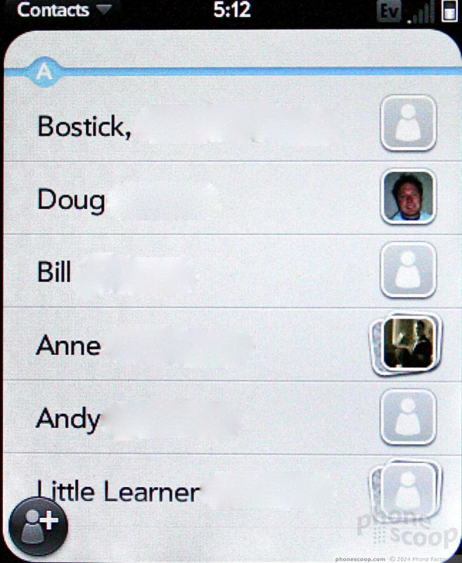
The Pixi uses Palm's Synergy contact database management system. With webOS 1.3 on board, the big improvement is better Facebook and Yahoo integration. You can easily import contacts from whatever email account you happen to use, Gmail, Facebook, Exchange and so on. Synergy then merges all the data from each of these individual accounts and forges a master contact that holds all the information about a single person. One welcome update with webOS 1.3 is that Yahoo contacts and Yahoo calendars are now supported.
If you have a friend stored in your Gmail contacts, but also in your Facebook, that contact will appear only once in your contact database, and it will include the information from both the Gmail and Facebook accounts in their profile. Synergy adds your contacts' Facebook profile pictures to their contact info on the phone itself.
If you don't want to take the time to scroll through your thousands of friends, just start typing their name. Synergy will begin to sort through them based on what you type.
It appears that you can't filter your contacts by account. In other words, if you want to look through just your Gmail contacts, you can't. You can, however, sort which account is the default account for each individual contact, and, if you really want to take the time, "unlink" accounts. So, if you want to have two separate listings for a particular person (one for Facebook, one for Gmail), you can do that.
From each contact, it is easy to initiate a phone call, email, SMS, IM or Facebook message.
Messaging
On the messaging front, the Pixi covers all the bases. Email, SMS, MMS, and IM are all present and accounted for. SMS, MMS and IM are bundled into one, tidy package, but email is handled separately.
First, email. As with most modern phones, all you need to do is enter the username and password of whatever email account(s) you want on the phone. The Pixi automagically takes care of the rest. It asks you if you want to import the contacts from each particular account, and you can decline if you wish.
Email can be configured to arrive instantly, or every 5, 10, 15, 30, 60 minutes or every 6 hours. The less often your email syncs, the better battery life will be. You can also choose how much email is stored on the Pixi at any one time (1 day, 3 days, 7 days, 2 weeks, 1 month, or all of it).
The main email client is pretty simple to use. Press the "+" sign to open a new email. Type in the name of an addressee, and webOS will sort through your contacts to see if there are any matches. You can also choose to open your contacts list from the email client to perform a more thorough search.
The Pixi will display HTML email. When you view each email, you can scroll to the previous or next email by pressing some dedicated arrows. Using the options button, you can mark items as read/unread, flag them, move them to other folders, as well as access the cut/copy/paste functions. As far as attachments go, because it has a document viewer on board, I was able to download and view (not edit) Microsoft Word and Excel and PDF files with no problem. The Pixi plays nice with Microsoft Exchange, as ActiveSync is on board, but it doesn't support the full range of IT policy controls that Windows Mobile does.
With respect to the other types of messaging, there are two basic tabs in the messaging app: one for "Conversations" and another for "Buddies". The Conversations side is all the SMS/MMS and the Buddies is for IM.
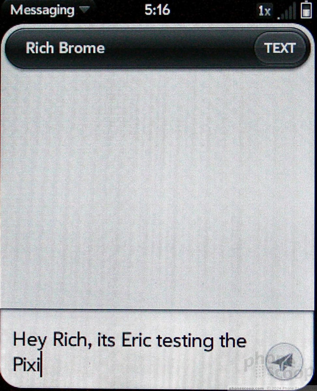
SMS and MMS are threaded nicely together. It is easy to read, easy to sort through your conversations, and really nice to see MMS messages included in line with SMS messages. Adding a picture is as easy as hitting a button in the text entry field. Audio and video messages are still not supported, though.
You can have multiple IM clients (AIM, Google Talk, Yahoo) running at a time, and the Pixi's ability to manage them all simultaneously is impressive. The IM client lets you see which of your buddies are online, and you can easily open the contacts app and find your friends' IM screen names and start up a new IM chat.
Extras
Music
The Pixi matches the Pre when it comes to music playback. The Pre was originally able to sync with iTunes, but Apple and Palm have been battling it out on that one. Right now, iTunes syncing is not supported. That means Apple users need to drag-and-drop their playlists manually onto the Pixi's 8GB storage card. The Pixi interacts with Windows Media Player no problem.
The music app lets you sort through your tunes via the usual methods: album, artist, song, genre, etc. In the main page, you can see how many songs you have, and a shortcut will let you shuffle and start playing your entire library immediately.
The player interface itself is pretty cool. It will show the album art or the list of tracks, whichever you choose. You can loop the songs, shuffle them, or just sit back and enjoy. Rather than having to hit a small little button, a light press on the screen will pause playback. Press again to resume. You can also swipe in either direction to the previous or next track. Fun.
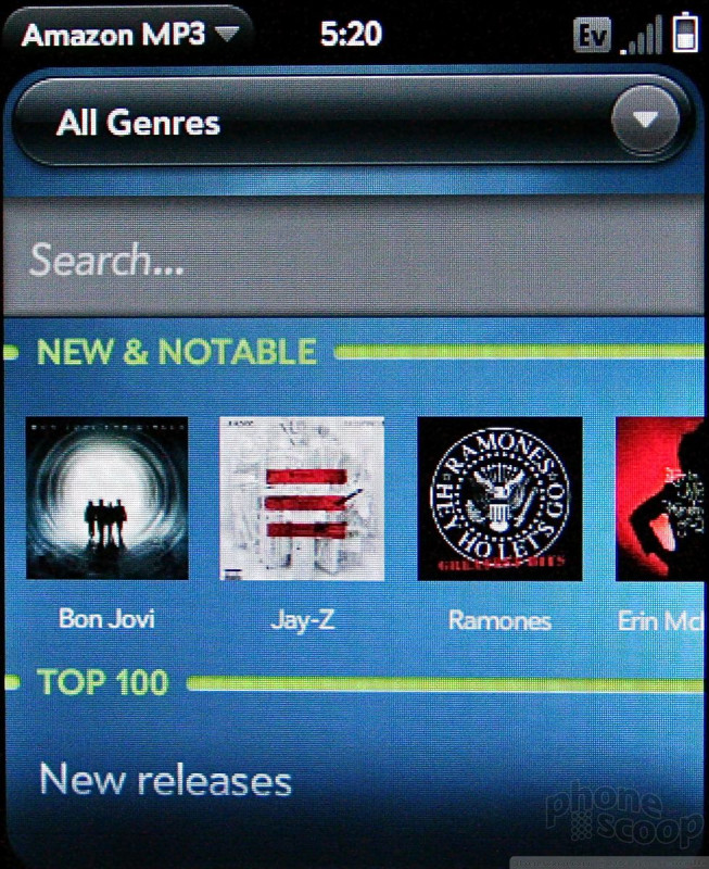
What's really interesting is the options button, which pulls down some neat features. Say you're listening to the new Megadeth album. Open the options menu, and the Pixi will let you perform either a YouTube or Amazon MP3 search for, say, "Megadeth". You can search by the artist or the song itself. Searching via YouTube, for example, will take you to a list of Megadeth videos. Searching via Amazon MP3 will take you to a selection of music from that artist that can be downloaded via the Amazon MP3 store. You can buy single songs or full albums over the air using the Amazon MP3 store.
The Pixi has a regular 3.5mm headset jack, meaning you can use most stereo headphones. It also can play back music via stereo Bluetooth. Music sounded really good, but the Pixi has no equalizer or any other way to control how the music sounds.
It has, however, added the Pandora application, which allows users to create personal radio stations and stream music via the wireless network.
Personally, I am disappointed by the 8GB storage limitation. I realize that for most people, 8GB is ample room for music and other media, but I would like more room. Because there is no microSD slot, that means 8GB is all you get.
Camera
Camera
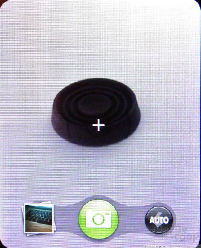
The Pixi has a 2 megapixel camera with a flash, but no auto-focus. As with the Pre, the Pixi's camera was designed to be speedy. Palm decided that speed outweighed other factors (such as auto-focus).
Unfortunately, the camera is similar to that of cameras we've seen on some other devices in its simplicity. There are no options to control how the camera takes pictures. The only adjustment you can make is to the flash, which can be set to on, off or auto. That's it. No white balance control, no exposure control, no zoom, nothing else. You can only point and shoot. Pictures capture and save nearly instantly.
Gallery
The Pixi's gallery can be opened either from the camera application or from the main menu. It shows images in a grid view, and lets you sort between the photo roll and the wallpapers that are stored on the Pixi. It's easy to navigate through your image library by scrolling up and down with your finger. You may also choose to load an image, and then scroll through the images one at a time by swiping your finger left or right. From the gallery app, pictures can be sent as MMS, email, or included in an IM chat. You can also choose to upload them directly to Facebook or other photo sharing service.
You can zoom in and out by pinching a picture using two fingers (multi-touch!), and you can assign pictures to contacts with ease. There are no photo-editing powers on the Pixi itself; no cropping, no fun frames, no ability to insert text; nada.
Overall, the gallery may not provide many new features, but it works much better. It is smoother, and operates with less fuss than the gallery did on older versions of webOS.
Photos
For the most part, I was pleased with the pictures that I captured using the Pixi. There were some occasional white balance issues, but in general, pictures were sharp, clear, colorful and correctly exposed. As with most cameras, shots taken indoors were more grainy than those taken outdoors, but sharpness didn't suffer much. The camera was able to balance out really uneven lighting better than most phones with cameras of this quality.
Not every shot turns out perfect, but I would venture a guess that most people will like what they see. It's a shame that Palm didn't stick with the 3 megapixel shooter in the Pre, but the Pixi will do just fine for capturing Facebook-worthy photos.
Just like the Pre, the Pixi does not record video.
Browse/Customize
Browser
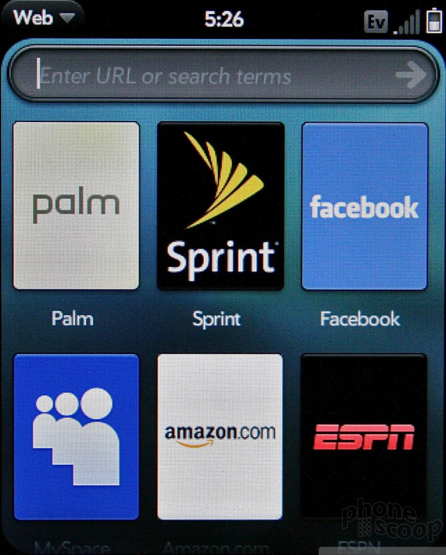
The Pixi's HTML web browser is simple to use. When you first open it, you get a grid-like panel of your bookmarks. About six fit on the screen at any one time. Basically, each bookmark is a snapshot of each web site that you've marked. Press to open that page. There's also a URL address bar at the top.
The Pixi uses Sprint's EVDO Rev. A network, which, for the most part, makes for fast browsing. Tapping will zoom in/out to different sections of any site you visit, as will pinching. The browser's preferences allow you to customize some settings and see things such as your browsing history. You can also add web sites to the home screen as cards, making them instant bookmarks from the Pixi's desktop. You can also share web site links via email.
Customize
The Pixi lets you change up most of the normal things you expect to be able to customize on any handset. I've already detailed many of them, but wallpapers, ringtones, caller IDs, alert tones, the menus, etc., can all be customized as you wish. The Pixi has a lot of keyboard-based shortcuts, and some of them can be user-defined to quickly initiate certain actions. For example, pressing and holding the "S" key automatically searches the phone for items that start with "S" in any given application. So, from the home screen, if you press "S", the Pre sorts out all the applications and menu items that start with "S". Same goes for any other letter in the alphabet. You can choose any song from your music library as a ringtone.
Extras
Apps Catalog
The Palm Apps Catalog is still in beta form, but Palm claims that there are now about 300 webOS applications available. (There were only a dozen or so apps when it launched in June.) It is still just as easy to navigate, read about apps and download them to the device. There are more categories to browse through, but don't be surprised if you see only one or two apps in each category. The Apps Catalog pales in comparison to the apps stores that are run by competitors Apple, Google and RIM. Palm needs to light a fire under its developers' collective rear-ends. Apps availability is a must-have feature.
Bluetooth
The Pixi supports audio Bluetooth profiles as well as PAN for data tethering and PBA for phone book access (with cars). You can connect it to mono, stereo and hands-free headsets, but not other devices such as computers or other phones. I had no problems pairing with headsets of any variety, and music playback / phone calls sounded pretty good.
Clock
The Pixi has pretty much no options when it comes to the clock. You can choose 12 hour format or 24 hour format. Whoop-dee-doo. As for checking the time, when the screen is locked, a quick press of the power/lock key brings up a bright, readable digital clock display. It works perfectly fine as a watch replacement, even if you can't alter the way it looks.
GPS
The Pixi has GPS and comes pre-loaded with both Sprint Navigation and Google Maps. Using Google Maps, the Pixi was able to pinpoint my location to within about 50 feet in just several seconds. After perhaps a minute of fine-tuning, it could get as close as 10 feet. Google Maps worked perfectly well at mapping routes from A to B, and the menu lets you see things such as traffic, the satellite view, perform searches for points of interest and more. Sprint's Navigation service also performed admirably.
Video
Here is a video tour of the Palm Pixi. You can watch it here:
Or visit YouTube for more viewing and sharing options.
Wrap-Up
The Pixi is a solid second-effort from Palm as far as webOS devices go, but it still manages to make its fair share of missteps. The Pixi is incredibly small and light, but the trade-offs are a smaller display and squished keyboard.
The Pixi has 3G, GPS and Bluetooth, but gives up Wi-Fi. That's a major error in my book. Browsing speeds over the 3G network were good, but having Wi-Fi on board would be the Pixi's ace-in-the-hole when cellular data isn't available.
The webOS menus and base functionalities haven't grown much in five months, but they were solid to begin with. Once users can get the hang of the "cards" user interface, it's a snap to use the Pixi.
On the media end of the spectrum, it is capable, but still doesn't manage to topple the competition. The music player is OK, and the camera downright simplistic, but the end result (good sounding music and good looking photos) outweigh the flashiness of the UI.
In all, for $99 you're getting a lot of phone and not making too many compromises.
Comments
I've used this.. nice phone!
(continues)
Now see...
Brilliant.












 Hands On: Palm Pixi
 How To Take a Screenshot on an iPhone
 How To Take a Screenshot on Android
 Google Photos Gaining Magic Editor
 Cricket Launches More Affordable White-Label Phones
 Palm Pixi / Pixi Plus (CDMA)

