Review: Motorola Charm
Sep 9, 2010, 7:20 PM by Philip Berne
The Motorola Charm packs a strong Android punch into a mini QWERTY slab shell. Will its charms sway you from noticing the low res screen?
Form
Is It Your Type?
Is It Your Type?

The Motorola Charm is a compact Android slab with a keyboard up front, instead of hidden away beneath. It's a unique form for Android with some powerful ideas inside. Will the Charm cast its spell on quick messaging and BlackBerry fans alike?
Body
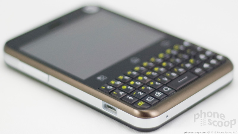
Because of its stubby design, the Motorola Charm seems a bit square at first glance, though it's actually much taller than it is wide. The phone has a solid, classy feel to it all around. There's a metallic band that stretches around the edge. Around back, the battery cover has a fantastic soft touch finish that makes it very pleasant to hold. That cover required some tough prying to pull it loose, but it was easy to replace. Under the cover you'll find the microSD port, but it isn't blocked by the battery so you can change cards while the phone is powered on.
The phone may seem a bit wide in the hand, but it's still easy to hold and I had no trouble stretching my thumb from one side of the screen to the other. The Charm is small, but not especially slim. It might not be a great fit for a tight pair of jeans, but you'll be able to throw it into a clutch purse or regular pants pocket with no trouble.
The screen is a 2.8-inch QVGA in a landscape orientation, so it's wider than it is tall. That's hard for some Android apps to deal with, as I'll explain below. Just beneath the screen are three touch sensitive buttons: Menu, Home and Back. They are spaced too far apart, perhaps to balance the overall wide look of the device. The usual Android search button gets its own key on the keyboard, right next to the space bar. I use this often, so I would have liked to see Search take its place up top, with the touch keys.
Around back, you'll find a small touch pad that Motorola calls the Backtrack. The lamentable Motorola Backflip had the same feature. Basically, using the Backtrack, you can manipulate the action without blocking the screen with your fingers. I'll talk about the Backtrack more in the Touch section of this review. Next to the Backtrack you'll find the 3 megapixel camera. The camera button is part of the keyboard. I like the way this all works out. You don't have to flip the phone to use the camera button properly, and my fingers never got in the way of my snapshots. That's a frequent problem I have with other phones, but not the Charm.
On the left side of the phone you'll find a volume rocker, nicely raised from the metal band surrounding it. On top, a screen lock / power key is a bit more shallow, but it was still easy to find. All of the other shortcuts and buttons are part of the QWERTY keyboard on the phone's face.
The keyboard on the Motorola Charm is great. I prefer well-raised keys with plenty of springy action, and the Charm keyboard fits my preferences perfectly. The keyboard looks small and short at first glance, but each key is a large dome with a satisfying amount of travel and a sturdy click beneath. I often dread text fields when a keyboard is lousy, but on the Charm I found myself looking forward to typing.
The keyboard offers a full QWERTY with numbers assigned as Alt keys. There's an inverted-T arrow layout for fine-tuned text editing. The camera button is there, as I mentioned, and next to it a messaging key that jumps to the universal inbox. I'd like to customize this button so that it takes me to a new, blank text message instead, but the phone doesn't let you change the function.
The Three S's
Screen
The screen is the biggest disappointment I found with the Motorola Charm. It's a bummer in every way. First, it only packs in 320 by 240 pixels (QVGA resolution) for the 2.8-inch display. I wouldn't mind the size of the display if it used more pixels for a higher pixel density. Everything looks lousy. Pictures look chunky and pixelated. Text looks jagged. The menu interface is blocky. If Motorola had doubled the pixel count to HVGA (320 by 480 pixels), I imagine it would have looked much better.
Even discounting the screen door effect of the pixels, the display's color and brightness were equally unimpressive. Even at full brightness, whites looked a bit grey, and the display had a shimmering quality that was not pleasant. Outside, the display washed out terribly under bright light. It was still visible, but very dim and hard to read.
Sound
Motorola has cultivated a well-deserved reputation for solid sound quality on its smartphones, and the Motorola Charm continues that heritage. Calls on the Motorola Charm's earpiece sounded crisp and clear. Callers could distort at the upper limits of the phone's volume, but at least they were plenty loud. You can actually adjust the tonal quality of callers in the Charm's earpiece. During a call, the menu key will offer an Audio Quality option, and you can choose a standard, balanced, bright or extra bright quality for your conversation, like an equalizer for phone calls. I didn't mess with this much, since the sound was already solid in balanced mode, but the bright options might be nice if you're having trouble hearing voices against deeper background noises. On their end, my callers said I sounded very good, and they could not guess if I was talking on a cell phone or land line.
I wish I could say the same for the speakerphone. It still sounds good, but it was not loud enough for my needs. I could barely hear the rings from across my house, and speakerphone conversations in a noisy environment, like a fast moving car, could be difficult. Sound quality was good, I just need more volume. Part of the problem is that the speaker is on the bottom of the phone, and when the Charm is flat on a desk, the speaker is muffled. When you need to keep quiet, the phone has a strong vibrate that is easy to feel in a stuffed pocket.
Signal
Reception on the Motorola Charm was spotty, and I had trouble with calls and data during my test run. Sometimes, the phone would completely drop off the network for no apparent reason. When the phone showed no service in the notification bar, I was unable to place calls or use the data network. When I did have a signal, all of my calls went through, but a few times the phone did not receive incoming calls. They were sent straight to voicemail, even though the phone was reporting a few bars of 3G service. I also had trouble with Wi-Fi, as well. The phone was never able to connect to my home network. I was able to use a portable Wi-Fi hotspot with an open connection, but with WPA2 security enabled on my Airport router, the Charm was unable to obtain an IP address and connect to my home network.
Battery
Battery life was not a problem on the Motorola Charm. I was surprised to open the box and find two batteries inside, one regular size and a larger, extended-life battery. For my testing, I focused on the standard battery since the extended-life uses a bulging back cover, and part of the thrust of this phone is its compact size. With the smaller battery, the phone easily lasted through a full day of testing, including plenty of GPS navigation and camera work. I started to get battery warnings in the evening after starting the day with a full charge. I imagine casual users will get a couple days out of the battery, and if you use more power hungry features, like Bluetooth or the GPS, you'll have to charge the phone nightly, or carry the extended-life cell with the spare back cover as a back-up.
Touch
The touchscreen on the Motorola Charm was quite sensitive. The phone always responded quickly to the touch. I found some lag in the homescreen panels, usually when they were chock full of widgets and shortcuts, but nothing that kept me from enjoying the Charm. I also found the capacitive touch buttons beneath the screen to be perfectly sensitive. In my review period, I never had to hit a touch button twice, it always registered my tap on the first try.
I'm constantly waffling on my opinion of the Backtrack touch sensitive pad on the back of the phone. I love the idea in theory, but in practice it could use some work. Basically, the Backtrack lets you use the same swiping actions on the back that you would use on the front screen. You can swipe through panels, move lists up and down, and even browse Web pages. For fine-tuned tapping, you can double tap the Backtrack and a target cursor pops up. Move the target over the object you want to select and tap the pad again for action.
The Backtrack is plenty sensitive, in fact that's part of its problem. When the pad is active, it's easy to brush accidentally, sending your screens flying about. With the phone resting in my palm, I often triggered the Backtrack or called up the target cursor. Swiping through homescreen panels with the Backtrack could also be a chore. If you don't swipe perfectly, the panel on the screen will move most of the way off, then snap back into place. I often needed to swipe a few times to perform the action I desired.
It's a great concept, and I hope Motorola doesn't give up on the Backtrack, but rather tweaks it to be more useful. I found it to be a fun way to make up for the small screen on the Charm, and with some better gesture controls and a safety to stop accidental motions, the Backtrack could earn its place on compact modern smartphones.
Basics
Menus
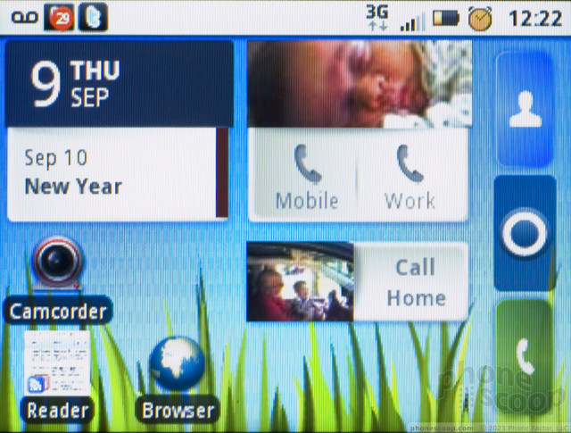
Even with the small screen, Motorola doesn't deprive Charm owners of the full Android experience. It's just been rearranged a bit. While most Android screens are taller than they are wide, the Charm screen uses a wider landscape mode, and this changes some behaviors. The Phone, Contacts and App Drawer buttons usually at the bottom of the screen are moved to the far right. This still leaves the same number of spaces on the panel, a four by four grid, to fill with app icons, widgets and shortcuts, so you can customize the Motorola Charm as much as any other Android. It even supports Live Wallpapers, which I was not expecting on this low resolution screen. Wallpapers pan across all seven homescreen panels on the Charm.
The Charm uses the same new MotoBLUR widgets you'll find on the Motorola Droid X and Droid 2 on Verizon Wireless. I love Motorola's new BLUR. It's much less intrusive than the original design, so you'll hardly notice it if you don't choose to use Moto's widgets for social networking and news feeds. But Motorola's widgets are the best Android widgets yet. They're colorful and well-designed. More importantly, they are completely resizable, so you can add a widget that takes up only a small corner of your screen or one that spans an entire row.
The BLUR widgets do lose something in the translation to the Charm. The contact and the social networking widgets rely heavily on your friends' photos, and photos look lousy on the Charm's display. They don't lose functionality, but you might have to squint to figure out who's in the tiny picture on screen. The same is true for the tiny icons in the notification bar. It can be difficult to discern the itsy Twitter or Calendar icon on the Charm's low-res screen.
The only app I tried that refused to work on the Charm was Speed Forge Extreme, a graphically intense 3D racing game. Otherwise, everything else I tried worked fine, though some had to adjust for the screen's aspect ratio. On many apps that I downloaded from the App Market, a screen or two, usually the initial logon screen, would appear sideways, in what would usually be a portrait mode. These apps always righted themselves once I had logged on, and it wasn't a huge issue, just a minor, ugly inconvenience.
Though I wish the main search button was placed more conveniently near the screen, on the main menu, the button isn't necessary at all. From the homescreen panels, when you start typing, the phone starts searching. Type a phone number, a contact name, the name of an app on the phone, or any search term you'd like, and the Charm will start searching right away. It's not just a convenient way to search Google, it's also useful for quickly jumping into apps you don't use frequently
Calls / Contacts
Calling
To dial a call on the Motorola Charm, you have a few options. You can hold down the Alt key and start typing numbers from the keypad. The phone will search for a contact with corresponding digits, but you'll have the option to call whatever number you typed. You can also start typing a name to jump right to a contact search.
The calling screen on the Motorola Charm has been rearranged a bit to take advantage of its width. Because the numbers on the QWERTY are all Alt keys on the top row, it can be easier to dial from the touchscreen number pad. There are buttons on the left side of the calling screen for contacts and the call log, and pressing the menu key will bring up an option for voice dialing.
When you place a call, the in-call screen presents quite a bit of information, though it's nicely organized. If you call one of your social networking friends, the Charm presents not only their name and number on screen, but also their last tweet or status update. That might be overkill.
The calling screen gives you buttons to send the call to a Bluetooth device, mute the call or activate the speaker. Press the menu key and you get that Voice Quality menu I mentioned, a hold button and a New Call option to add a third party for a conference. It was very easy to join calls for a conference, then split them off one at a time to manage the conversation.
Contacts
Motorola's BLUR interface does a nice job gathering together contacts from all of your favorite social networks. The contacts list can be highly responsive in some ways, deathly sluggish in others. Want to scroll quickly through all of your contacts? The Charm speeds through like a drag racer. Want to see pictures accompanying all of your contacts? The Charm can be forgetful and takes a long time to repopulate all of your friends' avatars. It can also be slow to open the contact card, waiting for that picture.
If you swipe the contact list left to right, you get a full communication history with all of your calls, messages, DMs from Twitter and emails from Facebook. For me it was a bit overwhelming, but it does provide an impressive, complete look at how you communicate. Swipe the contact list right to left and you get status updates from all of your contacts. Or at least, you're supposed to get status updates. After trying for a few seconds, the Charm quit each time and returned me to the dial pad screen.
Individual contacts can be quite extensive. There are plenty of potential fields to fill, including a limitless number of phone fields and email fields, as well as birthdays, anniversaries and plenty more. Plus, you can call, text, email or even navigate from the contact listing simply by tapping the appropriate phone number or postal address.
Messaging
The Motorola Charm has all the standard Android messaging options, plus the extras that come with Motorola's BLUR interface. Google services are segregated, so Gmail gets its own app and Google Talk gets its own client, but these aren't the only options on the phone. There's an email app for Exchange, IMAP and POP email accounts, and a separate IM app for Windows Live, AOL and Yahoo instant messaging. The Google options are more feature rich, but the phone does a fine job handling any email or IM account you want to use.
There are plenty of Motorola widgets to help with message handling, but some of these overlapped and could become confusing. There's a status widget to show all of your friends' feeds, and an unread message widget. At a quick glance, it was hard to tell which I was reading, though once you've read all of your unread messages, that widget goes blank. There's also a separate widget for your outgoing messages, and you can choose to update one network at a time or blast Twitter and Facebook with the same status update.
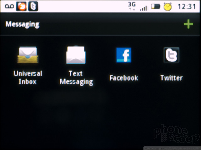
The Motorola Charm offers a universal inbox under the Messaging app. It's not quite universal, more like the entire universe minus Gmail and IM. It collects all of your Twitter DMs, Facebook emails and text messages, both incoming and outgoing, into one convenient list. The phone supports some threaded messaging in both the universal inbox and the simpler text message section. SMS and Facebook conversations are threaded, so messages show up as cartoon speech balloons in a long page. Twitter messages, though, get their own page for some reason.
In any case, the extensive messaging options on the phone can sometimes be overwhelming. Between the widgets, the universal mailbox and the individual apps, there are a lot of ways to have a text conversation. But you don't have to use all of them, you can simply pick your favorite and with so many options, at least you'll never worry about missing anything.
Social Networking
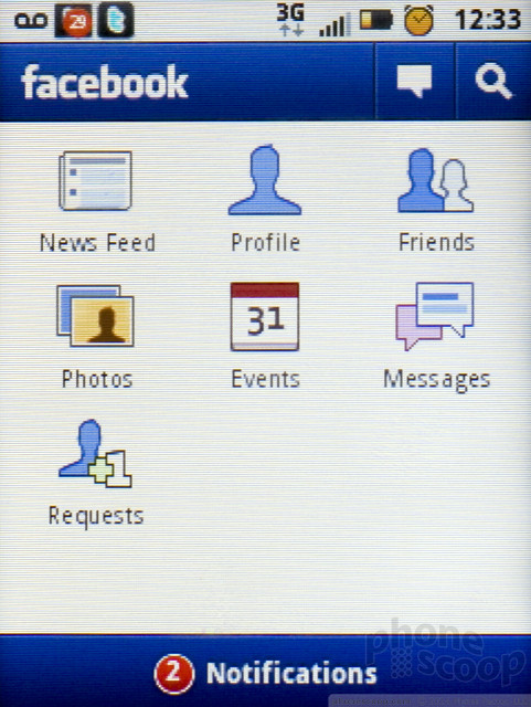
All of the social networking features on the Charm are integrated into the contacts list, the widgets and the universal inbox. Surprisingly, there are no social apps preloaded on this phone except for MySpace. You have to download Twitter and Facebook from the App Market if you want to take advantage of the features these dedicated apps offer. For reading and posting, the widgets work fine, but if you want to search or dig a bit deeper, the apps are free for the taking.
Out of the box, MySpace is the only preloaded social networking app. Both the official Twitter and official Facebook apps have problems with the phone's screen orientation. The main menu page for both apps appeared sideways on the Charm's screen. To log on, you'll have to tilt your head sideways while you type your username and password. In any case, it isn't a serious problem, just an annoyance.
Extras
Music
Though the music player on the Motorola Charm seems deceptively simple, in fact the phone packs a surprising number of preloaded features to make music listening just a bit more social. The music player itself comes from TuneWiki, which also makes its own Android app. When you start playing a song, TuneWiki automatically searches for lyrics. If it finds a lyric sheet, the words scroll up from the bottom as the song plays, usually in time to the music. It's a very cool feature, it's unobtrusive and requires no work on the user's part. It didn't catch every song, but lyrics popped up for about 60% of the music I loaded. You can also turn the lyrics feature off and just stare at the barebones music controls and the album artwork, instead.
TuneWiki also offers a music map on the phone. Tap on this option and a Google Map will appear with tiny TuneWiki icons spread all over. You can then zoom in on an area and see what other TuneWiki users are listening to. The map didn't offer usernames or any way to connect to people in your area with similar music taste, which would have been a cool, if a bit creepy, addition to the feature. In addition to TuneWiki features, the music player can also send recommendations to Blip.fm if you're signed up for the Blip service. Finally, you can jump from the Now Playing screen directly to a YouTube search for music videos.
In addition to the digital music player, the Charm also has an FM radio on board, and it uses your headphones as an antenna. FM reception was pretty good, with no static on the more powerful NPR and music stations I favor.
In terms of hardware, the Motorola Charm is well equipped. There's a standard 3.5mm headphone jack up top so you can listen with your own earbuds. A microSD card slot is hidden beneath the battery cover, but not under the battery, so you can swap cards without turning off the phone. The Charm comes with a 2GB card pre-installed, which is a nice start, and the phone supports cards up to 32GB. Like I said earlier, the speakerphone produced a clean sound for music, but the volume won't come close to filling a room.
Camera
Camera
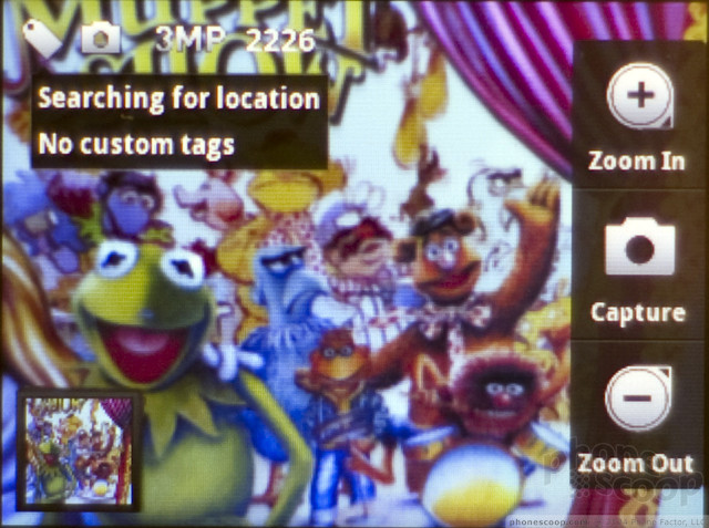
Camera performance could be mixed, but usually the camera reacted very quickly. Often, pressing the camera button on the QWERTY keyboard opened the app in a couple seconds, though some times it took more than twice as long. The Charm took less than a second between shots to get ready for more picture taking. The camera interface is sparse, but unique. You get a capture button on screen, though I found it much easier to snap a picture with the hardware camera button instead. If you tap the screen, you get options to zoom in and out (I always avoid digital zoom), and a geotagging button. Your location will pop up with an actual city name, not just GPS coordinates, and you can also add a custom tag to your geotag info. So, when you're in Paris, you can tag your photo for the Louvre or Pigalle, wherever you may be.
The rest of the camera options are buried in a settings menu accessible from the menu key. By camera options, I really just mean changing the image resolution, because that's all you get. You can't adjust white balance or exposure, you can't shoot a picture in sepia or black and white. Not to worry, the Charm has all of these editing options and more, they're just applied after you take a picture, as part of the image gallery.
The Charm has a great panorama assist mode. It automatically takes pictures in succession as you pan the camera, and you can tell the phone if you'll be panning left to right, bottom to top, etc. I liked the high resolution panorama shots the Charm took, and I used this mode often.
Image Gallery
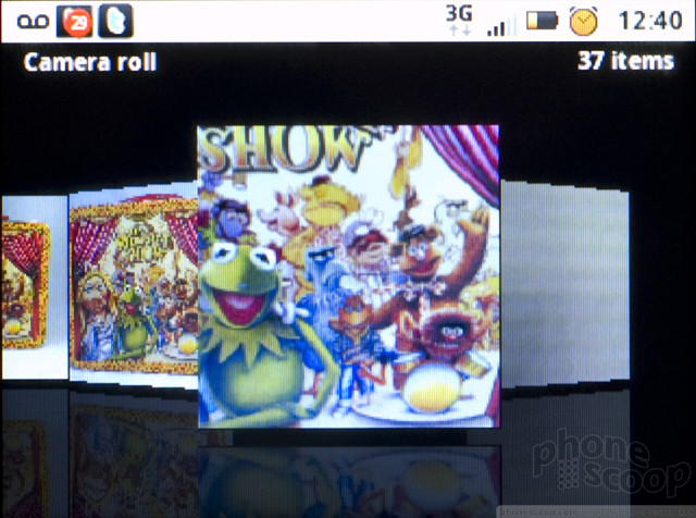
The only view available in the image gallery is a linear copy of Apple's coverflow, with all of your images floating horizontally by in an animated wave. Unfortunately, the Motorola Charm is simply not a good phone for photo viewing for a number of reasons. First, photos look terrible on the QVGA display. Second, the phone is underpowered for a tricky animation like coverflow. The gallery stuttered and skipped about frequently. Third, photos look terrible on the QVGA display. At full screen, images didn't look bad, but reduced in size, they looked blocky with jagged edges and too much lost detail. I'm guessing this is why Motorola nixed a thumbnail grid view.
There are loads of options for editing and sharing pics from the image gallery. You can choose the share menu to send your pictures to a number of different sites and services, including a special Motoblur site and T-Mobile's own photo sharing site, in addition to all your favorite social networks. You can email or send pics as MMS messages, or push them to your desktop over Bluetooth. You can set one of those services to be your Quick Upload choice, and the phone offers a shortcut button to send the pics to your favorite service quickly.
In the editing mode, the phone offers an auto enhancement feature from Kodak called Perfect Touch. It seemed to improve the dynamic range of my images, bringing out details from the shadows. It's nothing dramatic, but definitely helpful. You can crop, rotate or flip pictures easily. There are also advanced options to add color filters, like the Sepia and B&W filters missing from the camera, in addition to an oil painting filter and a lomo filter for a cheap plastic camera look. You can also add a number of frames, tiny stamps or clip art to images.
Image Quality
Photos
Image quality from the 3 megapixel camera on the Motorola Charm was not impressive. The phone lacks auto focus, and this hurt quite a few of my images, as the fixed focus lens blurred subjects that were within a few feet. Images taken outdoors on a bright, sunny day had a reddish cast to them. At full zoom, details were muddy and edges looked liquefied. Taking a step back, things weren't so bad, and besides the slight red tint, colors looked fairly accurate. I would share these pictures as MMS messages or reduced size Twitter pics, but I wouldn't post them anywhere people might want a closer look. Indoor images were almost unusable. Under good indoor light, pictures looked grey and unappetizing. Under lower lighting, images looked like they were sketched in pencil. Colors and details were mostly gone, and the images weren't even good enough for simple MMS messaging.
Video
Considering the camcorder only shoots in CIF resolution, which is only slightly larger than the QVGA display can show, I was happy to see my videos didn't fall prey to the usual mobile camcorder problems. Videos were blocky, for sure, and suffered from the same red cast as my still images. But motion wasn't much of a problem. I didn't see any of the wavy, liquid effect I get from worse phone camcorders. The video recorder also handled changing light fairly quickly, and even under dimmer indoor lighting, my videos were quite watchable.

3GPP / MPEG-4 format (viewable with QuickTime)
Browse / Customize
Browse
All of the problems that I had with the Motorola Charm come together in the Web browser to make one of the least pleasant browsing experiences on an Android phone. The low resolution screen hurt text and photos on Web pages. Simpler graphics looked fine, but pictures looked lousy and text could be difficult to read on long pages. The problems I had with the phone's reception hurt Web browsing considerably. I couldn't connect to my fast home Wi-Fi network, and the data network was unreliable. It would often drop to EDGE from faster 3G for no apparent reason, and sometimes it would stall altogether. Browsing could be a very sluggish experience. If there is a bright spot, the Backtrack sensor was helpful while browsing. With a light touch, the sensor on the back made it easier to scroll through long text pages like a New York Times article without getting my fingers in the way of the screen.
Customize
Even with its small size, the Motorola Charm is just as customizable as any Android phone. There are tons of widgets, including the custom Motorola widgets that can be stretched and resized to fit almost any available space. The phone does a nice job handling widgets, automatically moving icons aside so new shortcuts can fit. Most Android phones aren't so helpful. You can use Live Wallpapers on the Charm, and the wallpapers all stretch across the seven panels of the homescreen. You can customize ringtones and system alert sounds on the phone, as well.
Extras
Bluetooth
Bluetooth worked okay on the Motorola Charm. I had no trouble pairing with my Bluetooth headset, but reception suffered during calls, and the sound frequently dropped in and out. Sound quality was much better paired with a set of stereo Bluetooth speakers for music playback. I was also able to send picture files from the image gallery over Bluetooth without trouble, and I could upload files from my laptop to the phone over the Bluetooth connection.
Clock
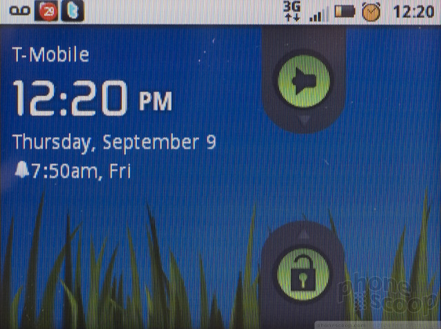
The Motorola Charm has plenty of clocks. There is a clock on the lock screen, though it is somewhat small for my taste. An even smaller clock persists in the notification bar up top through most apps. You can add clock widgets to the homescreen panels, including a custom sized Motorola clock widget. Unfortunately, making that widget larger does not produce a larger clock, but rather creates a lot of open space, and adds a calendar, if you go really big. There is also an app with an alarm clock and a countdown timer.
GPS
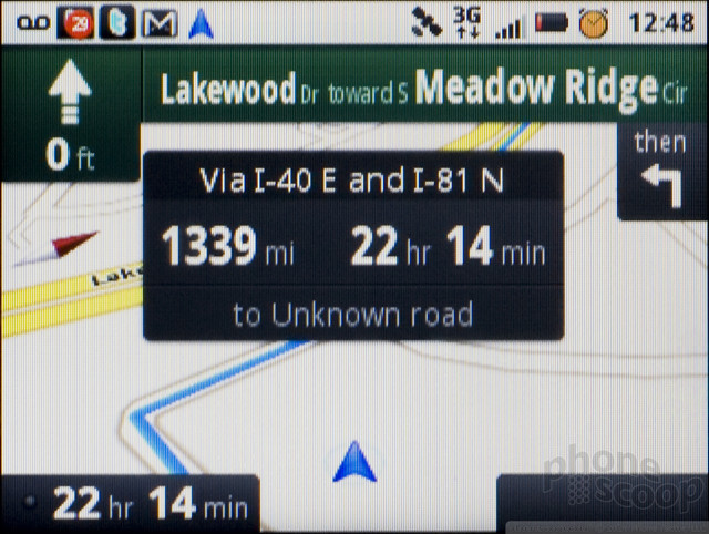
The Motorola Charm uses the free Google Maps app for turn-by-turn navigation. GPS worked very well on this phone. It found my location quickly, both in Google Maps and while geotagging my photos. Navigation followed me on my journey with no trouble, guiding me back to my route when I got lost.
Wrap-Up
Almost all of the problems I had with the Motorola Charm could have been solved with a much better screen. The interface would have been more pleasant to use, though I still enjoyed the custom Motorola widgets and the useful, if occasionally repetitive, social networking features. Web browsing would have been instantly more enjoyable if text were easier to read and pictures looked sharper than they do on the Charm's low resolution display. Photos might not improve, but at least I wouldn't be embarrassed to show off my pictures if the display didn't look so dated and blocky.
Even with the low res screen, I can still recommend the Motorola Charm. The keyboard is wonderful. Even for its small size, it made typing a delight. The phone may be small and less powerful, but Motorola hasn't skimped on software features, and the phone gets the full Android 2.1 treatment, with Live Wallpapers, Exchange support and free navigation in Google Maps, in addition to the full complement of MotoBLUR interface enhancements. The form factor is also unique for Android, and as more and more curious BlackBerry owners take a look in Google's direction, the Charm might be a foot in RIM's door.
But my warning to buyers is that they should do some heavy reading on the phone's screen before they commit to a two year contract. Some folks might not mind, so if you've spent some time with the phone and the screen isn't a bother, the interface and extra features only grow more rewarding over time.
Video Tour
Comments
Linked keys?
BackTrack
Like all phones with exposed keypads and/or touch surfaces, it has a lock/unlock feature.


















 HMD Launches Barbie Phone in US
 Motorola Gets Serious About Foldables with New RAZR Lineup
 Asus Announces US Pricing and Pre-Orders for Zenfone 10
 Beeper Mini Brings iMessage to Android
 iOS 18 Overhauls Home Screen, Messaging, Photos
 Motorola Charm

