Review: Motorola Q
The Q feels great in your pocket, it's so slim you barely notice it's there. While using two hands to type on the Q, it is just big enough to hold and the weight is well balanced. But when wrapping your hand around the Q to use as a phone, it is just a little too wide. It's not any wider than other smartphones, and it's thinner, so it is not the size that makes the Q uncomfortable in one hand. In fact the size is pretty much perfect.
Instead the discomfort is caused by the angular edges and a large ridge designed to protect the scroll wheel. The width of the phone forces you to grip it a bit more tightly and really dig in to these hard edges. Motorola curved the edges of the RAZR to alleviate this problem. It's a shame they did not apply the same principle to the Q, especially since this is supposed to reflect the RAZR's styling.
Motorola did manage to bring the RAZR's solid feeling to the Q. Despite its light weight and plastic construction, the Q feels exceptionally solid. Just like the RAZR, the Q has a thin curved battery door that - against the odds - snaps so tightly into place you'd never realize how flimsy it is. There is no wiggle or flex in the Q's body, even when you take it in both hands and try to twist it. It's quite impressive.
Keyboard
No matter how much we used the Q, we never were able to type accurately with the keyboard for more than a few words at a time. The keys are smooth, have rounded tops, and are made of a very hard plastic. Unfortunately this is a recipe for fingers slipping and pressing a jumble of keys when you only intended to press one. Although the keys themselves are disappointing, the action of the keys is satisfying. Each key press has a noticeable click or pop to it that lets you know you definitely hit something, either on the QWERTY keyboard or the navigation pad.
The keyboard layout leaves much to be desired. Other than letter keys, nothing is where you expect it to be - not even the period key, which is the only punctuation mark that doesn't require using the alt key to type. After a week of typing on the Q, we still press the return key to delete text (instead of the back navigation key), press the shift key instead of the period, and still can't remember which key is the comma and which is the apostraphe.
The navigation keys are the opposite of the keyboard keys in almost every way. The keys are flat and made out of a slightly sticky, shiny plastic. Raised ridges divide each navigation key and the D-pad from each other. The ridges make feeling the navigation keys very easy, and they also keep your thumb trapped inside the D-pad which makes using it for navigation very pleasant. Like on the RAZR, even though these keys are flat, they still click when pressed.
On the right side is the scroll wheel with push-to-select and a separate back button. This works poorly on the home screen - for instance it cannot be used to scroll through the icons of recently used applications - but once navigating the depths of the Q, it works well. The scroll wheel has a gentle click as you turn it, and a confident select action. The back button is a little too far away from the scroll wheel. Your thumb sits between the wheel and back button instead of hovering over them. Because it requires a large movement to find, it's almost as though the back button isn't even there.


 Motorola Q Video Tour
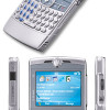 The Q - Motorola's Super Thin Smartphone
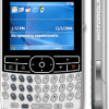 RAZR-like Motorola Smartphone Leaked
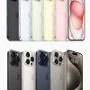 iPhone 15 Series Goes All-In on USB-C and Dynamic Island
 Motorola Q

