Review: Motorola Droid 4 for Verizon Wireless
Feb 10, 2012, 12:42 PM by Eric M. Zeman
updated Feb 10, 2012, 1:16 PM
Motorola takes its fourth shot at the Droid that started it all with the Droid 4. For the QWERTY keyboard seeker, there's a lot to like about this LTE 4G smartphone for Verizon Wireless.
Form
Is It Your Type?
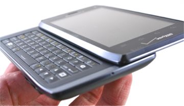
Motorola's "Droid" phones have always been about offering the best of both worlds: a touch screen and a real, physical keyboard on an Android device. The fourth-generation Droid lands on Verizon's network and is the best version yet, thanks to a wholly redesigned keyboard. For those who need real keys, the Droid 4 is likely to make you a more prolific mobile messenger. Here's why.
Body
The Motorola Droid 4 is a sideways slider. That means it's somewhat thick and bulky — though it's still thinner than some monoblock phones are. The good news is, Motorola has given it a lot of visual appeal by bringing its current design language to the Droid 4, giving it a much more modern look than previous Droids.
Anyone who's laid eyes on the RAZR, RAZR MAXX, or Xyboard tablets will immediately see the family resemblance. The Droid 4 has a clean look, with side surfaces that angle towards the top/bottom edges. The materials feel decent, but not top-of-the-line. The glass and plastics of the top half of the phone, for example, feel great. The rubber-y battery cover and soft-touch side surfaces don't feel as classy by comparison. Build quality is decent, but there is a bit too much space/air between the two halves of the phone. Held sideways up to my eyes like a pair of binoculars, I could read the text on my computer screen from several feet away through the phone. That's a huge gap.
The Droid 4 is shorter and narrower than the RAZR MAXX, and thanks to steeply angled side surfaces, it has a relatively small footprint when resting in your hand. It is comfortable in the palm, despite the overall size and heft. There is a subtle bump encircling the display on the front surface. This lets the Droid 4 rest safely on a flat surface while protecting the display. The Droid 4 will slip into most pockets no problem, but it will be hard to ignore when moving about thanks to its weight.
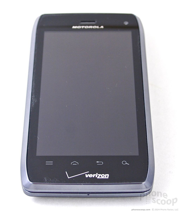
The front surface of the Droid 4 looks almost identical to the RAZR and RAZR MAXX. There is plenty of bezel around the display, and the standard Android controls take form in four capacitive buttons placed along the bottom of the display. All four buttons react quickly to input and have a really nice haptic response.
As with many of Motorola's smartphones, the Droid 4 has a docking set-up on the left edge. The mircoUSB port and microHDMI port are side-by-side, allowing the Droid 4 to lock itself into various accessories. There is no hatch covering these ports, and that's fine by me.
The volume toggle is found on the right edge of the Droid 4. It's small, but fairly easy to use. It's travel and feedback is much better than that of the RAZR and RAZR MAXX volume toggles. The power/lock button is on the top of the phone. It has a nice shape and contour, but I found travel and feedback to be a bit mushy. The 3.5mm headset jack is next to it.
The slider mechanism for the Droid 4 is not spring-assisted, which means you have to do all the work yourself. I found it hard to open by pressing my thumbs along the edges. The Droid 4 was prone to jumping out of my grasp that way. Instead, the best way is to put your thumbs on the display and push up. Not ideal, but it'd the safer way to open the device.
For the keyboard user, there's a lot to like about the Droid 4's keyboard. It 100% different from the keyboards of previous Droids. The keys are well defined, have amazing travel and feedback, and work very well. The keyboard also has a really neat back-light that makes the keys pop when used in the dark. The backlight provides a great outline for each individual key. There's no doubt this is the best keyboard I've used on any Motorola device. It simply feels great. It offers five full rows — including a dedicated row for numbers. The bottom row is reserved for controls, such as the shift, symbol, and space buttons, as well as directionals for on-screen editing. I would have liked to see dedicated "www" or "@" or ".com" keys somewhere, but they are absent.
The battery cover will probably infuriate you. It's nearly impossible to pry off. You have to press down own the outer edges of the cover firmly and then slide it downward. Only then might you actually expose a big enough gap at the edge to dig in a fingernail. (To wit, Motorola actually includes a tool in the retail box to help people remove the battery cover!) Both the SIM card and microSD card can be accessed without removing the battery itself.
Despite the few issues I picked on, the Droid 4 is no doubt the best version of the Droid yet when it comes to the hardware.
The Three S's
Screen
The Droid 4 has a 4-inch qHD LCD display (540 x 960 pixels). The smaller size and resolution make for an attractive screen. Individual pixels were visible occasionally, but most of the time items on the screen look smooth and clean. As for visibility, it is easy to see and use outdoors under full sunlight. The display doesn't have the same color-shifting problem I saw in the RAZR MAXX, but the Droid 4 has a blue tint that is persistent across apps (in other words, color isn't 100% accurate.)
Signal
The Droid 4 is a solid performer on both Verizon's CDMA 3G and LTE 4G networks. While the signal indicator rarely reached more than four bars of either, the Droid 4 was able to make phone calls and surf the web under all network conditions. It made calls just as easily with one bar as it did with four, and never dropped any calls during my testing. In the NJ vault (my local super market), the Droid 4 lost Verizon's 3G network, but held on to the 4G network. Surfing the internet was good on both networks, though obviously a bit faster when using 4G.
Sound
Voice calls sounded great through the Droid 4. Not only were they free of distortion and unwanted noise, they were plenty loud. With the earpiece set to maximum volume, it will be easy to hear conversations in crowded coffee shops, moving cars (as long as you're not the driver!), and busy households. The speakerphone is equally good. Calls sounded decent, and were loud enough to suit most users. I had no problem hearing the ringers or alert tones at half volume from a different room in my house. Set all the way up, they're just annoying. The vibrate alert is very strong.
Battery
Battery life falls into the "average" category for this class of device. Using the device under mixed network conditions (3G, 4G, and Wi-Fi), the battery was fully dead in less than 24 hours (9AM to 9AM). This included periods of heavy use (streaming music, uploading pictures) and periods of casual use (phone calls and messaging). It managed to live during the entirety of my waking hours for a full day. This is one of those phones that will need to be plugged in each night.
Basics
Menus
The Droid 4 runs Android 2.3.6 Gingerbread with the same user interface skin that is on the RAZR and RAZR MAXX.
The lock screen offers two shortcuts aside from simply unlocking the device: One silences incoming calls, and the other opens the camera. Being able to open the camera from the lock screen has become a key feature that I look for in a phone. There are five home screen panels for user customization. Motorola and Verizon have preloaded an abundance of widgets and apps, though they can all be removed from the home screen if you so wish.
The main app menu is laid out in an alphabetized grid. You swipe side-to-side (not up-and-down) to access the different panels of apps. The settings tools let you group apps into folders of your own choosing, as well as sort through those that are most frequently used or recently used. The main app menu cannot be viewed in list form.
The settings menu functions as it does on any other Android 2.3.x device, though Motorola has updated the icons seen along the left edge of the phone. They look pretty sharp, if you ask me.
The biggest disappointment in Motorola's Android skin is that it doesn't offer basic settings controls in the drop-down notification shade. I like to be able to quickly turn off the Wi-Fi radio or GPS on occasion, and the notification shade is the best place for such tools. Instead, you have set up a widget on one of the home screen panels to access those controls, but obviously you lose valuable home screen real estate.
Performance was smooth across the Droid 4. I didn't have any trouble transitioning between screens, opening apps, multitasking, etc. The Droid 4 was responsive and performed every task I threw at it with no hiccups.
Calls/Contacts
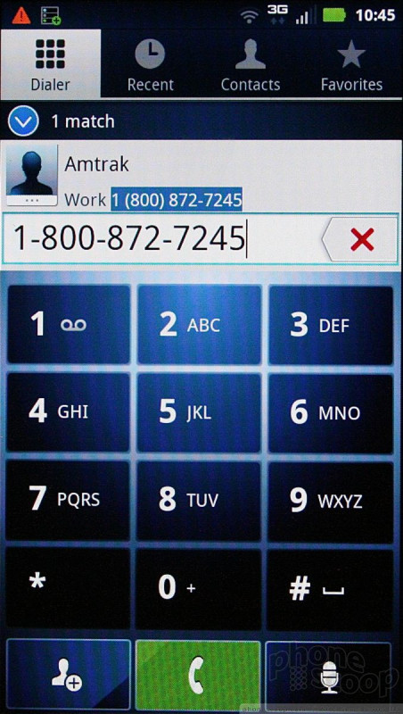
The Droid 4 uses the same set up we've seen on previous Android devices from Motorola. The phone application itself is a stock Android calling tool. Motorola uses some new colors to spruce it up a little, but in-call features are unaltered from stock Android, and are simple to use.
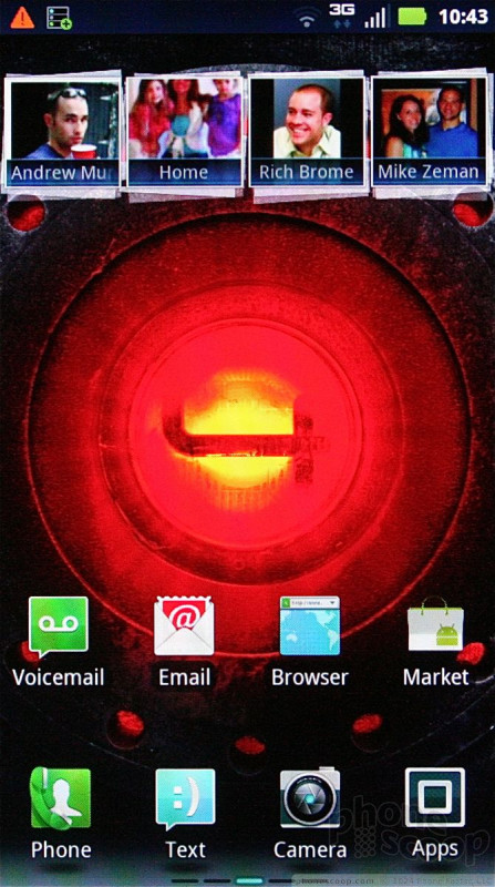
The main contact application is stock Android, but Motorola installed its cool home screen widget for your favorites. At the top of the central home panel, you'll notice four empty boxes at the top, with what appear to be other boxes stacked behind them. These are your contact favorites. Drag the set of boxes down, and the stacks will open up to show you a grid of your top 20 contacts, complete with photo ID. Tap the photo of your contact, and it will open a drop-down menu that offers a handful of quick actions, such as calling them, messaging them, or sending them a Facebook message.
As with any Android device, you can set up shortcuts to contacts directly on the home screen panels.
Messaging
The Droid 4 treads well-worn ground in the messaging department. Everything it offers, you've seen before on other phones. Stock Gmail, email, GTalk, and SMS tools are available and all do as fine as job as they have ever done.
The Droid 4 includes Verizon Wireless's generic instant messaging application. It supports AOL, Windows Live, and Yahoo. It's a decent little client, and offers the same user interface across IM networks so that you have a consistent experience no matter which one you happen to be using.
The biggest differentiator the Droid 4 has going for it when compared to Android handsets from HTC, Samsung, and LG is the Motorola-made widgets. There's a widget for updating your IM status; a catch-all social networking widget that lets you check Twitter and Facebook feeds from the home screen; a social status widget for updating your own status to Twitter and Facebook...you get the idea. There are also Google-made widgets for Latitude and Social Location. The social widget isn't too bad, and updates to both Facebook and Twitter flowed in smoothly.
If you want to interact directly with Facebook and Twitter, you'll have to download those apps yourself, as they aren't pre-installed.
Extras
Media
Music
The Droid 4 offers a lot of options for accessing and playing music. As far as apps go, there's MOG Music, Google Music, My Music, Slacker, and V CAST Tones. Those are all pre-installed.
The most useful of the included apps is Google Music, which acts as a local media player as well as a streaming music service. If you've uploaded your music to Google's servers, you can access it over the network from the Google Music app. It's a pretty good music player for the Droid 4.
Video
The Droid 4 has an abundance of options when it comes to accessing and playing video content, too. Preloaded apps include BlockBuster, NetFlix, NFL Mobile, Slingbox, Verizon Video, the stock Android video app, VideoSurf, and the stock YouTube application. Yeah, that's a lot. Oh, I forgot to mention that you can rent/buy movies directly from Google through the Android Market.
From this lot, I found the stock video and YouTube apps to be most useful. They are what you'll use to watch sideloaded content, content captured on the Droid 4 itself, and of course the social network through which you'll share your attempts at becoming the next Martin Scorcese. Almost all the other services will cost you extra money each month.
Camera
Camera
The Droid 4 doesn't have a dedicated camera button, but the camera can be accessed from the lock screen. It launches quickly. The camera controls are nicely arranged and intuitive to use.
The Droid 4's camera can shoot at a maximum of 8 megapixels if you shoot with a 4:3 aspect ration. If you want to shoot in a 16:9 ratio — which is what matches most of today's TVs and computer monitors — images are 6 megapixels.
The focusing box hovers in the middle of the screen, but the Droid 4 also includes touch-to-focus if you want to be specific. There's a slide on the left of the display for zooming (and the volume key doubles as a zoom key.) Then there's a small button in the lower-left corner to access the Droid 4's full settings.
Once pressed, a drawer pops out that provides access to six different control panels: Settings, Effects, Scenes, Shooting Modes, Brightness, and Flash. There's plenty to choose from when it comes to adjusting the camera's behavior. The effects are limited to colors, but the scenes range from portrait to landscape, and from close-ups to sunsets. It has an easy panorama mode for taking shots of wide vistas.
Overall, the camera functions well. It opens quick, is quick to focus, and fast to capture/save images. The Droid 4 can go from locked to snapping its first picture in about 3 seconds. That's faster than most point-and-shoots I've used.
Gallery
The Droid 4 makes use of the same Motorola gallery application that we've seen on other high-end Motorola Android devices in recent months.
The gallery segregates photo libraries, with the default view set to the images shared by your Facebook friends. The images appear as cards floating in a carousel and you can scroll through them sideways. It's a breeze to add a comment, or open the photo in the Facebook app for full interactivity. There are buttons below this carousel that open the camera roll, your image library, your online accounts (defaults to Picasa and Facebook), and DLNA devices.
You can upload/share with tons of photo/social services, and even add comments to your own photos. The gallery can be set to support automatic uploads, which means photos will be sent to the one social network of your choice automatically, in the background.
As for the main gallery of camera photos, it lays things out in a grid of thumbnails and supports slide shows. The editing features are robust. The Droid 4 can adjust effects, colors, and brightness, as well as crop, rotate, flip (horizontal or vertical), and even resize the image. It is really nice to have these features. I will complain about how deep these editing tools are buried, however. You have to make at least three menu selections to find the editing features (More -> Edit -> Advanced Editing).
Photos/Video
Photos
The Droid 4's camera can shoot at a maximum of 8 megapixels and is aided by auto-focus and a flash. This triple attack leads to good results most of the time. Some of the shots I took in my dark office turned out perfect, with solid focus, little grain, and good exposure — despite the fact that I had the flash turned off. The flash is bright, but is best used only when shooting people, otherwise you're in store for nasty glare.
Outdoors, the Droid 4 performed well. The bulk of images I shot were clear and sharp, were colorful and correctly exposed, and had good white balance and little grain/noise.
Video
The Droid 4 shoots video at a max resolution of 1080p HD. You can reduce that to cut down on file size if you wish. The Droid 4 suffers a bit from the same ailment I've seen on a number of 1080p HD phones: it gets a case of the shakes when panned about. For whatever reason, moving the phone while recording causes a severe shaking of the resultant video. It's jarring to the eyes to watch. Dialing the resolution down to 720p solves this issue.
Otherwise, the video is free of grain, insanely sharp, and correctly exposed. You'll want to share it, no doubt.
Browse/Customize
Browser
The stock Android browser works very well on the Droid 4. When surfing on Verizon's 3G network, I found pages to load in a reasonable amount of time, though the full HTML desktop version of sites such as CNN were slowed down by ads. I noticed a few hiccups when streaming music over 3G. On Wi-Fi, the Droid 4 surfed at blazing speeds.
As for surfing on Verizon's LTE 4G network, it was an excellent performer. Most web sites loaded in a few seconds, apps downloaded from the Android Market in a jiffy, and streamed music was hiccup-free.
Customize
The Droid 4 offers users plenty of room to adjust the phone's appearance, behavior and functionality. The items unique to the Droid 4 include several re-sizable Motorola widgets, such as the social networking widget, the favorites widget, the photo gallery widget (which also includes friends' Facebook photos,) and so on.
The Smart Actions tools also offer an interesting way to set up automatic controls over select behaviors of the Droid 4. Smart Actions lets you set up "triggers" to control a range of phone features. Here's how it works.
You set up a rule for the phone. Rules are things such as muting all alerts, or dimming the display, or switching to Car mode, or automatically playing music. Once you set a rule, you then choose a trigger that forces the phone to follow the rule.
Rules can be applied to the text messaging application, notifications, ringtones, wallpapers, application launcher, browser, display/brightness settings, Wi-Fi/Bluetooth radios, and so on. Triggers for the rules can be set to the occur based on the battery level, incoming/missed calls, motion detection, time of the day, etc.
Extras
Apps
The Droid 4 is crammed full of apps. There are 62 installed out of the box. That's absolutely ludicrous. You can get rid of some of them, but not all of them. A significant number of them are Motorola or Verizon-branded apps. The Motorola apps aren't so bad, such as the MOTOACTV application, which lets it pair with the MOTOACTV watch/MP3 player and fitness tool, or MOTOPRINT, which lets you print via Wi-Fi to networked printers.
Bluetooth
The Droid 4's Bluetooth radio connects to phones, headsets, PCs, and speakers. I had no trouble pairing it with half a dozen different pieces of equipment. Phone calls placed through my car sounded really good, as did music played through Bluetooth stereo speakers. It works, and that's what we want.
Clock
The Droid 4 has a large digital clock that's easily seen when the lock key is pressed. It is positioned in the top-left corner of the screen, and thanks to the good outdoor visibility of the Droid 4's screen, it is easy to tell the time no matter where you happen to be. The Droid 4 also has a clock widget for use on the home screen panels. This widget is widely customizable, but the lock screen clock is not.
GPS
The Droid 4 includes both Google Maps and VZNavigator. Both are capable navigation apps. Google Maps is easy to use, and ties in well to other Google services, such as Latitude and Places. VZNavigator doesn't do that, and costs $10 per month to use. VZNavigator's GPS performance is a little bit better and more accurate in my experience and better at handling dynamic traffic conditions. The Droid 4's GPS performance was good, and it was consistently able to locate me to within 10 meters in less than 30 seconds.
Wrap-Up
The Motorola Droid 4 is a good effort from our friends at Motorola and performs well at essential tasks. The Droid 4 is a signal hound, makes great voice calls, and is a solid data device on either 3G or 4G.
The Droid 4's QWERTY keyboard is truly fantastic and the best from Motorola yet. The rest of the hardware is decent and offers a mix of materials and features that work as they should.
If you're in the market for a QWERTY Android device with LTE 4G on Verizon's network, the Droid 4 is your best best. Though the third time is often the charm, in this case case, Motorola's fourth effort is by far the most charming Droid.

Comments
"That's a huge gap"
"but there is a bit too much space/air between the two halves of the phone. Held sideways up to my eyes like a pair of binoculars, I could read the text on my computer screen from several feet away through the phone. That's a huge gap."
Let me surmise why that might be.
For example, on my LG enV Touch (first and LAST LG anything) ... without a screen protector on the inside display, overtime, with the phone close, the keyboard will create small impressions on the inside screen ... as evident by the impressions on the screen protector, without which, they would be on the screen!
So, the gap you are referring to may be to prevent this, w/o out the need for a screen protector - at least for that purpose.
mx








 Hands On with the Moto Droid 4 and Droid RAZR MAXX
 Verizon and Motorola Debut the Droid 4
 Motorola Droid 4


