Review: Samsung Galaxy Note 3 for T-Mobile
Oct 1, 2013, 8:00 AM by Eric M. Zeman
Samsung takes another stab at the Note phablet and might finally have a winner on its hands. Here's what we like and don't like about Samsung's latest large-screen Android smartphone.
Is It Your Type?
Samsung's King of Phablets is back, and it's better than ever. This year's Note has a bigger screen, faster processor, thinner/lighter body, and improved S Pen powers. What's not to like? Well, a few things, to be sure. The phablet-averse may find the Note 3 to be too much smartphone, but those who live by the "bigger is better" mantra, the Note 3 delivers.
Body
The Samsung Galaxy Note 3 makes a couple of key improvements over previous generations of the fabled phablet that make it a more usable device.
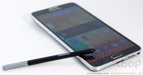
The first thing you'll notice is the change in design language. Samsung took a page from the design of the Galaxy S 4 and added a new twist that's unique to the Note 3. The device has the same polycarbonate frame that rims the side edges. It is strong and chrome-colored. Samsung has (thankfully!) ditched the flimsy plastic battery cover for one that has a faux leather surface, complete with fake stitching. The faux leather isn't slippery, has an almost-real feel to it, and looks much, much better than the glossy plastic of last year's device. No more gross grime! The result is a classy looking smartphone that exudes professionalism and power. The one undesirable side effect of all this is that there is now a sharper edge where the glass panel meets the polycarbonate frame. Hard edges are the last thing a phone this size needs.
Speaking of which, the Note 3 is a large phone - larger than most flagship phones - and that's the way it is supposed to be. The exceptionally huge 5.7-inch screen necessitates a tall and wide device. Even so, Samsung managed to make the Note 3 narrower than its predecessors. This is a major victory for users. It may be only 1 mm narrower, but the difference in the hand is major. Further, Samsung reduced the depth from 9.7mm to 8.3mm, and the weight from 6.35 ounces to 5.93 ounces. Added together, these reductions in size make the Note 3 feel significantly smaller and lighter when gripped in your hand. Yay!
Usability is definitely improved, but the Note 3 is still big enough that some people will find it hard to use. If you have small hands, the Note 3 is not for you — unless you don't mind using both hands to interact with the phone. It does slip into pockets a little bit easier, but that hard edge makes itself known. The Note II had a rounded profile that was a big more comfortable in tight jeans.
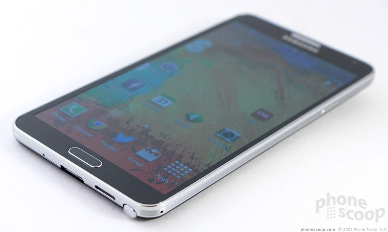
The front of the Note 3 really is all screen. Samsung did a great job minimizing the bezels along the side edges. The bezel above and below the screen is just thick enough to fit the Samsung logo and earpiece speaker grill up top and the physical home button below. The speaker grill has a nice chrome finish to it, and the Home button has a chrome rim encircling it. These adds to the Note 3's classier look. The Home button has excellent travel and feedback. It is also easy to find with your thumb. It is flanked by capacitive buttons for Menu and Back. The capacitive keys work well, and you can adjust how long they remain illuminated, to make them easier to find.
The side buttons are modestly improved compared to earlier Notes. The volume toggle is on the left. It's a thin, chrome-colored button. Even so, it has an excellent profile and even better travel and feedback. The screen lock button on the right edge has a smaller profile, but it still easy enough to find. Importantly, it has good travel and feedback. The stereo headphone jack is on top and the USB port is on the bottom.
The Note 3 is one of the first phones to use USB 3.0. For the uninitiated, micro-USB 3.0 plugs look different. They have two sets of prongs that fit into the port (see photos.) The extra pins support a mode called SuperSpeed, that, as you might guess, transfers data faster. The good news is that USB 3.0 is backwards compatible with USB 2.0 and will accommodate common micro-USB cables for charging and (slower) data. The device ships with a USB 3.0 cable, but I was able to charge it with any old micro-USB cable laying about my office.
Prying the Note 3's battery cover off require some delicate work with your thumbnail. The clips that keep it in place are strong. Once removed, you have access to the battery, SIM card and microSD card. The Note 3 uses a stacked set-up with the two card ports. The microSD card fits on top of the SIM card. The good news is you can swap memory cards without pulling the battery.
The stylus (nee, S Pen) is tucked into the bottom of the Note 3. It's easily retrieved with the help of your thumbnail. It sits tightly enough in its slot, though, that it won't accidentally pop out when the Note 3 is dropped. I don't care for the stylus much itself. It a bit too flexible and weak. Worse, the button is nearly impossible to find without looking at the S Pen directly. The button's travel and feedback is next to nil.
There's no denying that Samsung has crafted a fine phone in the Note 3. Aside from the drawbacks associated with its size, it is a good looking phone, is easier to use, and is well built. Well done, Samsung.
Comments
Old Sammy vs New Sammy
Today, I have fallen into the Samsung is awesome category. They have proved that they can manufacture a very thin design while still retaining key features into the lifestyles of many. My galaxy 3 has performed flawlessly and I really enjoy being able to remove the battery to visually inspect it on a monthly basis. I love the removable SD Card and Samsung's live chat with customer service has re-instated my confidence into the company.
I don't need metal hardware and I don't need companies to tell me what I can have or can't have. Samsung has provid...
(continues)
I think many people have feelings on brands on something they may have bought in the past, even somewhat recent. Best is to have an open mind. LG is an example, I think they have come along way in making some nice devices. Yes the Note 3...
(continues)
Is it the design or design language?
(continues)
'Rich Corinthian Leather'
That 'corinthian leather' back is particularly offensive. What's a shame is there's a lot of -good- ideas about the Note. I love the memo and stylus. It's a shame they're tacked on to every single bad directive Samsung has to the point where despite Android becoming a rather attractive, coherent OS, not a single screenshot in this review shows matching icons. Yikes.
Software wise, I haven't used TouchWiz since I had my Omnia 2, but from what I've s...
(continues)
I guess I can understand your gripe a little. However, the aesthetic looks of the icons never seem to have any bearing on my purchases or even bother me for that matter. Maybe we...
(continues)
Then by all means go get you an artsy fartsy iPhone that still doesn't have HD screeen or half the features of the Note 3, and rant and rave to your heart's content about how awesome it is...
(continues)
Great Review!
I'm patiently waiting to purchase it on Verizon. I've had my Samsung Galaxy Nexus since the day it was released, and it has served me very well for nearly two years. However, I have been wanting a more powerful device for quite a while now. My upgrade became available on Aug 15th, 2013, and I cannot wait to own the Note 3! It's the only smart phablet that I'm interested in.




 Hands-On: Samsung Galaxy Note 3 and Gear
 Samsung Debuts GamePad for Android Phones
 Samsung Galaxy Gear Smartwatch Is a Companion for Note 3
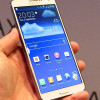 Samsung Note 3 Offers Bigger Screen, Smaller Footprint, Updated S Pen
 Samsung Galaxy Note 3 (GSM)


